Updated: May 10, 2019
Me no smart smartphone user. Me someone who likes their things big and comfy and efficient. Tapping with fingers doesn't quite translate into those needs. But ... with Lumia slowly ascending toward the big phonebooth that is in the heaven, alternatives must be evaluated. Hence, Motorola Moto G6, which I find to be a surprisingly good device, Android notwithstanding. On the contrary. This was another solid surprise.
So perhaps there's light at the end of the touch tunnel. As it happens, you also get updates for your phone, be it test device or not. This article tells my story of the Android 9.0 upgrade, how it went, the good, the bad, and the weird. So whether you're reading this on a nice 24-inch screen or a tiny phone in your lap, lean back, if you can, and enjoy. Let us commence to begin.

Update notification & procedure
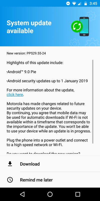
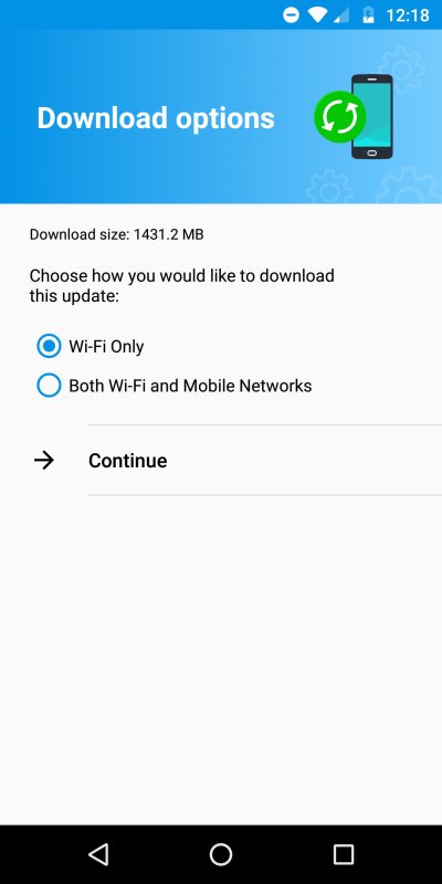
In late March, I got a prompt telling me there was a whole new version of Android available - 9.0 Pie. Since my Moto is primarily a test device, I wasn't too concerned about things going badly, so I let it update without any great fussing or preparations. The actual download weighed a hefty 1.4 GB.
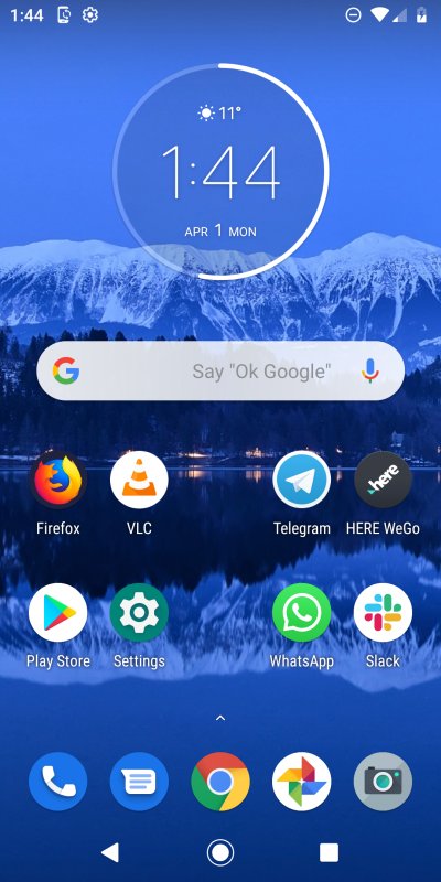
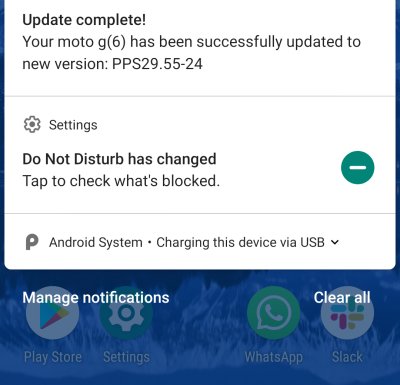
True to its estimate, 30 minutes later, the update was installed, and I was looking at my phone's home screen, apparently unchanged. That's good. But yeah, at first glance, there were no significant visual differences. I wasn't expecting any, as Google has grown comfy with its Material Design, and it's mostly soft refinements of a reasonable UI. But the Devil is in the detail, and under the surface, so I went about a-checkin' what has happened, and what has indeed changed.
System settings
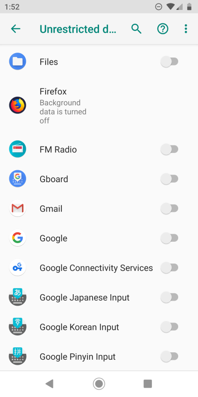
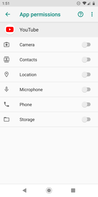
I soon discovered that all my settings were just as I'd left them before the upgrade. No application had extra permissions, and there were no sensors or options suddenly turned on. Applications that had their background data disabled remained in this state, and my account still had the Web and application history paused and all that. Very nice. I mean, there's no reason why anything should ever really change after an upgrade, but you can't really know. In this regard, I'm very happy.
What's new?
Well, the thing is, looking at the Android 9.0 Pie release notes, there's a lot of goodies about. Unfortunately, they don't really apply to me and my usage model, as I'm a rather frugal mobile user, and I see very little point to most of the touch features available in the operating system. Not just Android, this is a general thing. So I'll leave that to bloggers and people who care about those changes.
Thus, for me, the things I did notice were small visual differences that did impair my usage. First, I noticed that the application menu, if that's what it's called, features a background now, and it's no longer transparent. This is part of the system theming, and if set to Automatic, it will be configured based on your wallpaper choice. In my case, this meant a white background, and it clashes with the navigation buttons at the bottom of the screen, and the color is frankly jarring (comes with a bit of transparency).
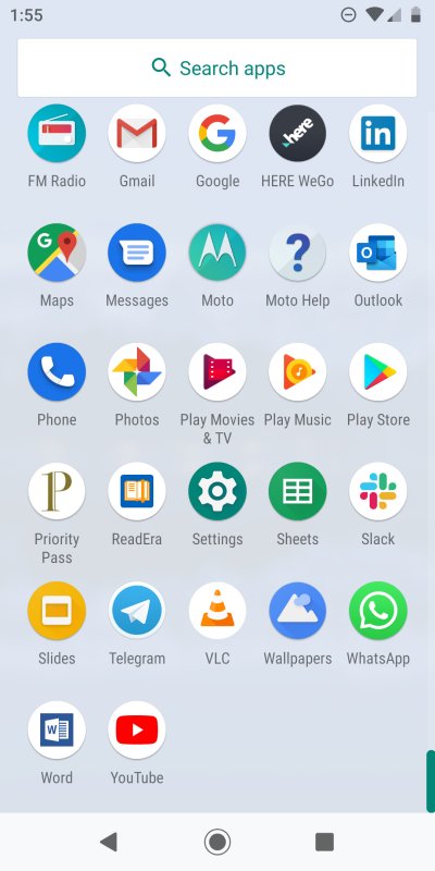

On the desktop, dark themes are awful; on the phone, they look quite all right. But green on black, nope.
I tried the dark theme, and it actually makes more sense. I've always claimed that dark themes work well on the phone, but never so on the desktop. After all, my Lumia is all dark-themed and whatnot. So this is a sensible fix number one to problem number one.
I also noticed the notification area has six buttons sorted horizontally, and they almost touch the borders of the frame. This really bothers me. It does not look ... settled. I tried removing buttons, but as it turns out, you need a minimum of six, and that's just wrong. When you expand, the layout is much better. I wasn't able to find a way to remedy this, and I think this is a visual regression. Otherwise, the styling is quite pleasant.
![]()
![]()
I'm really bothered by the proximity of those circles to the side edges.
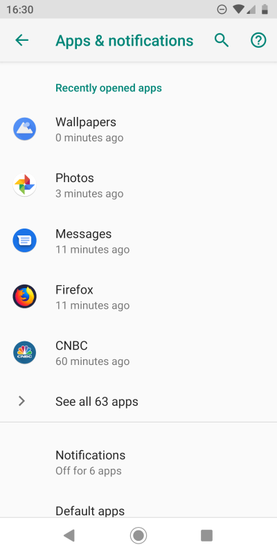
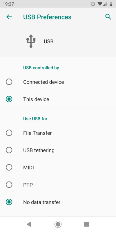
On the bright side, if you go into apps, and want to change their permissions, you now have a recently used list, so it's easier to make modifications to software you're testing and actively using. USB charging and file sharing comes with more options, too.
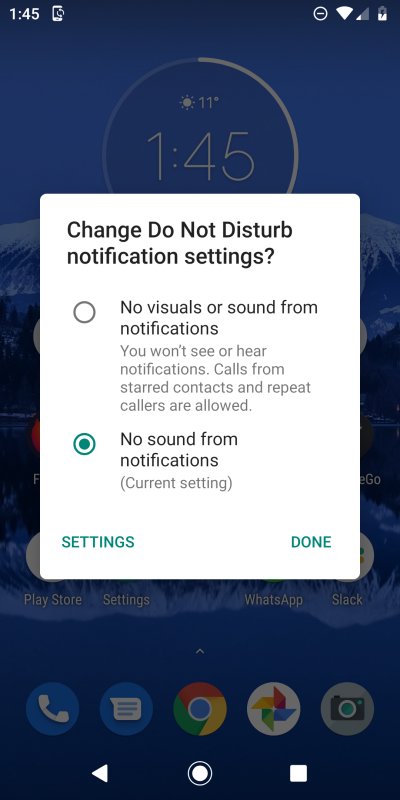
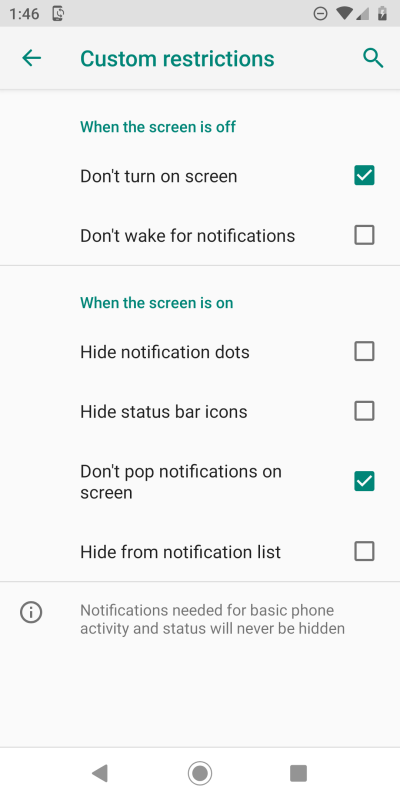
You also have more control over the Do Not Disturb profile, and you can obsessively fine-tune it if you like.
For me, the biggest change is the screenshot app. Now, instead of automatically taking a screenshot and saving it, you go through the edit wizard, which lets you crop, add effects and alike. Apparently, this was a big ask from the users, and I simply find it cumbersome, because it adds an extra tap to my workflow. I guess this is intended for phone-only users, who will be editing their screenshots right there, on the device, rather than copy them over to a desktop and do it using GIMP or alike. The worst part is that I couldn't find any way to actually skip the edit and just save the files right away. Eventually, I did find it, but that's a different article, you'll see.
Performance
The phone runs fast and true, the apps respond quickly. If anything, it might even be a little smoother than Oreo. There's also a new battery usage improvement algorithm, which should disable background data for less used apps, so it will be interesting to see how it works, although I don't expect any big changes. Hint, if you read my Moto G6 review and my Android privacy guide, then you know I've disabled background data for most of the apps anyway, so I'm already as optimized as possible.
Conclusion
I'm far from the intended demographic for this update, so commenting on the changes from my end wouldn't seem right. My level of interest in Android goes on a far less granular level than what a typical mobile users wants or needs. That said, on the positive side, the update was fast, accurate, without side effects, and there were no changes to my settings. On the negative side, I'm not keen on screenshots + edit, white app background (I want transparency as before), and the quick access thingie icons really bother me.
Overall, this feels like a reasonable update to Oreo, with a high level of consistency, which speaks of the maturity of the ecosystem. And yet, there are some really odd things here and there, like those icons and the dark green text on a black background, which is barely visible. Then again, there are some extra features and options in the settings, more visibility into usage, the performance is good, and we shall yet see regarding the battery. All in all, though, there's nothing here that's a dealbreaker. Perhaps you won't be wowed by the update, but there's nothing in Pie that should deter you from installing it. And that would be all from Curmudgeon Central. Stay tuned for a long-term test.
Cheers.