Updated: July 8, 2017
If you happen to be a person who finds the Linux font rendering to be good enough for your ocular sensors, you are a happy bunny. If you are like me, then it's only Ubuntu that gives you the right sharpness and contrast, and all other distros be heavily lacking in this space. Fedora, first and foremost, which is why I've spent months trying to perfect its layout and reading clarity.
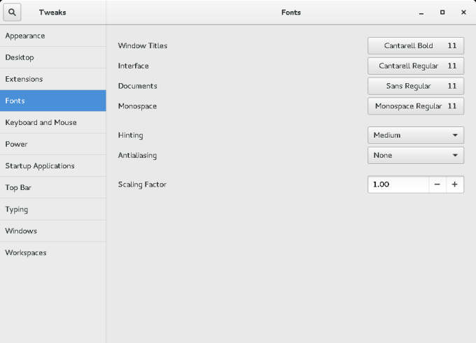
I ranted about the whole font problem in Linux some time ago, and then we also discussed the use of Ubuntu fonts on top of Fedora a couple of months back in another OCS-Mag article. Now, I want to revisit the topic for a third time, and see if we can somehow improve on Fedora's stock Gnome look, and the way it draws text on the screen. Let us commence hence forth.
What we've done so far
For those impatient or not willing to read the two linked articles, I tried playing with hinting and anti-aliasing with virtually no results. Infinality, Xdefaults, no luck either. It was only when I applied the Ubuntu fonts that things improved. But we can hopefully do better than that. So let us, and again, this without touching the default theme, which also can significantly affect the results, as we've seen in my Mint Serena review.
New fonts
Now, you may not like the direction I'm heading ... in. I am going to apply several new fonts, to see whether the overall clarity and contrast can be improved. This may be a rather subjective exercise, tuned to my taste and eye skillz, which is why you might not find the results as palatable as I do.
Droid Sans fonts are the first obvious choice. We talked about them in my first article on the fonts subject, and in my early encounter round the time of Fedora 12 and Moblin, they did wonders. They still remain one of the nicer fonts around. Definitely a top choice for improving Fedora, ideology and proprietary thingie notwithstanding.
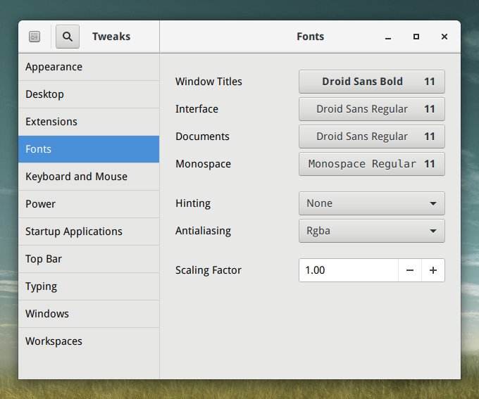
Droid Sans top, Ubuntu bottom; click for a full view.
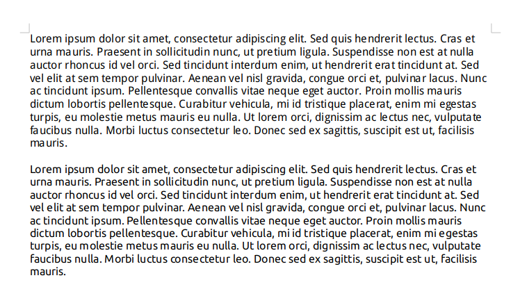
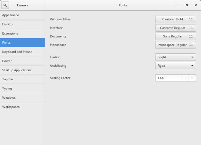
A second choice - Noto - a worthy option, but it does not transform Fedora in a way that is desirable or contrastful enough. Therefore, a third choice is required, Myriad Pro. These fonts offer a more Windows-like look. Applying hinting and anti-aliasing makes no difference, again.
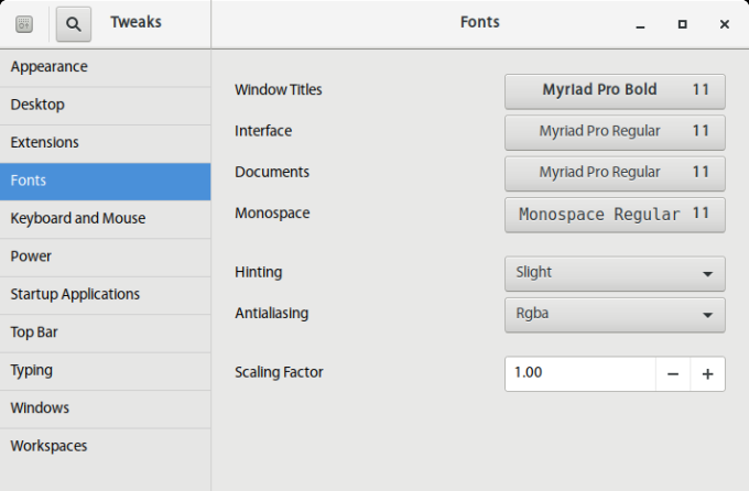
Droid Sans top, Myriad Pro bottom; click to enlarge.
I compared Droid Sans to Myriad Pro, and I believe, having gone through dozens of options, that the latter is probably the most optimal offering around. Of course, the display quality and clarity will also depend on your screen size, resolution, pixel lighting, color calibration, refresh rate, viewing angle and distance, and other factors, but on a typical mid-range laptop screen (1366x768px), this font wins big time.
Baseline
However, it is not all vague and un-scientific. My Lenovo G50 laptop runs a range of operating systems, so comparison under identical conditions is easily doable. The resident Windows 10 has none of the artifacts, nor the Ubuntu 16.04 or Ubuntu 16.10 setups. With Kubuntu, the default fonts are somewhat pale, but you can tweak the color and contrast rather easily, as I've written in my State of Plasma report. The issue mostly crops up when I fire up Fedora.
Furthermore, I tested the results on the older LG RD510 machine and the HP Pavilion system, the former set to 1200x800px resolution, the latter just like the G50 machine, both with Nvidia cards and official drivers installed, and the results are pretty much in line. So it would seem the sub-optimal behavior is specific to the desktop environment, the system, and fonts in general rather than any hardware-dependent minute details. And there's another, time-dependent reason, but we will discuss that in a second.

I still am quite intrigued as to why changing the hinting and anti-aliasing values makes little to no difference, as this same exercise in other systems, like Linux Mint, does the job. Moreover, I would also like to know why the Infinality + Xdefaults trick fails to make any improvement, either. And mind, we're talking Xorg (legacy) not Wayland.
dnf -y install freetype-freeworld
Already done, long time ago.
gsettings set org.gnome.settings-daemon.plugins.xsettings hinting slight
gsettings set org.gnome.settings-daemon.plugins.xsettings antialiasing rgba
Equivalent to changes through Gnome Tweak Tool, to be frank.
echo "Xft.lcdfilter: lcddefault" | tee ~/.Xresources
Does nothing at all in Fedora 24/25. Diddly squat.
Ze catch
Now, the really interesting observation is that things have changed some in the past few releases of Fedora. If we look at Fedora 23, it shipped with font hinting set to medium, and where this made the difference (indeed Fedora 23, blimey, with Nvidia drivers), the effects were significant and noticeable.

And here we go, side by side. Something definitely went wrong on the way to the forum. But then, it's not like the last year has been regression-free in the Linux world, now has it. Plus, most of the people using Linux are young, with sharp eyes and zero awareness to ergonomics. This isn't meant as an insult. Go into any IT shop, be it a small crowded office or a glamorous open space with a fountain in the middle. Most techies work with dark screen, less than ideal lighting, very large screens, and IDE, which usually only have code, so the contrast there is decent, but this does not extend to the final product. This is not how ordinary people spend their time in front of a computer. The UI considerations are secondary, it would seem, and it's only getting worse.
Do note that I've upgraded this particular instance of Fedora 23 to Fedora 25, and as you can expect, the settings that used to work and actually make a difference, for better or worse, now do nothing at all. Regressions? In my Linux? Never!
From left to right: No AA, slight hinting, medium (default) hinting. Worked in Fedora 23. Does nothing in Fedora 25.
And here's another proof - font color
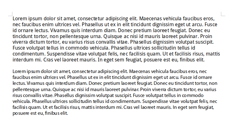
Now, recently, I've written an article showing you how to edit Gnome themes. This isn't trivial, and you will need a basic level of HTML and CSS knowledge, but if you possess those, you can tweak the default look & feel of your selected theme. This also includes font color. Now, take a look at what Gnome Breeze looks like with default pale-gray font color and then when that color is changed to black.

Click to enlarge and see for yourselves. Enlighten yourselves!
And a sweet GIF for you:
Why bother?
Well, if you want to be using your system for extended periods of time, you want the screen to affect your vision as little as possible. Less fatigue, more fun. Plus, we are deep in the pimping zone, so we want our Fedora to be as good as possible. After I opened up my chakras with Fedora 24 and then also version 25, I did a whole range of pimping and taming and tweaking, and fonts are yet another critical aspect.
Conclusion
I think I shall bring this article to a graceful end. After many weeks spent fiddling with fonts and trying to make Fedora look and behave professionally, I've come to a conclusion that the font management system has a long, long, long way to go - and a short time to get there. It's not even the fine differences between distributions, the quality, the consistency, or everything else implied from this. Nope.
This is all about making Fedora look fresh and crisp, with the best clarity and contrast. There will always be an element of free vs. proprietary that Fedora cannot resolve on its own, but the same way we used external repos to enrich the system, some level of focus on this aspect of desktop usage is required. Big focus. At the very least, system commands should work and exhibit noticeable differences.
I also think, in general, that Fedora - and many other distros - err on the side of its typical audience, younger people and software developers, who like things small and dark, just like their cubicles. But the text needs to be bigger and sharper and made for normal people. Writing code and reading text are two different activities. The default theme just does not have the right level of contrast - true for 99% of distros out there. The text is too pale, the background too dark, the font too small. So, here you have a little article and recipe for what is needed. Perhaps we will get there, some day. Tweak on.
Cheers.