Updated: October 29, 2012
In the recent few days, I got several emails from readers asking me to rethink my position vis-a-vis Gnome 3 and retake the most recent 3.6 edition for a spin. My eyes would be opened, they said. How can I resist my readers?
All right. So I did that. I downloaded the official Gnome 3.6 ISO, which uses FC18 as its underlying system, and booted, to see what gives. Once again, I will address all those issues that bugged me, including aesthetics, ease of use, power off button, and all the rest. So let's see if a year and a half down the road, Gnome 3.6 can be a redeemer.
Bootin'
It is as if the Gods of the Internets did not want me testing this distro. Trying from a live USB was a no-go, so I was forced to burn a plastic coaster and let the slow DVD reader do its work. And then, I got this image, identical to what I saw in my first Cinnamon review on Fedora Beefy Miracle, but not the second, mind.

Luckily, a few Ctrl + Alt + Backspaces sort of fixed that, although console messages still garbled the desktop for some time before vanishing. However, bottom line, I was finally booted into the live session.
Improvements?
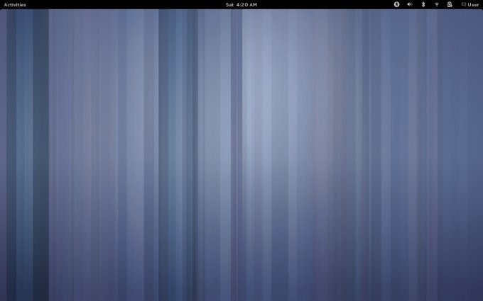
Well, I was promised improvements. The desktop itself remains empty, as it always has been. There's no immediate indication anything has changed. After a few silent minutes of exploration, I did notice several small alterations. For example, the icons are a tiny bit sharper, but not all of them. The system menu underlines the open programs.
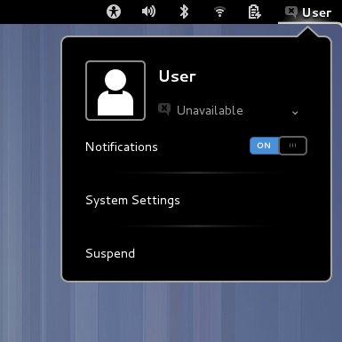
And the power off button ...
Now, I did show you this in my openSUSE review, but this could have a distro-specific fix, as the Power off button return was not announced until Gnome 3.5, whereas Mantis runs version 3.4. For those of you with short memory or too lazy to click above:

Now, it's final and official, the Power off button is back, because some people actually want to be able to shut their boxes off. This is so dramatically important given my speech in the original Gnome 3 review that we will be having a separate article, entirely dedicated to praising me how smart I am, and always right about everything. But that's for later.
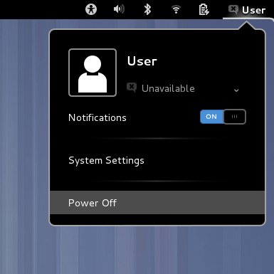
However, after about thirty minutes of Gnome 3.6 testing, the menu reverted to its original Suspend nonsense. Not sure why, but it happened. And no, I was not holding down any Alt, Ctrl or any other special key or anything. Just a man, mousing his way through. Definitely weird, but this could be a live spin glitch. We shall have the benefit of doubt.
Usability
Now we come to the most important factor - the actual usability. Unfortunately, not only have things remained as they are, they actually got worse. More and more functionality is taken away or hidden or neutered, leaving you with a bubble wrapping of cotton candy for the mentally challenged. For example, and the list is long:
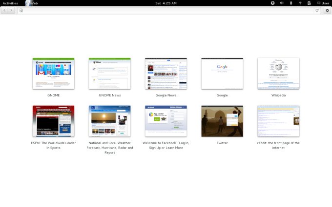
The browser - you have no idea what you're using. It looks like Chrome, but maybe it is, maybe it isn't. All of the stuff is hidden under that little cogwheel. And you are not quite sure how to minimize, resize or close the browser. Indeed, the minimize and maximize buttons are still unavailable. You also get no prompt on downloads. Flash is not included, either, in this demo. And you get some weird artifacts in the page renders. Multi-fail.
The file manager - Nautilus - You've all heard how Ubuntu and Mint will no longer be using Nautilus, because the Gnome people have yanked out some important bits, including the Compact View, up/down navigation and more. The file menu is also gone. In fact, everything indicates Gnome 3.6 is gearing for touch devices, which is okay, but then, it does not belong on desktops, which happens to be its target medium. So from the fail perspective, this is even worse than Windows 8 Metro, because Windows still lets you have shortcuts, icons, documents on your desktop, and so forth. The right-click menu would let me create folders, but not files. Nautilus 3.6 not in Mint? Good riddance.

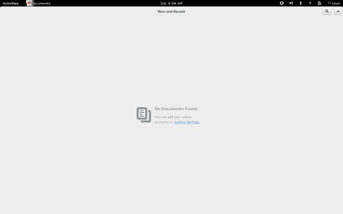
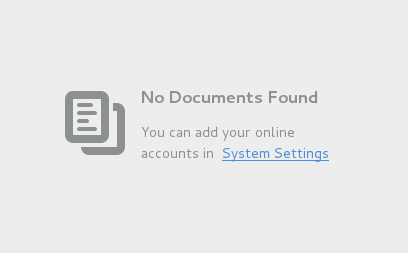
Documents - Oh, this is the worst one. You get an empty, blank slate that just looks sad. Not a folder, but some sort of a pseudo-placeholder where your online accounts should be sorted. Why online? What's wrong with local stuff? Are we into hypes, again? Just look at that vast gray emptiness.
Colonoscopy is more fun:
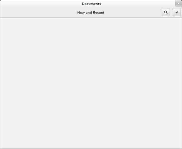
And here's a better version:
Note: Forever Alone and Okay face, courtesy of memegenerator.net and knowyourmeme.com.
Other annoyances
On top of all that, you get no way of knowing how many open programs you have, where they are, how to access them easily. The top panel is blank, the desktop is blank, there's nothing at the bottom of the screen, the Activities menu is just boring and slow. Two or three actions for every one you do in Gnome 2. Hell, Unity is super-elegant compared to this.
Some programs did not respect mouse focus and did not respond to the Enter key, so I actually had to click buttons to get a response from open applications. This must be a glitch, I hope, unless everything is so touch oriented, that hitting a key does not qualify.
If this is the case, well, I promise you the best rant ever yet.
Other stuff
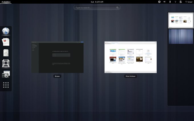
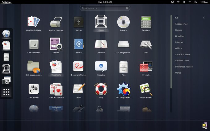
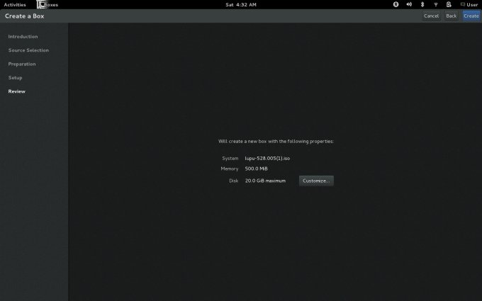
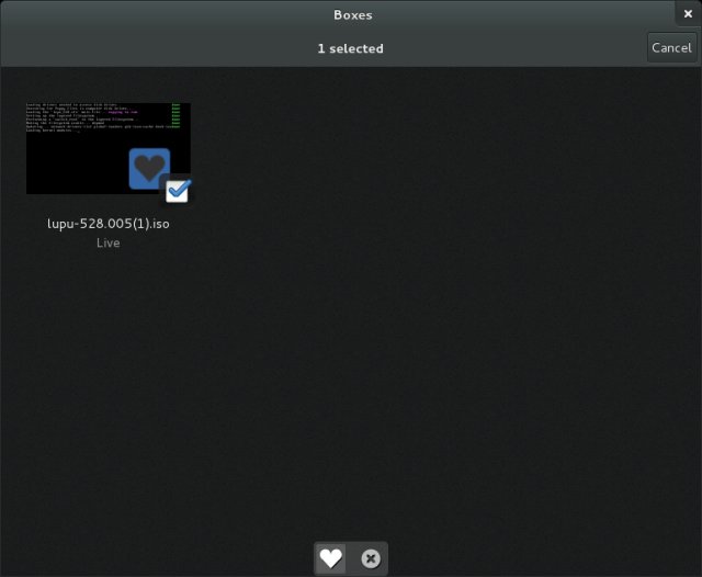
One more tool that was included in the Gnome 3.6 tech demonstrator is Boxes. This is supposed to be a Mac-like container slash virtualization program. Again, you lose all common sense of how things ought to work, there are virtually no options, no ability to customize, just casually run other operating systems like a champ, I mean a chimp. And the Boxes icon has a jarring glitch - the image snippets are not well aligned:
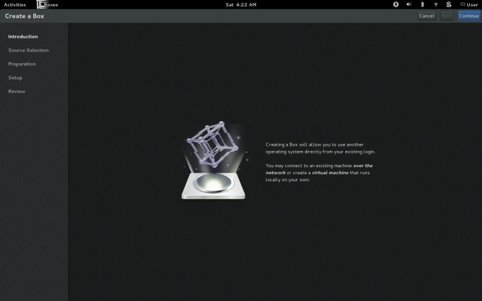

Anyhow, if this is an attempt at virtualization, it's a poor one. I could not find any way to enlarge that small screen. The program was using QEMU, without VT extensions, so everything was done as a pure emulation and super slow. All in all, weird.
Message from Dedoimedo
I know this is hard to understand, but let me paraphrase:
NOT EVERYTHING IS A SMARTPHONE OR TABLET!
Get it? Not everything. Relax with your hypes. Take off your freedom moccasins and step back. People using desktop operating systems actually need the file menu and bookmarks and such crap, as it happens to be part of the ambiance, part of the modus operandi, part of common sense and logic. Cogwheels are nice, but you're not a cloud provider. You are not Google. You are not selling Android. Relax.
When I think of Gnome 3 as a touch interface, all of the stupid things start to make sense. For example, not seeing the shortcuts until you hit a special button. So logical for a pocket-sized device with a touch-anywhere screen. And when I look at the programs that won't minimize or close, again all very well for smartphones. The entire flow might actually work there, and Gnome 3 is not too ugly, but the single-app, single-windows mentality is just wrong on anything with a real keyboard and mouse. So bloody very wrong.
Extensions
My readers told me to try the extensions - they can really spice things up. I agree, but why would I want to spice something that I do not want in the first place? Why bother? And there's the sentence, you can get used to it. Yes, I can. People can get used to all sorts of things, like labor in Siberia or prison camps in Laos, that does not mean you should be doing that if you don't have to. I don't want to get used to stupidity.
And if I must use extensions, it means it does not work well enough in the first place. Now, the second argument is, Dedoimedo, Firefox has extensions! Sure, but the default behavior does not lack anything the rivals offer, it adds. ADDS. The extensions are not there to replenish missing core behavior. Although recently, Firefox people have been shining the Google pole for the lack of a better metaphor, so the browser is getting more annoying, but let us not detract from the topic.
As to some beautification, this is what I did in openSUSE, with Faenza icons and whatnot. Albeit, framework 3.4, but still a valid case. As it turns out, Gnome 3 is a pleasing visual product, but then so am I. Doesn't mean you will be using me as a computing platform.

Conclusion
All right, so I have tried Gnome 3.6. And I do not like it at all. Even less than the original one, because you can excuse some rough spots in the product infancy, it's only expected. But now, six minor versions later? More and more productivity is stripped off. Gnome 3 is becoming a pure toy factory. Probably the worst UI that exists for traditional computing devices.
Gnome 3 takes twice or three times as much effort to achieve the same simple things like its predecessor Gnome 2, it is utterly frustrating, slow, cumbersome, counterproductive, practically useless, and does not get any better. It has some decent looks, but you can't really get used to it, other than halving your intelligence and accepting a truth from another dimension. Like eating apples in the morning when you wanted a juicy steak for dinner. Completely and totally irrelevant. And now I know the truth. It's a touch operating system landed on a traditional desktop. Spell with me, F-A-I-L.
There you go, take it or leave it, ignore me. It doesn't matter. I am convinced that Gnome has no future. It will soon be pushed into obsolescence by its own suicidal design. For those who want traditional, there's Cinnamon or KDE. For those who want, pseudo-touch, there's Unity. For those who want touch, there's Android. Which leaves Gnome 3 nowhere and with nothing. An idea that came to solve world hunger. On planet Mars.
Cheers.