Updated: February 26, 2021
They say people get bitterer as they grow older. I say, it's not a function of age, it's a function of experience. Hope is finite, and it gets eroded and chipped away as one goes through life and tastes the fruit of disappointment, time and time again. But hope is the last thing to die.
Which is why my mood cycles between mildly despondent and apocalyptically gloomy as I watch the software world rumble by, doing its thing, and me just wanting to be a happy user. LibreOffice plays a huge part in this equation, because it covers one of the two critical things that forces me to use Windows. Office and gaming, which are simply not as doable in alternative operating systems. Thus, every time there's a new LibreOffice release, I get all hopeful, thinking this will be the day I can say I'm less of a prisoner of my own choices and the tragic state of the software world that surrounds us. And so I tested LibreOffice 7.1.
Installation, blurry icons
There's not much to be said. I tried the suite in Windows 10, because why not, and it installed without any problems. I then launched the main program and tried the different programs. The one thing I noticed right away is that the icons in the application interfaces are all blurry.
![]()
Icons that simply look wrong ... Not what I expect in 2021.
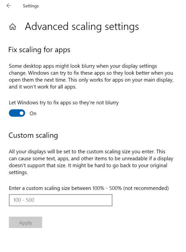
Now, my IdeaPad 3 does use 150% scaling (in Windows), which can affect applications, but certainly not a brand new piece of code designed in the modern era surely? I started playing with Windows display scaling settings, and there's an option to let Windows try to fix apps so they don't look blurry. This was actually turned on, so I toggled it off. Helped a little, but the icons were still blurry.
I decided to look inside the program's Options > View. And here, I discovered that by default, the program uses Colibre icons. But you can switch to the SVG set, which then gives you much sharper, clearer looks, regardless of the resolution and scaling. Why isn't the SVG set default? Or why doesn't the suite detect what it's running on and adjust accordingly? Even so, some icons remain low-res - it looks like the set isn't complete. More on this shortly.
![]()
Layouts
LibreOffice comes with a UI layout switcher tool, which lets you change the look & feel to one of seven available options. There are two major issues here: a) the actual options, which we will discuss shortly b) glaring visual artifacts when you switch between layouts. If you go down, no probs. If you go up, the window does not resize appropriately, and you end up with a terrible glitch, as you can see in the screenshot below.
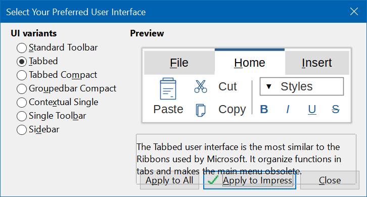
Bugs aside, the layout switcheroo is just wrong. Seven options are way too many. This means seven permutations of code and consistency that the LibreOffice team needs to maintain. Obviously, this isn't an easy task, as the screenshot above shows. More than that, it's just too much for any user. At best, two options are more than sufficient - the classic look and the Ribbon look. That's all. Instead, you get these varied choices that don't look that different from one another, and they are also 100% nerdy. Just the phrase Groupedbar tells you everything you don't need to know. Why would an ordinary person ever want to mentally wrestle a word like that?
Even if you do go for Tabbed, it's implemented badly - no text so you need to guess what icons do, not enough spacing between elements, it all feels crammed, and you end up with something that is neither the classic nor the Ribbon solution. Half way in between with none of the good stuff that these two options offer.
![]()
Notice the Expand double arrow on the right side of the screen - horribly low-res.
![]()
Microsoft Office compatibility
The real test for LibreOffice is how well it renders Office documents. We can pretend that this isn't the case all we want, but the vast majority of people use Microsoft's products, and that's what matters. It's not a question of moral right or wrong or anything like that - pure, simple functionality. And unfortunately, until LibreOffice can do Office stuff perfectly, it will never become the dominant player in this field.
Similar to what I did in my LibreOffice 6.3 and LibreOffice 7.0 reviews, I downloaded a bunch of templates and rested them. Last time, one of the suite's developers contacted me and asked for details on these files, and it turned into a rather interesting file compatibility experiment. I'm sure you'll be able to find this online discussion and whatnot quite easily.
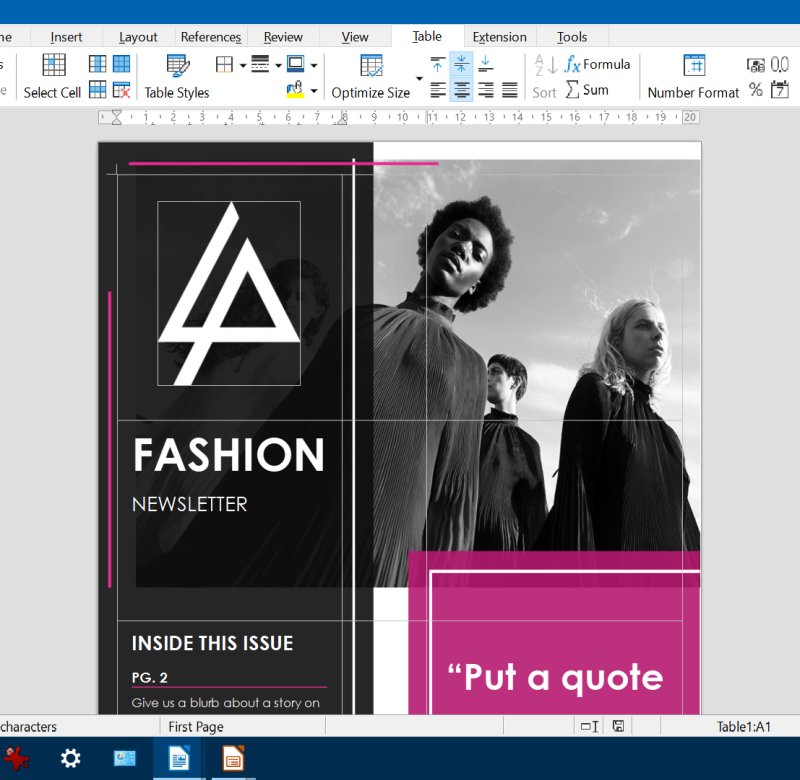
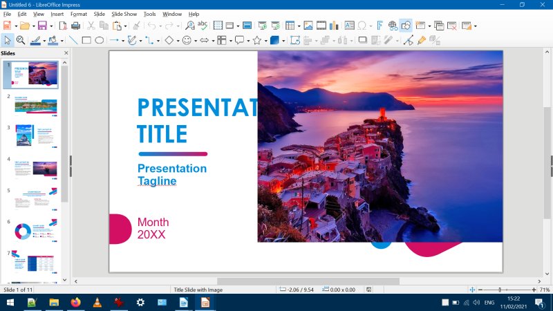
To see how far the program has progressed, I grabbed two of the same templates, but also tried two Powerpoint presentation templates. If you want to test, the templates in question are: DOX 1, DOX 2, POX 1, POX 2. Anyway, the results are less than promising. In fact, they are quite bad.
First, the Word documents. Better than before, but still not good enough. Misaligned elements. Images with the wrong aspect ratio. Elements sticking out of the actual area of the document. If you were to use these and work with someone, you would not get the desired results.
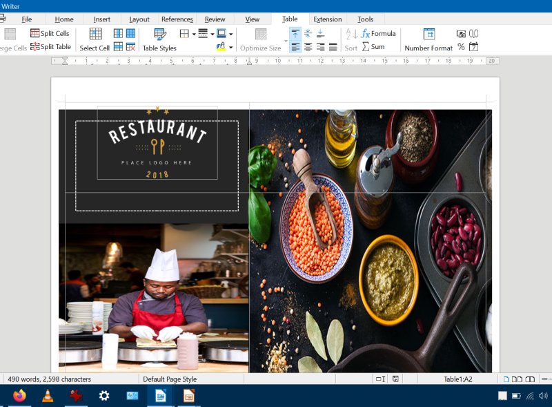
Now, the presentations. Even worse. Completely unusable. The slides look nothing like the originals. No transparency, the image elements are positioned all wrong. If you were to actually do the presentations this way, you would completely mess up the layout.
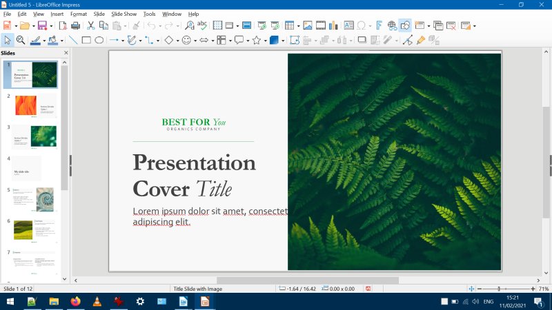
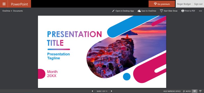
And for comparison, here are the templates as they render in Microsoft Office Online:
Style management
Still not as efficient as they should be - and worse than Office. The Styles list jump to the current style, so if you want to apply a new style to multiple paragraphs, for instance, you have to scroll around EVERY SINGLE TIME. This is dozens of clicks and mouse actions more than what Office does. The styles are also applied with double-click, so more waste. No ability to search for styles. No quick-style reapply. Clunky.
Performance and such
Sadly, every new version of LibreOffice gets slower than the old ones. I have LibreOffice 5.0 through the latest version installed in about a dozen different operating systems on several machines, and there's a distinct difference in speed and responsiveness among them. In particular, 7.1 feels laggy. Opening and rendering documents takes time, and the interface freezes now and then. Changing layouts takes about 15 seconds in Writer and Impress and almost 30 seconds in Calc. We're talking a brand new system with NVMe, so there's really no reason for anything but the snappiest of behaviors. Alas, not the case.
Conclusion
I feel that LibreOffice has lost its momentum, just like the Linux desktop. The domain has been idle for a while, the world is changing, and there simply isn't enough energy - or money - to sustain the project in a good, vibrant way. After all, many open-source projects kick off with gusto, but then a decade later, they are pretty much in the same position they've always been, and that's not very inspiring - or whatever word you want to use for where people source their drive and creativity.
LibreOffice 7.1 feels worse than its predecessors. It doesn't introduce anything super cool or useful, but it does bring in more bugs. The speed is also an issue, and the Microsoft compatibility remains tricky. Then, the interface doesn't need a billion choices, just one or two but polished to perfection. And I'm not even going to talk about the whole Community Edition thing. I will gladly pay for LibreOffice, but I expect pro results in return. In fact, the healthiest thing that can happen to this fine suite is to become costware, because otherwise, I can't see where the needed investment and resources will come to ramp up on the much needed features and tools. Free is good, free is fun, but tools that don't tool aren't very useful. And thus, another layer of hope is chipped away from me soul.
Cheers.