Updated: April 4, 2018
This is my BEST pun yet. Or not. A few days ago, I've read the release notes on Ubuntu 18.04 MATE beta, and there was a lot of good stuff in there, enough to have my jaded curiosity glands intrigued. Many new features are going into the reincarnated version of Gnome 2, and they make for an appealing case for the retro desktop that MATE is. Neat.
In my review of this desktop environment, the freshly released 1.20 version, I did mention that in order to compete with the likes of Gnome 3 or Xfce, MATE needs to step its game up and introduce modern features that go beyond what Gnome 2 used to. Lo and behold, her we have Bionic MATE, and it seems to be just the thing I was looking for. Specifically, a Unity-like Dash-and-Launcher setup called Mutiny. Let's explore.

Better than the vanilla edition
When I tested MATE 1.20, there were not many (or any) distros offering some/any kind of tech demo for the new version, which meant manually setting up a repo from Debian Unstable in MX Linux, and the installing the packages and testing. This was all right, but not as smooth as I'd have hoped.
Bionic Beaver comes with some polish out of the box, offering an altogether more refreshing MATE experience, including not just the basic polish and look & feel, but also various extra tools and utilities that allow users to test the desktop to the fullest. Even simple things like notifications, or the New button on the screenshot tool, so you need not close your app after every action. So BEFORE we dabble in Mutiny just yet, I'd like to briefly explain what I did, recap on my bionic adventures, and also give some extra attention to MATE. After all, 'tis deserved.

More polished all around.
The Renaissance Desktop
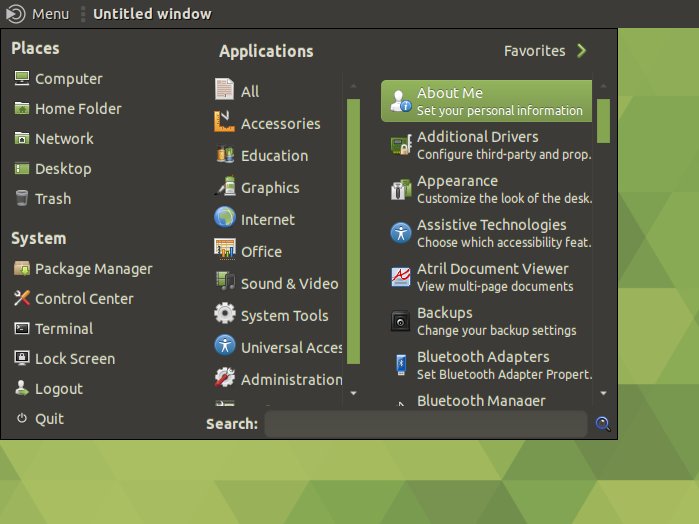
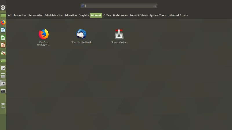
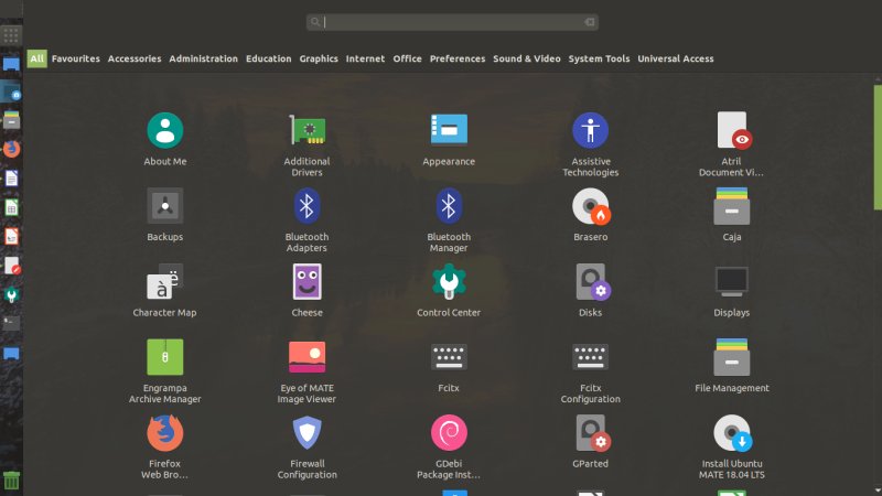
Gnome 2 slash MATE normally ships with the classic three-tier app menu that is both simple and inadequate in 2018. Bionic compensates for that with not just one but three or four different menu options. I did mention Brisk, a sort of Xfce Whisker counterpart, but it did not look pretty in my vanilla test. Here, it's more elegant, with menu categories and items arranged well.
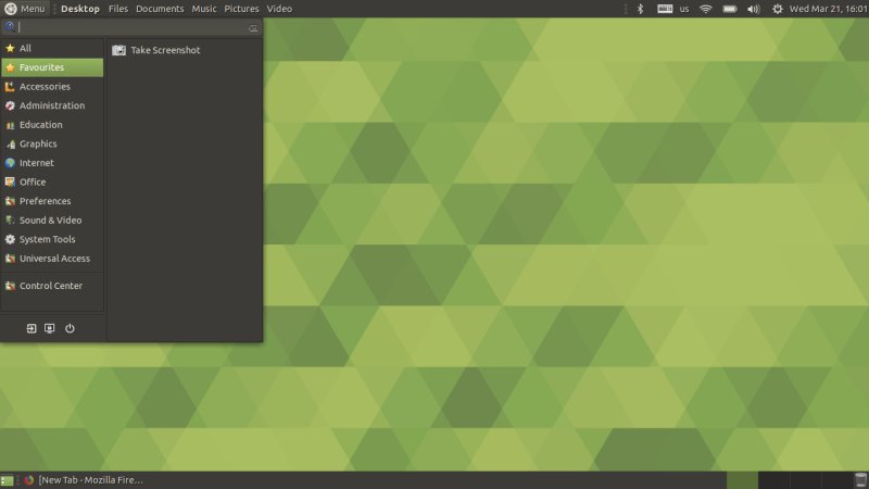
If that's not enough, you can also install MATE Menu, which feels a bit odd. It made sense in Linux Mint approximately three or four years ago, not so anymore. Still, it's something you can choose if you feel like.
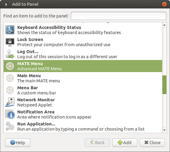
Global menu
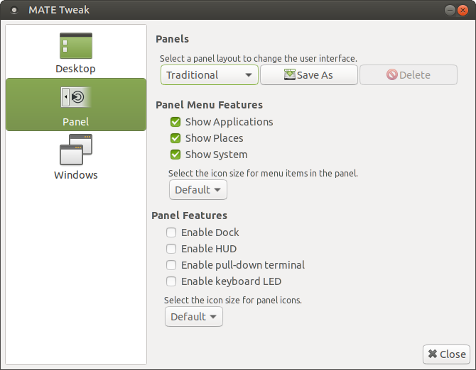
Another cool feature is a global application menu - if you use it, app windows will not have the menu, and it will be integrated and shown in the top panel - or anywhere you position the applet. Seems to work reasonably well, with minimal delay. This is something we will also explore in Xfce at some point in the future. You also have an integrated system dock, which is again, an excellent feature. You can control this via MATE Tweak.

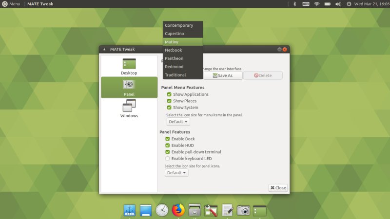
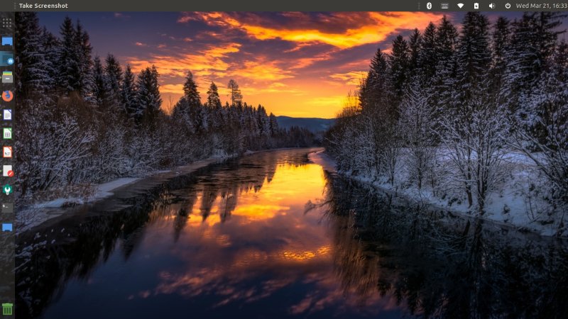
Mutiny on the Tuxy
Or maybe this is my best pun yet? Or palindrome? Indeed. Again, fire up MATE Tweak. And then, change the menu layout. There are multiple options, which is really neat, and you can also save your custom configurations. The one we want is Mutiny, and this was specially added as a request by the MATE team.
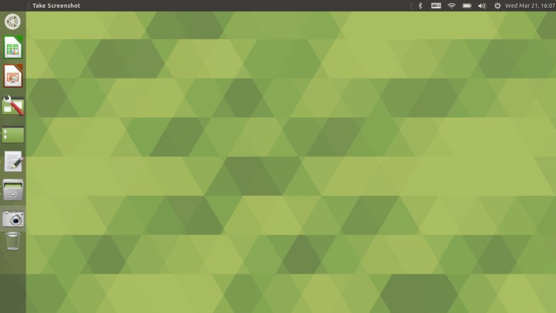
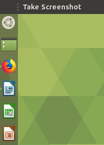
And you get a Unity-like layout with a vertical dock on the left - complete with a trash icon and right-click menus for individual programs. Very very nice. Looks like a solid alternative for Unity. The defaults are a bit ugly, but you can sort that out relatively quickly - including dragging 'n' dropping icons in the order you see fit, although not as smoothly as Unity, regardless of which compositor you choose: software, hardware or Compiz. Last but not the least, there's also supposed to be Unity-like HUD. Didn't figure out how to activate it.

Now, there were some problems. By default, the menu button is smaller than the actually dock items, and this looks a bit off. The logo is actually positioned below the top panel, and this could be done more elegantly. Sure, you can drag the Ubuntu MATE logo where you want it to be, but then if you use the global app menu and maximize an application window, the window control buttons will "transfer" to the far left position on the top panel, pushing the menu button in. Perhaps this can be sorted out with locking and such, but it can also be arranged by default.
![]()
![]()
The menu gets pushed to the right.
Also, if you hide desktop icons, the app menu will show current - or if nothing is in use - last active application rather than the desktop menu as you normally see in Unity, and this can be a little confusing.
The Dash can also benefit from some visual improvements - category separation, better scroll bar, stuff like that. All in all though, this is an excellent concept.
Strictly Beta Dancing (issues)
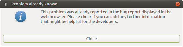
Finally, we need to remember that this is still a beta release. The distro was fast but also buggy, with things crashing constantly. Bionic let me know that most of the issues had already been reported, and it would open a Launchpad window, to allow me to add my comments to various bug entries. Not bad.
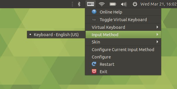
The language icon in the system area kept dancing, showing the language on and off, but it was the only configured keyboard so it makes no sense. Also, the system menu reads in English UK, which again makes no sense give the keyboard choice, and the simple fact I download the distro without choosing any locale whatsoever, so it should default to EN (US) as I always expect and want.
Sweet customization
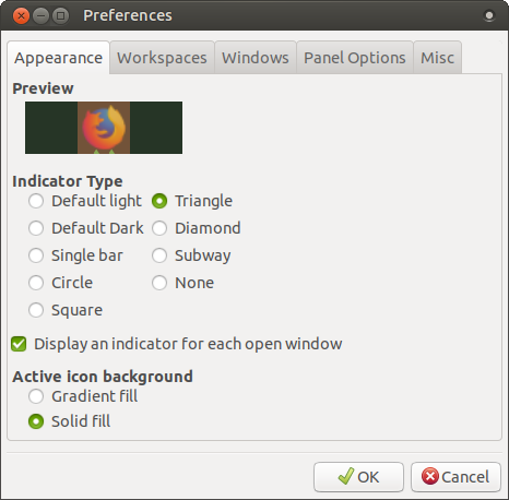
I invested some time making this pretty - hopefully something we will have in the final incarnation of Bionic. First, I wanted some spacing between the logo and the top panel. I tried with spacers, but this is cumbersome and ugly to an extent, plus locked items make the setup tricky. Instead, you can just drag and drop the menu and the dock - and the trash as you see fit. Next, new icons and wallpapers.
You can also separately tweak the panel and the dock - they are actually two separate items, and they have their own options and settings. I noticed that the distro logo and dock items match up best on the 36px width, but I expect this to be solved in the official release.
And behold! Is it Unity, is it MATE, we don't know!
Conclusion
Several things: MATE 1.20 looks way better on Bionic than my early test. A little bit of customization goes a long way, and there's still more room for improvement. Then, Mutiny, with its Dash and HUD and whatnot, is a smart and practical nod toward Ubuntu and Unity, and it's way better than Gnome 3. Brings MATE up to modern levels, and it easily achieves parity.
I am quite happy with what MATE is going to bring us, and the 18.04 LTS test might actually prove to be a very sensible and fun distro, with goodies, practicality, speed, and efficiency blended into one compact and solid package. Bugs are to be ironed, for they are Devil's work, and MATE can benefit from extra bling bling. But then, from a bland sub-performer to a nifty desktop, with tons of options and features. Takes some fiddling, and not everything is easily discoverable, but the road to satisfaction is a fairly short and predictable one. Mutiny is a cool, cool idea, and I'm looking forward to Bionic's official release. Take care.
Cheers.