Updated: October 29, 2022
As you well know, the Plasma desktop is awesome, and simply the best Linux offering there is. Looks, ergonomics (yup, that ole thing), customization, elegance, speed, all there, all ahead of the competition. And every few weeks, the KDE team unleashes a new version of their desktop unto the world. By and large, these are mostly decent, and usually an improvement over what came before. But not always. This is what makes today's article reasonably interesting. The suspense!
I fired up KDE neon User Edition - equipped with the stable release of Plasma 5.26 - on my test machine, the triple-boot IdeaPad with a Ryzen processor and associated Vega graphics. I didn't install the distro, and kept my work limited to the live session. But that was more than enough to give me a good glimpse and impression of what this new Plasma 5.26 can do. Let us talk.

Default looks
Recognizable, solid. But. On the 1920x1080px laptop screen of average quality, like mine, the default colors are a bit pale. As in, until you activate the power of HD scaling, which again Plasma does the best of all, the text looks grainy and weak, not helped by the default dark-gray but not pure black font color in Plasma.

I quickly increased the scaling to 125%, foregoing any other 6.25% increment in between. I used X and not Wayland, because that's the default the distro booted on, plus X is still better, so. This immediate improved the legibility of the stuff shown on the screen. Next, I went into the Appearance category in the Settings, and discovered a few other nice perks. The Colors section now includes Breeze Classic as a scheme, and if you activate it, it will color your window borders dark gray. Better than using an all-dark oppressive theme or the light-on-light Breeze option. The mix of light windows with dark borders works the best - a solution conceived in the era of sane, non-touch, non-flat desktop interfaces. In a way, this supersedes the need for the Twilight theme.

You still get pointless alpha borders in screenshots.
I did change the desktop theme to Breeze Dark, which colors the panel and the menu dark but not the rest, and I used my Brooze font color change. Finally, Plasma 5.26 was looking the part. Easy changes, and no need for any command-line CSS hackery. And no need for any third-party tools. Perhaps the defaults aren't ideal, for me, but you can easily and quickly change them - and more easily and quickly than before. Progress!

The system menu is now resizable
Don't you hate random scrollbars in the categories section in the menu? I do. Well, now, the Plasma menu can be resized easily, using draggable corners. No more QML hacks. More good stuff.


Discover
Plasma's package manager is okay. But still only okay. It is faster than ever before, it is a bit more consistent, but the layout is still somewhat meh. The main problem is that selected programs aren't showcased as well as they could be. There's no glamor to it. Enticing, amazing storefronts are hard to do.

Does anyone really need to know that the version is ...04+jammy+release, or that nerdy "Distributed by". Perhaps, but shouldn't that info be below the actual description? And shouldn't the images be bigger, and shouldn't there be more of them?
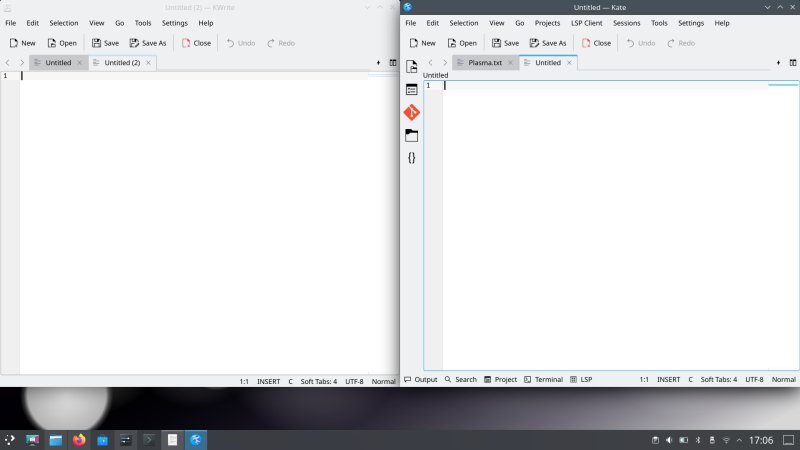
Text editors
Some nice stuff here. You get both Kate and KWrite. I find the former nicer. Plus, a bunch of visual bugs that I've observed in the previous version have been removed. Good. I'm not sure why the Git and LSM plugins ought to be active, but they are. You can turn them off if you don't need them. All in all, solid, though. Still no Notepad++ behavior of preserving unsaved buffers on quit. Soon, I hope?
Touch mode
Perhaps this existed in older versions of Plasma, but I only noticed it now. You can switch your desktop to the so-called Touch mode, which makes clickable (touchable) elements bigger, and increases spacing between them. Not bad, but not ideal. I understand the logic, and hopefully there will be a market for this kind of thing. Perhaps Plasma Big Screen? And it would be cool to incorporate this with desktop activities, so different ones can serve different purposes. Anyway.


Using Neon
Not Plasma exclusive, but still, quite indicative. The system auto-detected my printer, no sweat, no configuration needed. The browser integration is awesome. Music playback + lovely decor, yup. So way ahead of the rest of the bunch. The combo of great performance, looks and functionality, without anything missing, anything being over the top, and no need for hacking config files or some such.


The performance is superb, except the Samba speed was only 7 MB/s. This may also be down to the underlying distro choice, but overall, the result ain't amazing. However, the Samba connectivity has improved massively in the last few Plasma releases, to the point, apart from raw throughput, it feels like working with a local filesystem in every way.
Some things bugged me
I didn't like the Peek widget. It's the new thing that scatters the windows out of the view rather than minimize them. I prefer the old classic behavior, which is still there, and you can easily switch. Now beyond that, what bothered me was the blue line above the widget, once used. It shouldn't be there in the first place, because the widget isn't an application, it's an on/off button. Secondly, the blue line doesn't show well against the frosty colors of the default desktop, so it looks like there's a kink/step in the panel.


The problem remains even if you use the classic Show desktop (minimize all) widget. It does look more reasonable with a different background, which has a higher contrast, but the issue of the line being there at all remains.

The Plasma System Monitor is still meh. Yes, you can customize everything, but the defaults need to be good, and they are not. Data science is sacred, and this ain't it. The chief problem is, if you switch to the History view, the CPU graph is nonsense. Going above 100% (stacked graphs) is meaningless for two reasons. One, if you stack, showing individual cores is unnecessary, that's the whole point of stacking. Two, the user doesn't necessarily know how many cores they have, so the graph could be 800% or 1600% or more. And showing tiny fluctuations of 1-2% in these scenarios is pointless. With the 100% graph, the view is static, you get what you need, and you know the total consumption of your system resources, be it per core or cumulative. Lastly, the labels ARE STILL TRUNCATED! I reported this issue a century ago.

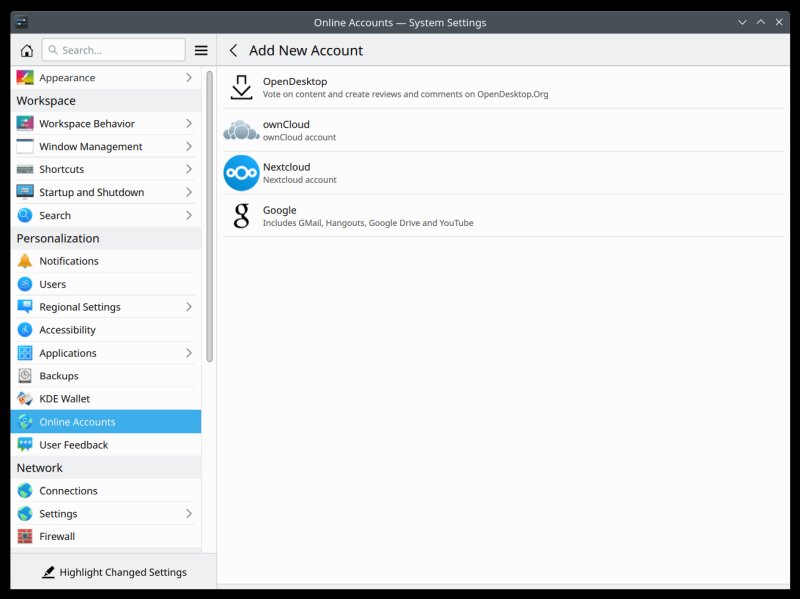
I know online accounts don't play a great role in the classic desktop, but hey, if someone includes an option in the system settings, then it'd better deliver. You get a very limited list here, and this feels like an utterly neglected element of the Plasma desktop. If I'm not mistaken, there has been no change for a good three or four years. Overall, the Settings tool is getting nicer and friendlier, the KDE team has rearranged the logic of the presented information in a good way, but then you have the black sheep there, Online Accounts, waiting for some love and care.
Some of the other functions also need polish. KDE Wallet isn't auto-enabled. Desktop search isn't auto-enabled, and then you have two options to choose. I guess this is because Baloo used to eat CPU like mad, but then, shouldn't the users have a good and fast desktop search? And how does this align with say KRunner?
If you want to use the Firewall, it's not enabled, so you need to turn it on. But then, the default policy will be Ignore. I'm not sure what syntax this represents. Does this mean, drop packets? Overall, what I mean, there are some neglected areas in the Plasma stack, and while some cannot be strictly decoupled from the underlying distro, a bit more attention and polish wouldn't go amiss.
Inconsistencies
There were some. Take scrollbars. Newer versions of Plasma use normal, thick scrollbars, as they ought to be on the desktop. But this does not apply to all applications, it seems. Firefox, for instance, uses the thin, expandable ones still.

Even though it's only the live session, I still installed UBO, and changed the Firefox UI look some, because some things are a must. We must fight the "modern" stuff as much as possible, because IQ ought to be > 100.
Conclusion
Plasma 5.26 is quite decent. It continues a long line of fairly consistent, mature releases of this desktop environment, bringing a new array of gradual improvements and cool features, some fixes, and a small selection of new issues and bugs. Overall though, it's good. Elegant, polished, stylish, and with enough freshness to warrant the version increase.
What really stands out is the emotional element. I'm deep into apathy when it comes to the Linux desktop, and desktop stuff in general, but whenever I try Plasma, something nice and positive awakens in me heart. It's a semblance of that childish joy of discovery and fun. Plus, it's also a reminder of how awesome Plasma is, and how tremendously better it is than everything else. If you want a desktop that does it all, then you have your answer. Well worth testing, and I'm looking forward to the new and upcoming stuff. Now I need to will myself to turn the Pi on and see what Plasma Bigscreen can do. Until next time.
Cheers.