Updated: March 28, 2022
At the risk of repeating myself, I must say that Plasma is the best desktop. Period. It is also extremely customizable, but in a fun way. You can use the defaults, never worrying about any tweaking, or if you so desire, you can make visual changes to pretty much anything and everything, with a great level of detail. A good example is Dolphin, Plasma's default file manager, our topic for today.
In this article, I want to show you how you can go about changing the look & feel of Dolphin. And to satisfy the bombastic title I used above, I intend to go beyond the pure basics. As in, I won't talk about changing the size of icons in the sidebar, or removing certain categories and alike. That's too easy. We'll actually tweak the look and feel. Follow me.
Configure toolbars
If you click on the file manager's menu (the little hamburger thingie), you will see several options. One, you can configure Dolphin, but this actually affects its behavior, the default directory, whether to save session on exit, and Trash options. Two, you can configure toolbars, which are part of Dolphin's UI. Three, shortcuts. If there's one aspect to this thing, it's the naming convention that could be improved. Anyway, we want the second option.

Under Configure Toolbars, what you get is a two-pane window, and you now have the option to move and shuffle options and functions from inactive to active state, and vice versa. Left, the list of ALL available Dolphin capabilities. Right, a set of current actions, which are active and shown in the file manager's interface. You can then move items up and down, which in fact reflects how they are visually stacked from left to right. This means the topmost item is whatever is in the top-left corner of Dolphin's toolbar.
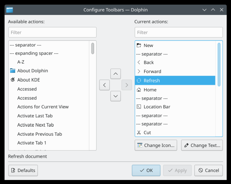
This is not that different from sorting out panels in various Linux desktops. You add icons and text, you add widgets, and you can even add spacers and separators to make things look extra tidy. Very neat and fully reversible.
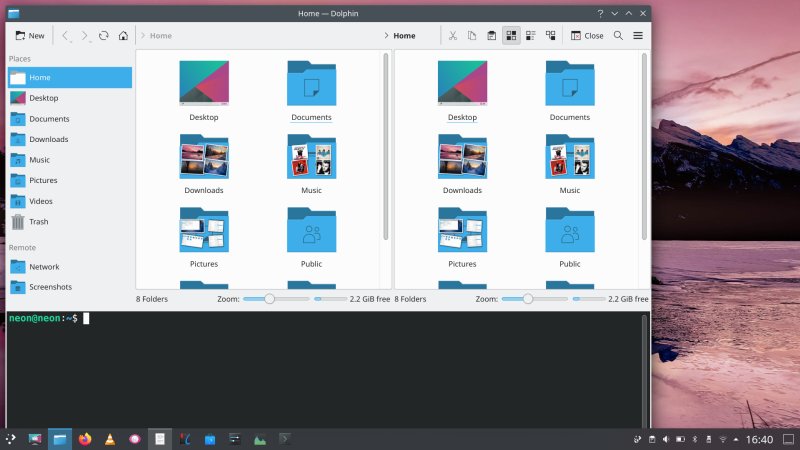
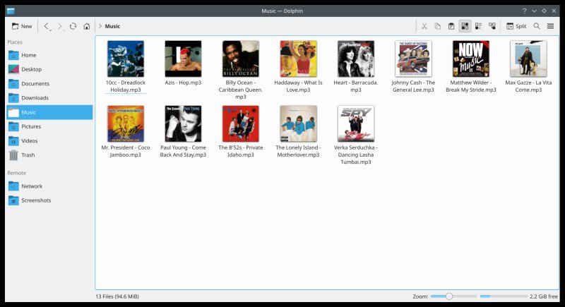
Navigation icons and Home button added, New folder on the left.
Icons and text
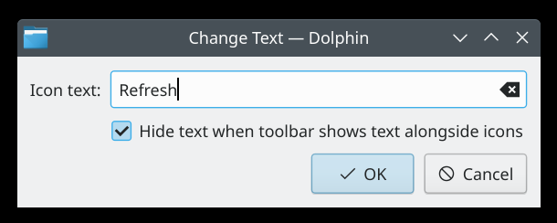
The really cool part is that you can change icons for EVERY single added action. On top of that, you can also decide whether to display text, and which text. This is an insane level of detail, but it lets you make your Dolphin be your Dolphin!
![]()
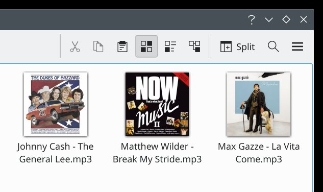
End result, noice!
For instance, I didn't do too much. But the changes are meaningful. I added "browser-like" navigation on the left, so I can quickly go back and forth, refresh the contents, or go Home, hi hi. I also have the New Folder button at the beginning of the toolbar, but it only reads New. On the right side of the address bar, I added the cut, copy, paste options, and moved the three display view mode buttons. This makes for a simple, fairly clean, uncluttered look, and yet, I have all the functionality I need.
If this isn't enough, don't forget the lovely FISH integration, split view, integrated command line, session save, and then some. And then I think of some other other file managers out there, including other operating systems ... maaaaan.
Conclusion
This is just the tip of the creative iceberg. You can go wild with your settings and options, and really tweak Dolphin beyond any reasonable need. The good thing is that you do have the flexibility to choose to do so, or decide to entirely ignore it. I've always liked Dolphin, and with the significant advancement in its connectivity and plugins, it really is a top notch thing.
Anyway, I hope you find this little tutorial fun and useful. If you have other requests or ideas, don't be a stranger. Most importantly, if you're a KDE user, and you've not really given Dolphin much thought, try making some UI changes, perhaps you can even boost your productivity some. Take care, fellow marine mammals!
Cheers.