Updated: March 27, 2023
I'm a great (if not the greatest) fan of the Plasma desktop environment. But sometimes, it can really drive me mad. Case in point, Dolphin, a splendid file manager, with lots of features, options and customization. Tweak the looks however you like, and you will have a splendid, productive tool in your hands.
While sorting out my Slimbook Titan, I encountered an odd problem. All of the different folders had their view set correctly, and they were showing the contents as they should, be it icons or details or whatnot. But the Downloads folder had its own behavior. It would show items grouped by date, in a rather Windowsy and super-annoying fashion. Now, it took me a while to disable this, hence this tutorial.

Solution - View > Show in Groups
Now, the fix is seemingly trivial. The problem is, FINDING the right option is hard. Why? Because Dolphin hides the file menu by default, and the hamburger menu presents the options weirdly. What you need to disable this unnecessary, pointless grouping by date is: View > Show in Groups. Only finding this option is hard.
Indeed, to get there, without a conventional menu, you need: Hamburger menu > More > View > Show in Groups. This is not an expected workflow in any way. But then again, Dolphin is fully customizable, and you can toggle the menu with Ctrl + M (or tick the right box as shown in the screenshot below):
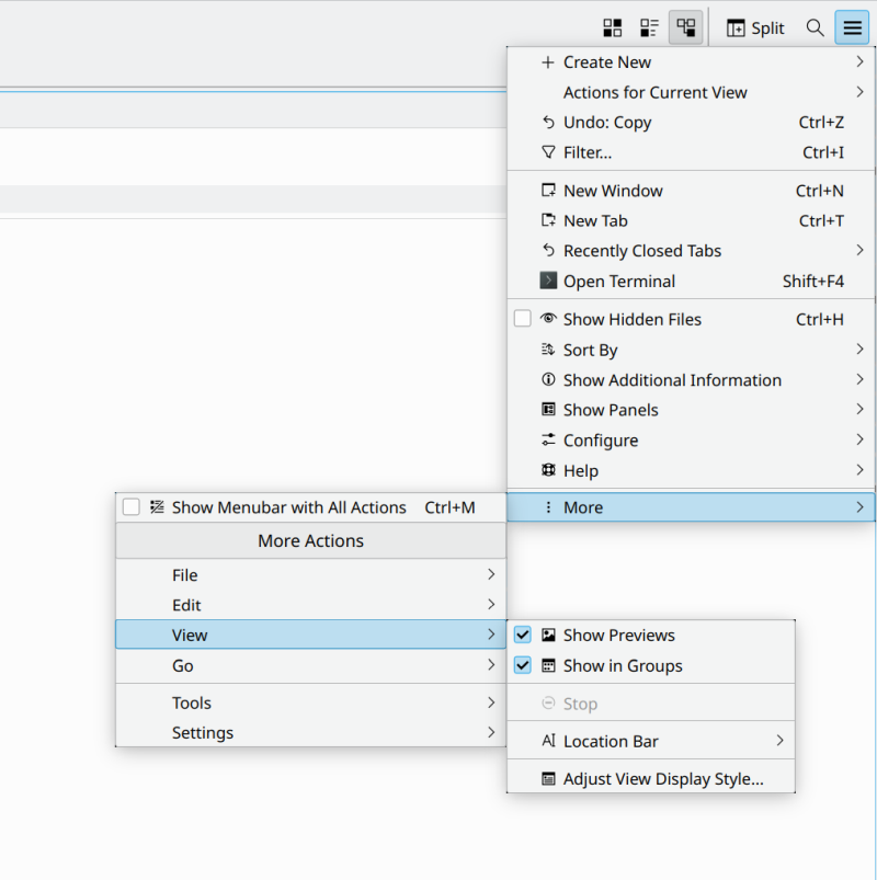
Now, you will have a normal menu, View is obvious, and so are the options there, and instead of four mouse clicks, you can get everything done with just two mouse clicks. We're talking 50% improvement over a pseudo-touch arrangement (no menu, hamburger, that is):

Most importantly, the Downloads folder is now OCD-compliant:

Conclusion
There we go, we fixed the little annoyance. I really don't understand why the good ole menu is such a nuisance on the classic, conventional desktop. Now, we also need to remember that the Plasma desktop is highly consistent and extremely customizable. So you can easily change anything you like. But the defaults should be more desktopy, even if they are somewhat less visually pleasing so to speak. Minimalism only works for glass displays and people without a real task at hand.
Visual clutter isn't a thing with a simple, static menu, especially considering that Dolphin comes with a very rich sidebar, including categories like Last Month, Recent, etc. So in a way, Dolphin creates visual clutter by adding search categories no one asked (in addition to having its own search icon in the toolbar), plus you get special treatment in the Downloads folder, which is totally redundant if you have the sidebar categories there at the same time. Now, I always disable those, but that's not the point. In the default mode, Dolphin gives you three search filters for the Downloads folders. That's clutter. The menu there, a static line of strings, that's efficiency galore. All right, enough ranting. We're done. I love Plasma, and off I go.
Cheers.