Updated: August 30, 2021
Almost exactly 10 years ago, Microsoft came out with Windows 8, featuring Start Screen, a useless idea that introduced extra mouse clicks into an efficient desktop workflow. As a member of a small group of people with IQ above two digits, and who value productivity, I wrote a guide on how to disable the Metro interface. This was during the preview, pre-release phase of the Windows 8 lifecycle. And then, Microsoft took the capability away.
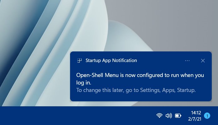
I had to use Classic Shell, and to this day, Classic Shell, or rather, Open-Shell (the new, up-to-date version of the original) is my go-to menu in Windows 8. Now, now, now, color me surprised, a decade later, the exact same thing is happening with Dev builds of Windows 11. We have a new, useless menu that adds extra mouse clicks, because mobile. Used to be tablet, now phone. The cycle repeats itself. You could disable it via registry, no problem. But then, boom, new Dev release, and that tweak is gone! Well, we must resort to Open-Shell once again. Indeed, here, I want to show you what you need to have a good, seamless experience with this alternative menu utility in Windows 11. After me.

Why is the Windows 11 menu useless?
Because it is simply wrong on every level. In the default guise, it pins a whole bunch of random applications, all of them the so-called "modern" type, which means touch-like design. We all know that anything touch on the desktop is absolutely inferior to classic desktop programs. Simple fact. Show me one touch-inspired app that works better than its desktop counterpart, and I'll buy you a can of cheapest beer.

Default nonsense.
Second, if you unpin everything, the menu looks naked and useless. Want to see all of your apps? Waste your life clicking on a small icon. Pointless. If Microsoft introduces a tweak that allows switching between using pinned/recommended and showing all apps, and also allows the users to change the width of the menu, no problem, I'll take my words back. Until then, this is a useless abomination.

How very efficient and elegant.

Useless clicks, useless width. Bad design.
Third, recommendations. Here's the thing after some use. Look at that nonsense. All of the AI/ML in the world, and this is no better than "shopping recommendations" on every site out there, or any "ad" on any platform. They tell you what you already did or bought. How very useless. Same here. The system recommends stuff that I already used. Why? What's the point? Do you really expect your users to be such complete and utter idiots that they need this help?

I could give better recommendations by tossing a cube and calling out software at random.
For these simple reasons, the Windows 11 menu fails the usability test. It's designed for chimps, not for intelligent humans. Alas, the chimps outnumber the smart people by two or three orders of magnitude, and the world of software is moving into the direction of idiocracy more and more every day.
I can't really fault Microsoft for this decision - except the irony of repeating past mistakes. But their tool, their choice, they want to make money, and all that. Excellent. Except, I don't want to be part of the idiocy equation, and I want to use my DESKTOP, the way DESKTOPS are meant to be used. This means no touch nonsense, and maximum efficiency on every level.
Again, if in some future build, the menu gets the necessary flexibility that allows me to skip pinned and recommended stuff, and I can see a simple list of my applications without extra mouse clicks, great, I'll be the first person to bow in respect to Microsoft and acknowledge the change. Until then, we need a better solution, and that's the lovely Open-Shell tool, a normal menu program for Windows.
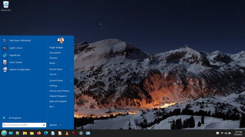
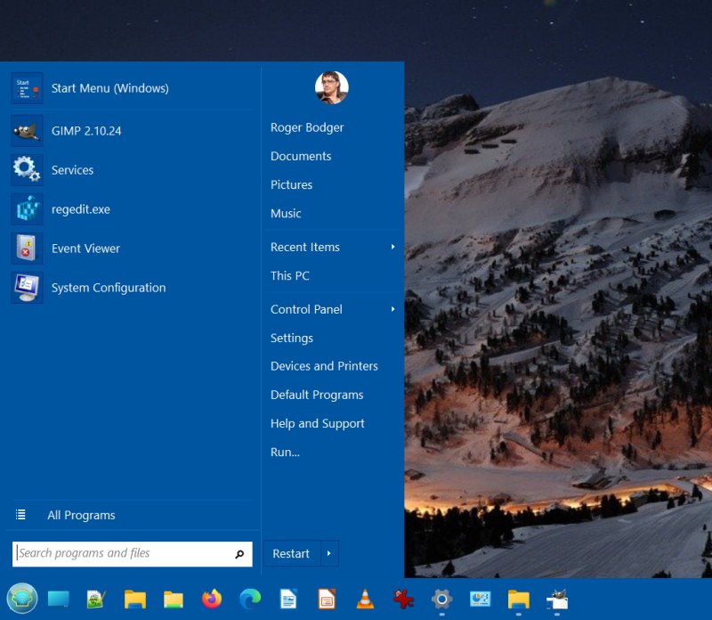
Install Open-Shell
Get the program installed. Basically, we're done. But there be one problem: Super key works fine, launches Open-Shell, but mouse clicks are hit-and-miss. You get the Windows menu opening instead. This is because the Windows menu "peeks" under the Open-Shell icon, and can be clicked.
Use a custom icon for Open-Shell
The solution to this issue is to use a custom icon/logo for Open-Shell. You can try with the standard one, but you will notice it's round, so if you hit outside its radius, you will launch the Windows 11 menu. The fix is to create an almost transparent square image, and use it as your overlay icon.
The actual size may vary for you. I tested this on a full HD (1920x1080px) screen, so adjust accordingly. Launch a program like GIMP, create a new 68x182px blank white image, then change its opacity to 1%, ergo almost completely transparent. Save it as PNG, and then, set it as the icon using the Open-Shell menu settings. Now, you should avoid accidental clicks, and still have the Windows 11 logo show through the transparent layer of your overlay icon.
You can change the icon under Start Menu Style > Replace Start Button > Custom > Pick image.
![]()
![]()
Other tweaks - DPI and color
You can also make the menu bigger - change its DPI value. This is under Menu Look > Override system DPI. If you're using scaling, and the menu does not obey for some reason, or you just want it bigger, do some simple maff. The baseline DPI is 96. Ergo, if you want 125% or 150%, multiple the base number by the relevant factor, and set the DPI value in the settings.

You can also try font smoothing, if you like.
Color wise, it all depends on your selected theme. For instance, the Metro theme is hard-coded to the Windows 8 color values, which sort of clashes with the dark gray theming you may want to use in Windows 11. The remedy isn't simple.

The Override glass color options does not work with the Metro skin.
However, you can alternatively color your taskbar to be the same as the menu. Or just use different hues, if that does not bother you too much. You can customize the look on the Taskbar tab. You can customize opacity, as well as the color. And other things, of course, because Open-Shell is awesome.

Open-Shell working fine now
And there you go, now you have a nice and elegant menu that does the job. No silly pinned apps, unless you want them. No recommendations. And most importantly, no extra mouse clicks. You get your productivity back. Once again, reason wins over fads. The ordinary users can waste their lives clicking and clicking and pretending they are on their phone when using the desktop. People with skills and intelligence can instead use a more efficient workflow, where mouse clicks aren't wasted.
Conclusion
There you go. Back to sanity. The time loop is complete. The same issue we faced with Windows 8 is back, ten years later, and we use the exact same method to fix it. Now, I don't care what changes happen in the new Windows 11, I'm not interested. I have a thing that works, it's friendly and efficient.
I'd like to see Open-Shell address a few issues ahead of the Windows 11 release. Most importantly, the ability to use a "standard" icon that will fully cover the default one, so that Open-Shell can be invoked correctly all the time. And then, to gain the ability to match the menu color to the taskbar one, and not just vice versa. Anyway, we've accomplished what we needed. Happy times.
Cheers.