Updated: September 14, 2013
As you know, I really like Classic Shell. It is a superb little piece of software that allows Windows users to choose their application menu layout, going all the way back to the old looks, if they like. It works for all Windows editions, and most importantly, it allows Windows 8 users to get rid of the stupid Start Screen and use a normal menu on their desktops.
I have highlighted the great importance of this program on many occasions, even going as far back as the Windows XP and Windows 7 transition. Then, I told you how it was going to save Microsoft from complete failure, by providing an alternative to disappointed users, and allowing them to keep using Windows 8. The same applies to the equally colossal failure successor called Windows 8.1, which we have discussed several weeks ago. Now, there's a new version of Classic Shell out, and it's even better than before.

The magical mystery tour
I was invited to test the program while it was still in the beta phase - still is - so by the time you read this review, some of the details might change a tiny bit, but let that not deter you from enjoying the article. You can check for updates further below, if you please. Anyhow, I installed the new beta version 3.9 over the existing installation, without any problems. I had a prompt telling me my digital hamsters could go wild, but other than that, there were really no problems, whatsoever.

Classic Shell 4.0 comes with a new logo. On first launch, you're asked to choose the desired layout. You can use the classic style, like Windows XP, a two-column layout, or the full Windows 7 style, which is quite probably what most Windows 8 users are looking for.


The search function
One of the would-be weak sides of the Classic Shell was the fact its search was somewhat clunky. If you chose the Windows 7 layout, you would not get results shown in the menu itself. Instead, they would feature in a set of cascading sub-menus opening to the right, somewhat similar to Windows XP.
Now, this has been fixed, and you get a full 100% Windows 7 like compatibility when using search. It's shown right there, inside the menu, and it's done inline, as you type. You would not really know it's a different shell running on your system. Awesome.


Niggles what I found during the testing - before updates!
There were a few tiny problems. Again, by the time you read the review, they might be fixed, perhaps even due to my own feedback. Or not. By default, the menu font color can be problematic, because the menu is transparent. You will have to customize the menu layout a little, including options like sub menus, glass transparency and glass color.

Then, true awesomeness ensues:


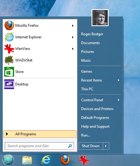
Another small problem I encountered is the position of the shutdown drop-down button. In Windows 7, the button has a left margin of about 10 px from the left pane. But in Classic Shell, the text of the button is aligned with the categories text just above, so the button is indented too far to the left, in my opinion. It needs to be flushed about 5-10px right, and then it would be a perfect match. To wit, screenshots:


Personally, I would align the button border with the text of the Run... shortcut, and then it would be really sweet. The vertical location is just fine, and it matches the overall menu layout. Finally, there's the matter of low-resolution icons shown when you browse the categories, like Games, Control Panel and others. I would expect a higher quality of icons, so this is something worth considering.
![]()
Final looks
And after some extra work on transparency and font color, plus you can pin applications to the top of the menu, you really get an awesome result. Classic Shell gives you an extremely accurate representation of the start menu, and no mistake.

Updates: Changes from the beta version
Here's a micro update on what has changes since I grabbed the beta version for testing and the moment you're reading this article. Yes, I have a super long article pipe, and sometimes it takes months before a review or a tutorial is uploaded. Anyhow, the things that have changed since the early testing.
Good news, all of the little niggles and problems I have mentioned above are resolved now. You get high-resolution images in the menu on mouse hover over the different categories, like Games, Control Panel, etc. Then, the shutdown drop-down button has been changed to match the one in Windows 7, so you get a full fidelity clone, at least in the visual space. Functionality wise, the Classic Shell does more. Well done.
![]()

More reading
You might also want to read all of the below:
Windows 7 classic shell thingie
Windows 8 Consumer Preview and Enterprise review
Windows 8 new activation & BIOS explained
Windows 8 safe mode explained
Windows 8 recovery options
Windows BLUE & desktop death discussion
Windows 8.1 boot to desktop feature
Windows 8.1 local account setup
Conclusion
There you go. In the past, you might have lamented the lack of a proper search functionality in Classic Shell, but it's gone. No more. This awesome program now comes with a high fidelity behavior, which is practically identical to what you have in Windows 7. Which means you can go about never using the stupid Start Screen on your desktop.
Honestly, kudos. This is a life saver, and Microsoft saver, and a great thing, which lets sane people put the pseudo-social nonsense aside and focus on productivity, using their keyboard and mouse devices as intended. I cannot begin to praise the quality and importance of this program. A true blessing. May it last forever. Use it, now.
Cheers.