Updated: March 11, 2019
E.T. phone home? No, Windows Phone home. Aha! So yes, we are here to attempt the unattemptable. Well, not really, because the apps are in the store, and all that, but really, the reason we're here is because I want to try using Windows Phone theming on an Android phone. With the inevitable demise of the Microsoft smartphone line, including my most fabulous Lumia 950, the supreme ergonomics of its tiled user interface will be one sad day consigned to memory. That leaves me and like-minded users with color-iconics approach used by the market leaders, Android and iOS.
I've recently gotten meself an Android phone, to test the waters so to speak, and I'm very pleased with the Moto G6 choice I've made. It's quite reasonable, in all aspects, and if it had the tiled interface, 'twould be superb. As it happens, there are apps of this nature in the Play Store. So I'm testing, and trying to come up with an answer to the important question: can one use a WP-like layout on Android? Well, I tried this four years ago, so now we need to have a second look at this. Follow me.
Test 1: Square Home 3
The big problem with doing this is the abundance of available options, and the even greater abundance of opinions. Then, Google and friends invest a whole lot of capital in making the Android experience as streamlined as possible. Cue random but eager developer, who tries to offer a sensible alternative, David vs. Goliath style. Doable? Yes. Probable? Perchance.
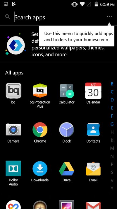
I tried Square Home as the first option, given the positive reviews everywhere. This little launcher has more than a million users and a score of 4.6/5.0 with some 55,000 ratings and comments. That sounds quite neat. I installed the app, and then went through a quick familiarization tour, which explains the basics of how you manage the tiles.

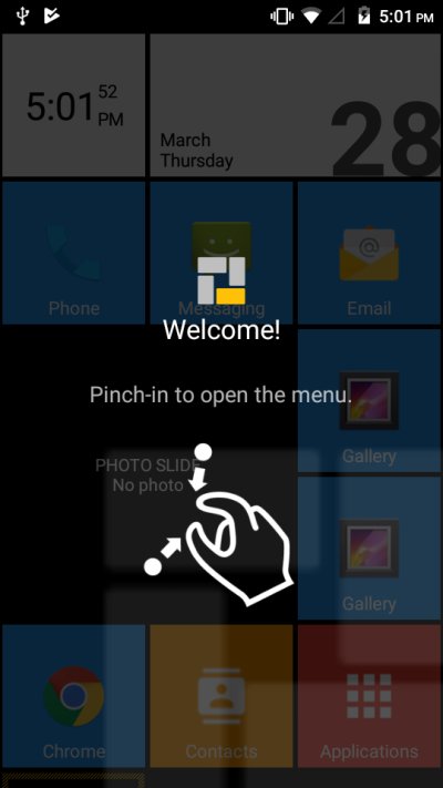
Compared to Windows Phone, the looks aren't that minimalistic. The tiles come with non-abstract icons full of colors and even labels, and you invoke the application menu from a separate tile. I found the transparency somewhat distracting. Of course, you can tweak everything, and Square Home comes with a bewildering array of options, but they have a very nerdy feel, and it takes quite some effort to get everything in order. Some of the settings can be changed for 14 days, but then you need the pro version after that.

Test 2: Launcher 10
This was my next attempt. This application comes with roughly the same number of installations, a respectable 4.2/5.0 mark, some 8,000+ reviews, plus in-app purchases and ads. Once installed, I fired it up. You get a very Windows Phone layout, with transparent tiles. The behavior is much like what you know from the Lumias and alike. Long press to select tiles, move them, change their size, or unpin them.


After a brief customization session, things were looking much better. The most important change I made was the use of a black background, and this instantly gave the phone a very credible WP looks. The app section is invoked with a swipe, and it feels just like my Lumia.
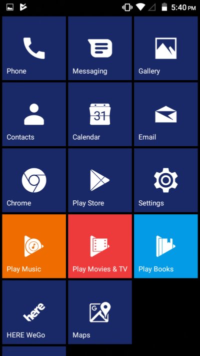

There are fewer settings, they are easier to navigate than Square Home, but some of the features require a pro (purchase) version, plus you get ads at the bottom of the screen, which really doesn't feel like my Lumia after all. Launcher 10 also comes with a detailed privacy policy that states the different vectors of data they collect, and I felt this isn't what I'm looking for. If I'm not mistaken, the Launcher 10 collects calendar events, and they've recently removed call log and SMS permissions to comply with the new Google Play policy. I do understand a home screen launcher needs access to different apps and notifications, but still.
Test 3: Microsoft Launcher
This sounds very interesting. After all, Windows Phone, tiles, Microsoft, duh! I also cannot escape the feeling that Microsoft is gently - or not so gently - positioning itself more and more into the Android app space. It failed to make a significant impact in the mobile operating system domain, but then, perhaps it's not necessary if people use your software.
Microsoft Launcher looks handy - 10M+ install, some 850K reviews at 4.6/5.0 rating, no ads. Well, I installed the program and learned a few interesting things. First, you go through a little wizard, which lets you customize a few options. Among other things you can optionally sign into a Microsoft account.

There's an intro tour, too. And then you have the option to make additional changes. There are quite a few of those, including the use of various accounts, including something called Wunderlist. You can set up Cortana, and download a whole bunch of Microsoft apps. Some of these are quite handy, but they are not in any way specific to Microsoft Launcher.
Oh, it doesn't look that different from Android - basically, it's a home screen with pretty much the same icons, and just an extra search box (with Bing as your default provider). Sure, you can make changes, but you won't get the nice, simple, minimalistic tiled interface, which is what I've been looking for in the first place. So I guess I need to exclude it from consideration. Ergo, we have Square Home and Launcher 10. All right.


So what did I decide?
Well ... it's a tough one. While I love and admire any attempt to create superior ergonomics, tiny details can really spoil everything. I linked to my Android like WP 2015 article in the beginning of this piece, and there's the similar Ubuntu Phone effort, and in both cases, you get 95% of the original. But not the full 100%. Somehow, it matters a lot.
It's not that these other projects and apps aren't good - far from it - but there's a big difference between an application with a specific theming and experience versus an entire operating system built from the ground up for a very particular mode of usage. Things come apart three or four levels deep. Tiny things. But my OCD demons can't get past that.
Then, I have become more averse to the whole mobile drama in the past few years. It's not that I'm more paranoid, but I'm sure less tolerant to the almost liberal misuse of system settings and permissions for the sake of some 1950s salesmanish foot-in-the-door model, where user data and ads have become the holy grail of everything. And so, having additional software at such a critical junction of usage as the home screen does create a sort of dilemma. The idea is to minimize one's digital footprint, not increase it, therefore new apps, even those that offer the amazing WP looks, create a tricky conflict of experience-driven ideology.
The real solution is, of course, native solutions from OEM, Google, or maybe Microsoft if they ever go back to making smartphones. Nokia could do it too, but I'm not sure who owns the brand Lumia and its associated art, and how it can resurface (see what I did there) as an ergonomically superior option for phone users.
Specifically, both Launcher 10 and Square Home 3 are very neat. But there are some technical problems that prevent me from using them. One, payment - I have nothing against paid software, and nothing against paying Google or other software companies if and when needed, I just don't want to do that on a phone, because I don't want to have my payment methods associated with any particular device, and that prevents me from enjoying the pro editions of these apps. Two, they work well, but we go back to the 95% thingie, and that's something that I can't really get past. Three, the required permissions to make these launchers work are rather permissive [sic], and turning everything off would render them useless. That approach works for standalone apps like a music player or a browser, but not for a launcher that's meant to be the gateway to your entire phone's ecosystem.
Conclusion
I really wish there was a single-click - or a single-tap - option to turn your default Android looks into a tiled interface in a way that does not introduce any complications or expand on the existing set of permissions. Alas, that's not possible, for a variety of reasons, and the best one can have, if they want WP ergonomics on an Android, is a set of third-party apps. Square Home and Launcher 10 are nice, but full versions cost money, there's the implicit and explicit trust in their usage (like any software really but more so given their role), and you will never get a 100% WP experience, because Android works ever so slightly differently.
So the question is, can you live with 95%? Or can you live with Android looks? For me, a less-than-perfect alternative is no alternative, and I'd rather suffer the sub-optimal defaults than sub-optional optional choice of my own choosing. This is the reason why I almost never tweak anything in my production setup, be it Windows, Linux or phone. So perhaps I will be a tragic hero, straight out of Greek mythology, and continue using a phone with superb ergonomics but dead or dying ecosystem (Windows Phone) or use Android, which is rich and vibrant but not my cup of artistic tea. Maybe one day we will have both, but for now, this shall remain my unicorn.
Cheers.