Updated: January 21, 2012
Like Kororaa, Pear OS came up on my TODO list following a squall of emails. All right, let's take a look, me says. Indeed, the prospect is promising. Pear OS is based on the latest Ubuntu, which is quite neat. However, it tries to do even more. Challenge legal issue by using yet another bitten fruit as its logo, use the top panel contextual reveal-as-needed menu and a bottom dock much alike the copycatted operating system in question. And you still get the Gnome Shell underneath, plus supposedly tons of usability, a unique branding, and an app store.
Now I promised not to test any more Gnome 3.X distros, but this more sort of falls under the hat of Ubuntu than anything else, so I believe I can be excused. Anyhow, I'll be doing my usual stuff, which is everything. Join me for a ride. Or as they say in French, tais-toi!

Live session - Take my arm, but not my eyes!
I was unable to boot from USB, so I burned the image to CD and powered on my test machine, the venerable, sturdy T60p. It showed two options, live CD and direct install, as expected. Remember this, it's important.
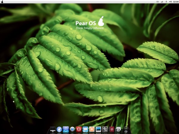
The desktop combines elements from three distinct desktop environments. You have the Mac-like arrangement, with the top panel revealing application-specific menus only when selected, the bottom dock, and powering it all, the Gnome Shell slash Unity engine. The desktop background has a rather vague motif, unless those are pear tree leaves.

And the installation icon is right there! Surprised? You might be, because some people reported not being able to install Pear OS from the live session, but in my case, the button is there all right. Or could it be because they tested in a virtual machine? Aha! More about that later. Anyhow, the button is there, we will use it later.
Look & feel
Now, some more focus on the aesthetics. The controversial installation icon uses bad color contrast given the default wallpaper. All in all, it looks like any modern Gnome desktop, with a dock at the bottom, which should resolve the usability issues that people may have had with Gnome 3 and Unity. However, it adds its own complexity.
![]()
The system menu on the left, represented by the pear symbol is the system menu that Natty and Oneiric offer on the far right side in the shape of a cogwheel. It will not launch any applications for you.

To launch programs, you actually need to click on the second icon from the left in the bottom dock, which is called Launchpad, not to be confused with Ubuntu's Launchpad. You will have to use your mouse to get it running, as I am not sure what the correct shortcut is, but using the Super key does not work.

Another thing you may notice is the very Mac-like first icon, called very Mac-like Finder. It will not find any files for it, but it will launch Nautilus. It's the classic file manager, with some Mac colors. Looking good all right, but Apple's people might not like this.

Appstore
Another controversial coin phrase. Indeed, Ubuntu Software Center turned Mint Software Center turned Pear OS Appstore. Except, it's just a fancy frontend for APT, in French. For some reason, half the menus and options are in French. And there's nothing to buy really.


Multimedia, ca plane pour moi!
You do get Flash and MP3 support out of the box, which is nice. To play Flash, you need to launch your browser. Pear OS ships with Opera, which might be ok if the end product looked well, only it does not.
The homepage display a portion of the next slide image because of the resolution incompatibility, naughty, naughty Web designers. But let's say it's a one-time glitch, as you will never want to visit that page again. The most jarring issue is the combined-menu button in the top-left corner. It showed a very unnatural, cropped letter O that cannot be resized in any reasonable way. For me, the OCD champ, this is equivalent to murder.


The menu integration is also missing. On the top panel, File only reads Quit, in French again. All the other options you might expect, like Bookmarks, Tools, About, and whatnot are hidden somewhere in the eight-dimension Opera menu world, only partially exposed by that hideously cropped button.
But we're talking multimedia here, so please:


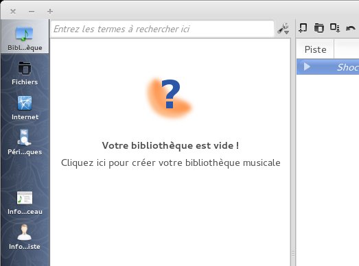
Alas, I cannot let bad styling and integration be. Clementine is also affected by French. Now, I don't have anything personal against the language, except that it is not really efficient, as text-to-voice ratio is fairly low, but it should not show up on a system that is not designed to display French. This is evident both in the application menu and the top-panel integration.


If you don't know Latin, you're effed.
Installation
There's virtually no difference from the standard Ubuntu installer. So much in fact that it asks you to install extra stuff, although it's already installed and that checkbox does not really do much. Moreover, the rather sleek and pleasing slideshow you see in Ubuntu has been removed, alongside username web camera image customization.
As to the hostname, I called my machine banana, just to be super-unique. In the end, the dual-boot setup with Windows 8 worked fine, but the GRUB2 menu reads Ubuntu in its title. QA people, another strike.


Using Pear OS - Gaston le telephone qui sonne
Don't mind me, I'm just quoting random stuff from some rather lovely French songs, just to spice the atmosphere, as this review is clearly not going well.

Applications
For a distribution that weights 900MB, Pear OS packs a very meager arsenal of programs. You have no office applications, and the rest is pretty much basic. Then, your standard PDF reader is called Pear OS PDF Viewer, what would that be? And your Pear OS mail turns out to be Sylpheed beta. In general, thin and disappointing.

System resources
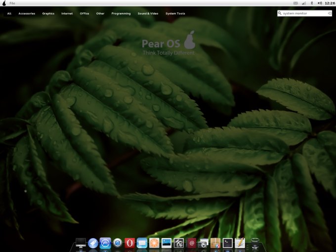
To use the troll parlance, how do I opened the system monitor? Note: the previous sentence is misspelled on purpose. You don't. It turns out that Pear OS Launchpad does not contain an entry for this utility. However, Pear OS Appstore clearly marks it as installed. Indeed, firing it up from the command line works. But why not include such a simple and essential tool in the basic list? I know why, you'll learn soon.


Looking at the actual usage, you get nothing spectacular, some 410MB more or less. This is more than Ubuntu 11.10 or Linux Mint on the same hardware, which tolled less than 300MB on average. In actual numbers, we're talking 30% more resources.

Problems
Normally, I use H3 elements for problems, but there were so many that I had to create a special sub-section to handle all of them, hence H2 heading. Now, where to begin?
We've had quite a few so far. In the live session, we observed some visual integration issues, as well as the liberal use of French on an otherwise English desktop. You might also claim legal issues with the branding. Some titles are misleading. Some applications don't really do as promised. Opera looks monumentally ugly, with that cropped O letter and the homepage tuned to some weird resolution that makes it look completely amateurish on my 1440x1050px display.
During the installation, Pear OS offered to install third-party codecs, even though they are already installed. The final GRUB menu reads Ubuntu. This Panther is looking more and more like Ocelot. Now that I think of that, Ocelot is also a cat. Mac OSX Lion, Leopard, now Panther, and Ocelot! Blimey, we've got the whole of National Geographic here!
The installed system suffers from yet more bugs and quirks. Launchpad is not central to the desktop functionality, so you will struggle transitioning from an iconless-desktop slash top panel to looking for an insignificant second-left icon in the bottom dock. The applications choice is meager. The system monitor is invisible.
Now, yet more stuff.
Back In Time is broken
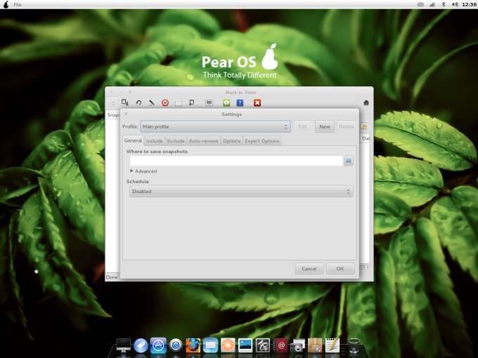
Much like its rolemodel, Pear OS comes with Back In Time, a program designed to take periodic snapshots of your system. All right, let's do it. On first launch, the program will ask you to configure your backup area, the files and directories you want to monitor, the schedule, the exclude list, and more. No problem. Except once you complete the initial setup, the program just exits. On every subsequent launch, you're presented with the same starting point, as if all of your previous changes have been discarded.

Control Center is non-resizable
First of all, the term Control Center is misleading, but that's what the bottom dock icon reads, even though it opens the standard Ubuntu System Settings menu. However, unlike Ubuntu, you cannot change its size, so you'll always have the ugly scrollbar that crops just the last 15-20px, such a shame. And the icons are staggered in a wild fashion. Why, oh why?

Proxy
Proxy support does not work at all. The Pear OS Appstore is designed in such a way that you cannot input proxy details using the graphical interface. Even if you try using environment variables in your shell and exporting them before launching the utility from the command line, the Appstore will still fail to connect. Pear OS Panther v3.0 comes with probably the worst proxy support in a long time.
The package manager ignores local mirror
Even though I specifically listed a local mirror, Pear OS ignored me and hardcoded itself to a French Ubuntu mirror, which was obviously slower for me. I don't like this at all. Feels sloppy. All I asked is some extra MB to download my po ... I mean my updates.
Sudo is French
If you try running the package manager, it will asks for your password. Again, this takes place in a mix of French and English, even though I specifically selected English as the language of choice.

New programs do not show in the Launchpad
I did not like Opera, so I decided to remove it. This procedure did not complete cleanly. A handful of ugly errors specifically related to Pear OS internals came up, causing the post scripts to fail and exit. End result, Opera was not completely removed. For example its icon remained in the bottom dock. Likewise, after installing Firefox, it's not available in the Launchpad, for the same reason. And I guess this also affects the System Monitor.

You've been had!
Now, if you've read half a dozen or so rather generic reviews floating about the web out there, you'll notice that everyone seem to have encountered the same issues, except me. Well, I'm unique, but I also did not test the distro in VirtualBox, which is what everyone else seems to have done. But for the sake of statistical control, I repeated the same test in a virtual machine. Now, those familiar errors crop up, in addition to all the rest I've shown you earlier.
If you boot with a low-resolution, like 1024x768, then you will encounter multiple issues with the arrangement of items on your desktop, cropped menus and more. As you can see, the virtualized session exposes even more bugs and problems. The list is simply neverending. I'm not impressed, at all.
Finally, there's no installation icon in the virtual machine, which agrees with the reported problem you may have seen elsewhere. So there's something else broken inside this distro that makes it behave differently on physical and virtualized hardware.


Nano summary
Pear OS seems to be a pikey mishmash of popular concepts. You have the clear Mac styling, only not quite as well executed as the original. Or even Macbuntu for that matter, which did not alter the basic system, only your specific user. For instance, I like this better:

Then, there's the question of branding. Using the word pear as a rather linear pun for Apple is kind of funny but not really professional. Besides, branding is a tricky business. Either you do it completely or you don't. Having your GRUB menu read Ubuntu is not a good thing in this case. QA, the mighty vixen. And let's not talk about all them errors.
Conclusion
Pear OS Linux Panther v3.0 takes the original, slightly changes its visual aspects - let's face it, you get a dock at the bottom instead of a Launcher at the left side, and that's about it really - and introduces an army of problems. You face aesthetic and linguistic issues, code problems, functionality problems, missing applications, and more. Hardly worth the price.
If you're looking for Ubuntu-based alternatives, you might be interested in Linux Mint. Now, it's not the perfect product it used to be, mostly because of the Gnome 3 nonsense, but it's still usable to some degree. And remains still the most reasonable conversion of Ubuntu, desktop interface notwithstanding.
While I appreciate the effort, like with most Ubuntu forks, it is misplaced. Ubuntu cannot be upped by changing a few icons or renaming a few programs. The change must be substantial and no fork and spin offers that today. Pear OS could interest people who like to dabble and experiment, but for serious work, it is simply inadequate. Even the basic apt-get functionality is flawed, so look no further. I'd say 3/10, at the moment.
Cheers.