Updated: March 12, 2010
What is the color of stability? A certain blue to be sure. Can it be aubergine? Well, this is what Ubuntu is trying to do with its upcoming Long Term Support (LTS) release, 10.04 Lucid Lynx. Make Ubuntu look different. Step away from its legacy orange.
My initial reaction, as I was fighting a not so successful Jaunty update that turned my Shutdown button into Logout button, was a kneejerk impulse. Browsing through a gallery of copy-pasted images from Ubuntu Brand page and replicated like Borg in a kazillion blogs, I did not like much what I was seeing, a Mac-like imitation.
Something like this (not quite, this is my own version):
Don't get me wrong, I like how Mac looks. But Mac already exists. It's there. Does the world need another operating system that looks like Mac? Well, maybe. A free price is always a good offset. Still, the big question is, what else is there? And how this new branding really is?
I did not want to judge just by reading other people's impressions. I downloaded the latest available alpha release and installed it. Then, I tweaked the looks to resemble the prototype and started testing. Here's a summary of my experience with Lucid Alpha 3, mainly from the aesthetical perspective, plus some general use.
Let me tell you my story.
Get new themes!
The new themes and icons are available in the repositories, so you can install them very simply by powering Synaptic and searching for ubuntu-mono and light-themes. After that, it's time to tweak the Appearance. For those asking, a tutorial on how to install themes is on the way.
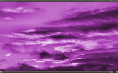
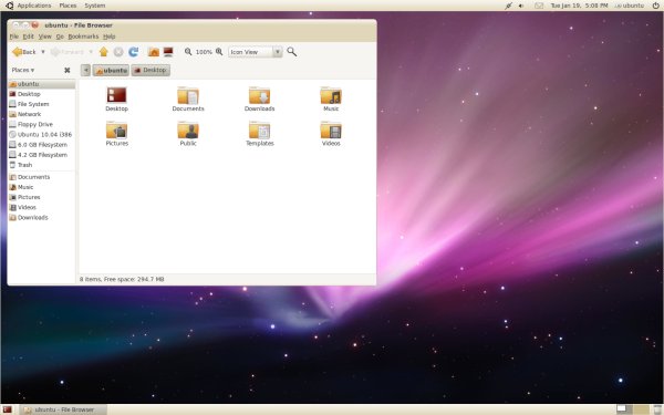
This will install both the light (Radiance) and the dark (Ambiance) themes. And this is how they look, along with the subtle aubergine-violet-inclined change of the wallpaper:
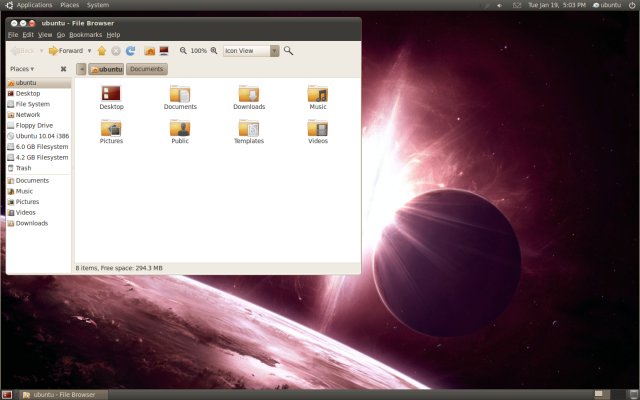
Of course, I did not want to monkey-copy the one example provided by Ubuntu like everyone else did, so I actually spent a deal of time creating a similar version, with the main difference being the choice of the desktop background.
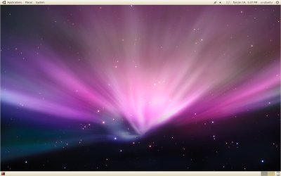
Anyhow, the Mac-like looks are evident, including the round window borders, the top panel looks, the positioning of the window buttons on the left side. Rumors say the buttons will be placed on the left side and Ambiance will be used as the default theme.
What do I think?
Surprise, surprise, after staring at the screen for about 10 minutes, I decided that various reviews were doing this new style injustice. There was too much emphasis on the Mac copycat business, which kind of skewed the overall feel, which is exactly why you must do your own testing, too.
The theme seems quite nice. There's a serene elegance about it. But you may have a burning question that won't let you relax and enjoy the article. How do you change the position of the buttons from left to right - and vice versa? Well, let's step back and fix that.
Changing the default position of buttons
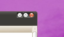
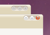
Not very intuitive to change, but quite doable. You will need to invoke the Gnome Configuration Editor, known as gconf-editor, from the command line. Once it opens, in the left pane, expand apps > metacity > general. Then in the right pane, under button_layout, change the order of the buttons and the position.

The colon separator dictates the side where the buttons will be positioned. If the character is placed to the right of the minimize, maximize and close words, the buttons will be on the left; if it's placed before them, the buttons will be on the right side.
Thusly:
:minimize,maximize,close
Places the buttons on the right side.
minimize,maximize,close:
Places the buttons on the left side.
You can also change the order of the buttons, if you want. I did. There's also a slight aesthetical thingie with icons in their expected, normal order. The Minimize button has its own separator, which makes for a somewhat ungainly visual effect.
Back to style ...
Now that we know how to fiddle with the buttons, let's talk some more about the design.
Ambiance and Radiance look well. They remind me of Crunchbang Linux, which had a similar feel of round, soft quality about it.
The icons have also changed, with a new refreshing repertoire. Combined with decent fonts, it's a good feeling browsing through the menu.
You may even try something like this:
When it comes to beating the UNIX cousin, Ubuntu has taken a bold step forward. Hopefully, there are no legal issues revolving around this. For casual users, this can definitely be the nudge in the right direction. The looks are way better than Windows, but that goes without saying.
Problems
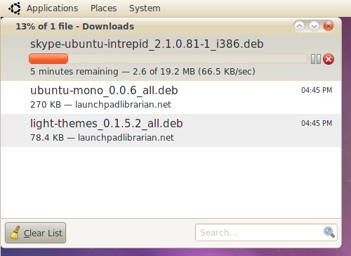
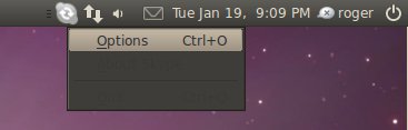
The light theme is all dandy, but the dark theme is problematic. Some of the applications and desktops elements do not yet fully support the new theme, so you end with dark font on dark background.
For instance, the Skype right-click menu:
Or Firefox awesome bar:
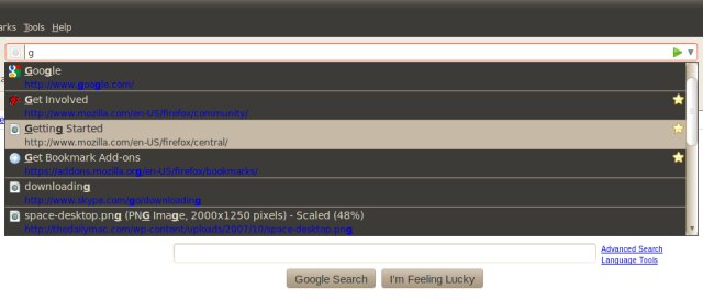
This is something that has to be addressed - quickly.
What else is there?
This is a very good question. I must say I do find the new themes reasonable. This is a far cry from the usual Linux Gnome artwork, which has so far focused around Human and Clearlooks motifs. Although I like them very much, they might appear somewhat archaic to the casual eye, and the casual eye is all i-eye.
Good stuff
Good news are that Lucid has behaved nicely so far. It ran stable, despite being only alpha, there were no kernel oopses and the PulseAudio works, even in virtual machines, which is a nice step away from the Karmic disaster.
Taking these into account and extrapolating, plus a humble prayer there won't be any last-minute regressions, Lucid starts to look like a very reasonable prospect. With three years of support, quite elegant looks and fair stability, it is a good candidate of becoming a production machine. This says a lot.
For all practical purposes, the buzz around Lucid Lynx is that of Windows 95 coming to desktops after the long era of DOS dominance. The impact seems similar.
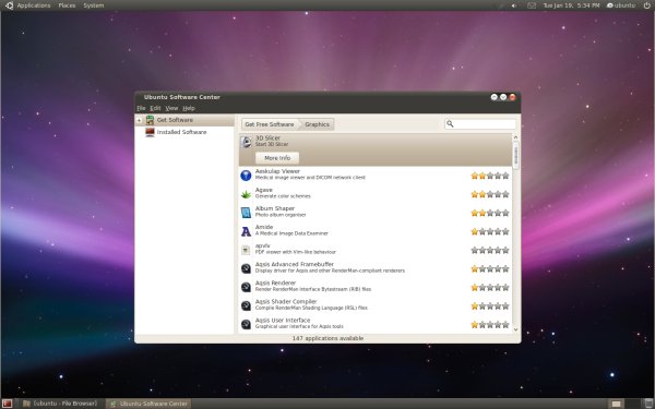
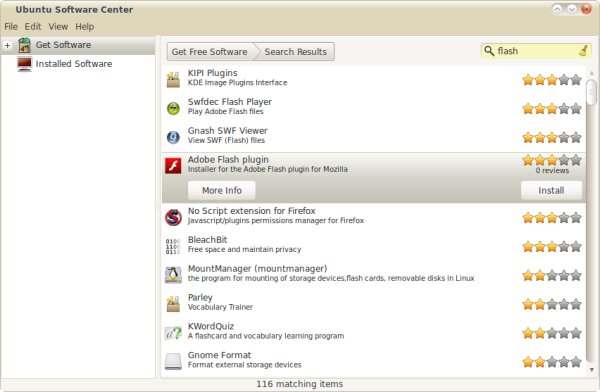
Then, I also examined the applications and the changes introduced to Ubuntu Software Center. The efforts start to show through, gaining on a solid shape. You can also find some of the programs you would not have expected, like Adobe Flash.
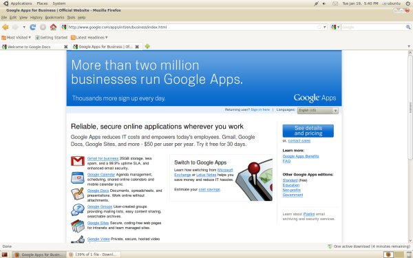
Firefox has also undergone branding and it takes a more blended, natural feel on the redesigned desktop:
Conclusion
The real test will come in approx. a month, when Lucid Lynx gets released. It'd better be good, because it will carry well into the future, considering the LTS label. For now, Ubuntu 10.04 seems like a very hopeful bet.
It looks well, it fixes some of the glaring problems seen with the predecessor. Still, the real test comes with the official release. Some of my production machines run Jaunty rather than Karmic, and Lucid might make for a good reason to change.
Ubuntu is free of cost. And it has a new look that can appeal to modern users as well as more conservative veterans. It seems to be fairly stable, having none of the ugly issues seen even with the official editions of the previous cycle champion. Combined, it makes realistic the change of becoming what everyone wants - a replacement for payware operating systems currently available. Looks without stability would not work. And stability itself does not seem enough for most people out there, unfortunately. However, the two might be the right formula to sweep the masses over into the friendly hug of Linux.
There's a good chance the next color of stability will be aubergine. I hope I don't get disappointed.
Cheers.
Updates:
Same day, different hour:
A few readers asked me for full-size images of the new themes, so they could appreciate the changes up close. You can find below thumbnails, linking to full-sized images. So here's a small gallery:

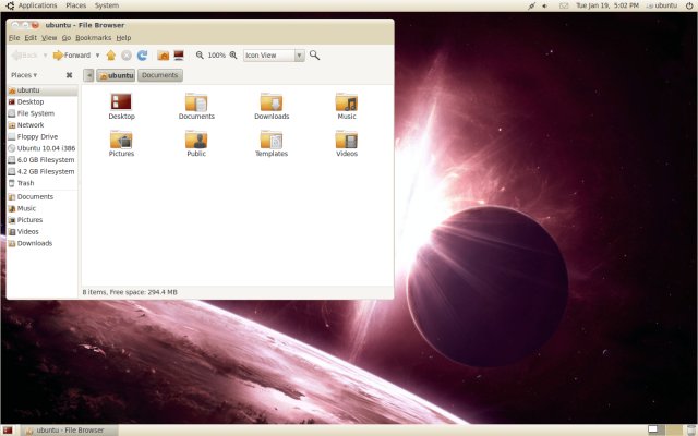
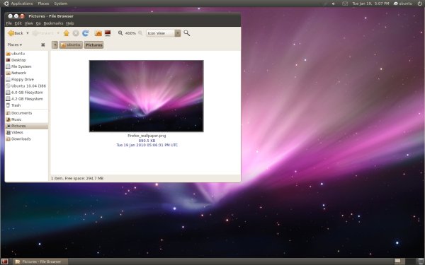
color-light-full-nautilus-1440x900.png (844KB) - Ubuntu Lucid desktop
with Radiance theme with Nautilus file manager open and the
exploding supernova wallpaper

color-dark-full-app-menu-1440x900 (1.14MB) - Ubuntu Lucid desktop
with Radiance theme with the Application menu open, with fontsize set
to 9pt, featuring the exploding supernova wallpaper
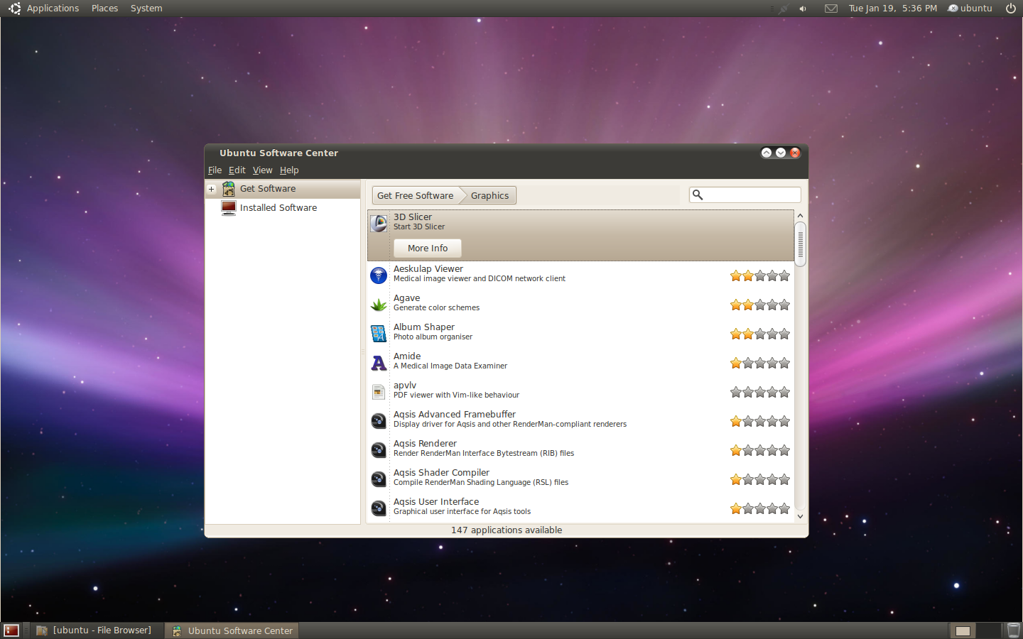
color-dark-full-usc-1440x900.png (434KB) - Ubuntu Lucid desktop
with Ambiance theme, with the Ubuntu Software Center (USC) open,
featuring the Mac space desktop background
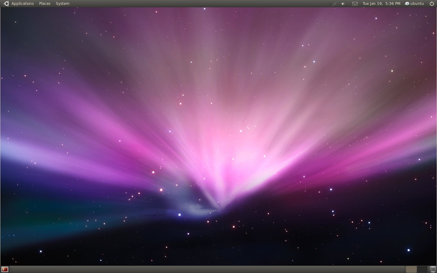
color-dark-full-mac-1440x900.png (596KB) - Ubuntu Lucid desktop
with Ambiance theme, featuring the Mac space desktop background

color-light-full-mac-1440x900.png (596KB) - Ubuntu Lucid desktop
with Radiance theme, featuring the Mac space desktop background
Please do not hotlink to these images! Kindly point to the article instead. Share fairly and everyone will get a piece. Bandwidth does not run on air, after all.
That would be all!