Updated: October 13, 2026
Every few months, Mozilla decides to test its most ardent loyalists by unleashing unto them a new, changed UI for its darling browser Firefox. The changes come with names like Australis, Proton and now Nova. Usually, these massive facelift efforts result in deleterious ergonomic effects. Worse yet, in its attempt to regain market share, Mozilla's work has often imitated Google Chrome, deliberately or by accident, thus further eroding the vital part of its uniqueness factor in the Internet world. Firefox 157, just recently released, brings yet another iteration of this strategy to its users.
Largely hesitant, I decided to give it a go. My first impression wasn't terrible. It wasn't great either, but I had none of the sharp aversion that I felt for Mozilla's previous UI projects. Sure, I did notice lots of little issues, of course, and the ergonomics can sure be notched up to eleven, but all in all, I felt okay. Perhaps I have grown resigned and apathetic to technology, and perhaps Mozilla have done a reasonable job this time. However, like me, you still may not be fully sold onto the idea. So let me show you what options exist before ye. Commence.
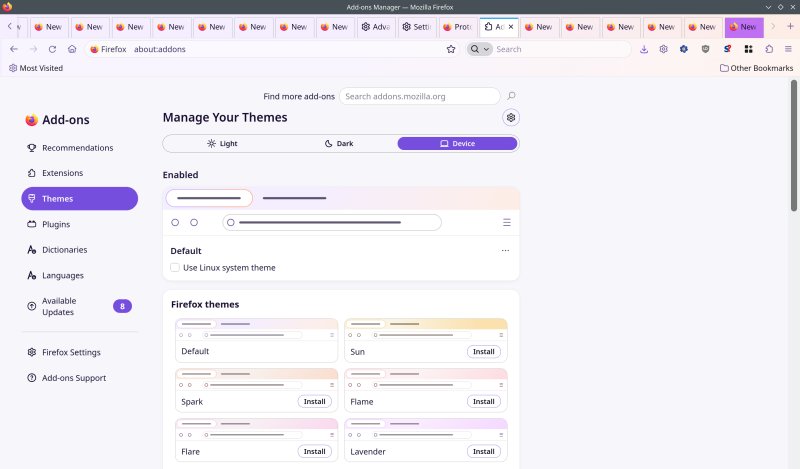
Nova, gradients and colors
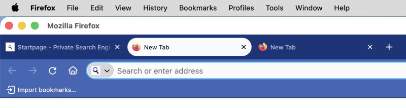
One of the biggest issues with most modern software interfaces is that they are flat, with a bad color palette, weak contrast, and almost invisible separation among elements. With Nova, Firefox chose to restore some of the mid-2010s vibe with a soft purple gradient across the UI. This wouldn't be bad, except the gradient is too weak, so it feels more like a smudge than a wild artistic choice. The tabs don't really have borders, actually.
Then, container tabs (if you use them) come with a big, line across the top of the tab area, but it's neither distinct enough, nor pretty, nor does it fit well with the rounded tabs. Even in macOS, this feels rather plain, to say nothing of the other operating systems.
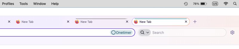
Notice the container label has a different radius than the address bar. Hi hi. Notice the lack of borders, too.
I guess the container tab label was "missed" because it does look ok with an actual address typed in:

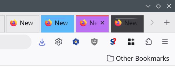
This is just a tiny sampling of badly designed and tested concepts in Nova. However, what makes Firefox so much better than its competitors is that you can actually change the UI quite significantly. I've made a beginner tutorial on how to achieve this, including lovely colors for your container tabs. For instance, here's a screenshot from my Proton customization article. You can quickly and easily see which of your tabs belongs in which container, plus you can also quite easily spot the active tab. Not so with the default skin, and still not the case with Nova, as you can see above.
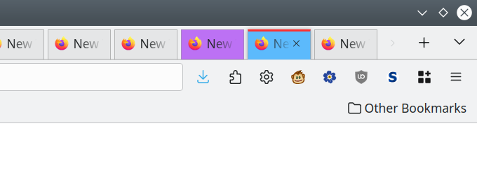
Okay, so let's do some alterations, then!
Disable Nova
The very first thing you can do is toggle Nova on or off. It's an about:config tweak, no need to restart the browser, so you can actually see what gives right away. I noticed the tabs are shorter and more condensed, there's the annoying horizontal container line (which we will tweak soon), and without the gradient, it's actually easier to see the UI elements.
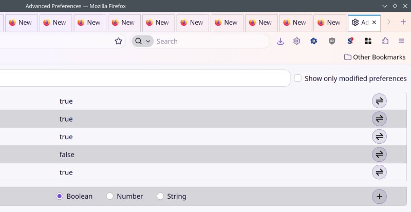
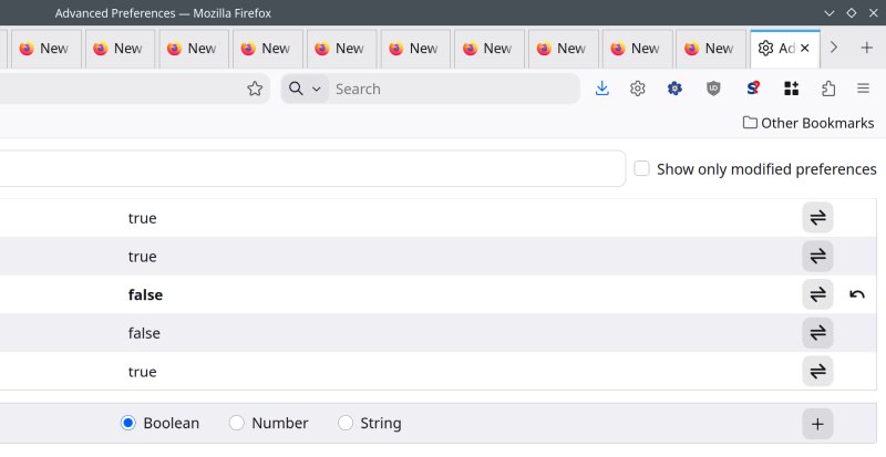
Now, the reason you actually see square tabs with good borders in both examples is because I am using a heavily modified userChrome.css file, with tons of Proton tweaks, plus some new changes for the more recent editions of Firefox.
To activate or deactivate Nova, open about:config, and then change from true to false (and vice versa):
browser.nova.enabled
New default themes
As it happens, Mozilla probably predicted a backlash around Nova, so they provided a relatively easy way out. Multiple easy ways out. One, you can actually install an official Firefox Proton theme, which gives you an earlier sort of look, without compromising the overall Nova change. From my perspective, with all my different tweaks in place, this was almost perfect, sans the container tab line.

If you don't want to use any new theme, you can try a whole bunch of variations of the default one. Go into Settings > Add-ons > Themes, and here, switch to whatever suits your fancy. You have Spark, Flame, Ash Lavender, and quite a few others.
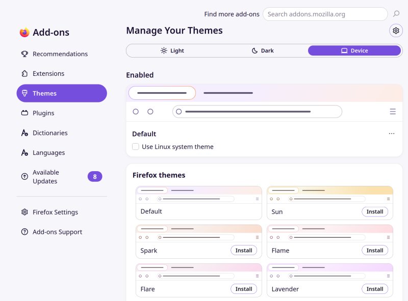
Linux can use a non-gradiented system theme
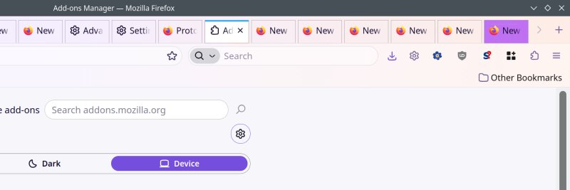
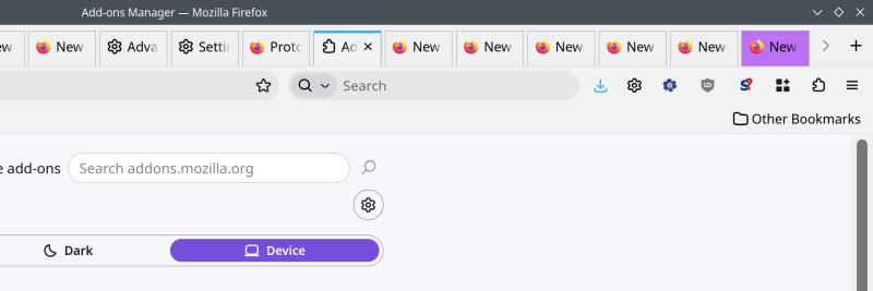
I don't know why, but Mozilla made it possible for Linux folks to simply untoggle the gradient-ness through the settings. Tick the box, done. Basically, this gives you a simple, plain, Proton-like theme without being Proton. Again, we will need to implement a few tiny changes here and there. Anyway, before and after:
Still other themes
If none of this works for you, take a look at my recent Firefox themes article. It shows how you can use a non-default Mozilla-made theme to work around the contrast and coloring problems in the ever-changing Firefox UI repertoire. For instance, using the likes of Visionary or Activist will actually help you work around all sorts of Nova-related issues, including gradients. In fact, these alternative themes work surprisingly well in combination with Firefox 157. Go figure.

Small CSS tweaks
Now, let's do some tiny changes. Really small ones. Let's get rid of that accent line and make our tabs a bit taller, and move the tab text a bit higher. I would recommend you consult my Firefox UI tutorial on both how to identify and style parts of the browser UI. Yes, it's a bit tedious, but you get nice results.
To get rid of the container line:
.tab-context-line {
border-block: 0px !important;
}
And to make the tabs a bit prettier:
.tab-content {
padding-top: 5px !important;
height: 49px! important;
}
This is purely cosmetic, and the actual values depend on your needs and taste.
Conclusion
There you go. First, Nova ain't that bad, and I'm actually surprised that Mozilla managed to make a semi-decent overhaul of the UI. Can it be better? Sure. But it's reasonable, on its own. Two, you have tons of freedom to change the looks, which few other browsers allow. Three, you can both use a variety of default themes, use the Proton theme, remove gradients in Linux, or even opt for yet other Mozilla themes that both look great and bring vivid color to the browser, without harming the Nova feel. And if this still isn't enough, you can go wild with manual CSS tweaks. Interestingly, most if not all of my changes from the Proton era seem to hold quite well.
I would like for my software not to change, ever so often, or even never. I don't see much value in occasional visual changes, especially if their only purpose is to create a sense of freshness. Then, we must also contend with all sorts of modern, trendy vagaries, many of which will look cliche in a few years, hence another round of changes. The better solution would be to stick to simple ergonomics, and provide clean UIs with bright colors and excellent contrast. At the end of the day, I doubt the snazzy looks and angles are what decides the bulk of the browser share any which way. All that said, Firefox 157 Nova is a'right. Peace and fun.
Cheers.