Updated: October 3, 2018
Recently, Google started enforcing its new looks onto Gmail users, without the ability to switch back to old (classic) Gmail. Until a few days ago, you could go back to the older version. Not anymore. The problem is, the new interface is designed primarily for mobile use. It is aesthetically pleasing but ergonomically inferior.
Like any mobile product, everywhere, throughout the galaxy, once it's applied to the desktop, it does not work or look as well as it should. Here, the main reason is - the use of the Roboto fonts. In this guide, I will show you several tricks you can use to recreate the classic looks and enjoy improved visual clarity on the desktop.
Problems with the new Gmail interface
People will say - you need to embrace the change. No. You do not. You need to embrace good change and resist change that is done for the sake of it, or one which harms your productivity. Google's product, Google's rules, right, so that's fine, but the issue is, the new interface is not as suitable for desktop use as its predecessor. I've actually spent a few days testing this thing, writing down all the issues that I've encountered.
The new interface loads more slowly than before (especially in Firefox). It takes about 2-3 seconds longer to transition from login to inbox, including the new splash animation. I can already see the development logic here. Mobile users don't really sign into their inboxes, and the apps often load in the background. On the desktop, if you're signed in, you won't notice the time effect either. I guess this is the target state Google aims for. But if you sign into your Gmail account to check new messages and then sign out, then you will suffer a penalty of a few seconds on each load compared to the classic interface.
The new interface also crashed on me a few times - the inbox would load, and then I'd be thrown back to the login screen, and on the next login, there would be a system error notification. This never ever happened to me before with the classic interface.

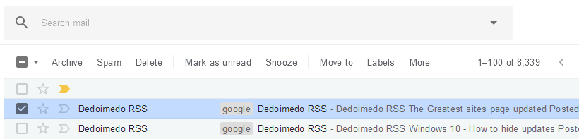
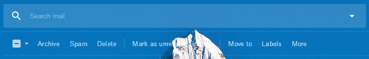
The new interface is less efficient. For instance, you need to click Reply and then type - this is a typical mobile usage stuff forced onto the desktop, and it fails. An extra mouse click. A waste of life. Much like any product created in the past few years. Windows 10 settings menu versus old control panel, WordPress Gutenberg versus the current TinyMCE editor. More and more and more and more mouse clicks. Life goes away trying to do things instead of doing them. That way lies mediocrity. Oh the humanity.
The Roboto fonts are sub-optimal and look worse than Arial. I've already mentioned the Roboto fonts in my POP!_OS Linux distro review. These fonts might appeal to younger people and might render nicely on the phones, but they are not suitable for prolonged reading (which you don't do on mobile) and render all fuzzy on the desktop. And before you dare say - it's your setup, no it's not my setup. I've tested this on a range of operating systems and browsers on a range of devices, including 14 to 24 inch range and resolutions anywhere from 1366x768px via HD to full 4K. Roboto fonts might be hip and cool but they are not good on the eye.

The font is not easily readable, especially bolded items.
Now ignore the curmudgeon's rant on fonts and ...
The new interface is less legible than the old one. When using themes (official ones), some of the buttons may not be visible against the background image. Gmail does try to use light/dark buttons based on the theme, but in some cases, this does not work well. This never happened with the classic interface. Whether you like Roboto or not, this is not good. I did play around with fonts (as you can see), but the icons need a separate remedy. And even with labels, it can be a tricky game.
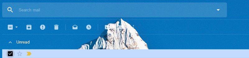
You also need to guess what the icons actually mean.

Another example - the same theme, different time of day. Even with other fonts + labels, this is hard to read.
The new interface comes with a bunch of new activities, like smart text, mail suggestions and nudges, most of which are rather counterproductive. For instance, I received an email from my editor, in which they sent some suggestions for one of the chapters in my System Administration Ethics book. At the end of the email, Gmail had a few templates for quick replies.
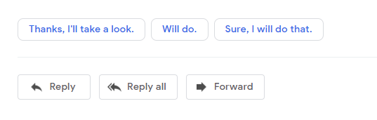
This is horrible on many levels. One, I never write like that. NEVER. Google has my email, they can scan all my messages, and this is the best the "deep learning" algorithms can come up with? This maybe works for some random chode on a phone who struggles writing complete sentences, but this is an insult to my intelligence and if I were to write this to my editor, it would be an insult to theirs, too. This might even hurt my business reputation if I were to reply like some double-digit IQ simian.
I don't mind new technology, but it needs to be meaningful. It needs to add VALUE. This adds nothing but visual noise. I also sort of feel slighted that someone feels it's their job to help me write emails. I don't need any help, thank you.
Actually, this new interface just might be the change that will prompt me to start migrating away from Gmail. A strategic overhaul. I never take decisions lightly, and this won't be an overnight revolution, more of a good few years of planning things carefully and making a seamless, efficient transition. But if I have to use products designed for dumb smart phone users with double-digit IQ, then I refuse to do so, down to the quantum level. For now though, let me show you what you can do to regain some of the old productivity back.
Change new Gmail interface fonts
I spent a while fiddling around, and realized that the only way to actually use the new Gmail without serious eye pain is to force an accessibility change. BTW, Gmail folks, you could really make a difference in the tech world industry by offering accessibility options to the visually impaired. Offering choice in font family and size changes does not need to significantly make your product development more difficult or complex, but it could mean a world to a whole range of Gmail users.
Anyway, I went about thinking how to change this. I realized I would need to do something similar to when I forced the background color in Office Online to be white using a CSS override. Here, I decided to implement this as a constant change, which meant a Javascript trick. I went about searching for existing scripts, and I did find something that looked like a good baseline template, a script by Michael Hulse, which changes the font size in Gmail. I made tiny tweaks to the script to also include the family font override I needed, from Roboto to Arial, which used to be the font in the older, classic interface - you may have already guessed this would be the direction, based on some of the screenshots earlier.
GreaseMonkey & Tampermonkey
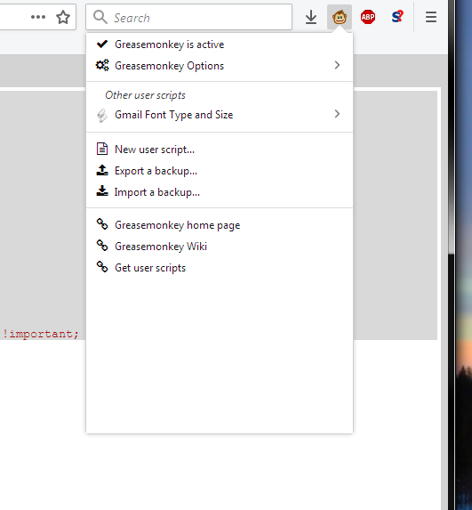
To implement this, I decided to use GreaseMonkey in Firefox and Tampermonkey in Chrome, browser extensions that allow you to load scripts on demand and modify how pages behave and respond. With this particular edit, the change is minimal - a few CSS classes are changed so they use a different font. That's all. Very simple. Anyway, the script reads as follows:
// ==UserScript==
// @name Gmail Font Type and Size
// @include https://mail.google.com/mail*
// @description Set Gmail font to classic view
// @version 1.0
// ==/UserScript==
(function() {
'use strict';
function addGlobalStyle(css) {
var head, style;
head = document.getElementsByTagName('head')[0];
if (!head) { return; }
style = document.createElement('style');
style.type = 'text/css';
style.innerHTML = css;
head.appendChild(style);
}
addGlobalStyle('* { font-family: Arial, sans-serif !important;
font-size: 10pt !important; }');
})();
The next step is to add this to GreaseMonkey and/or Tampermonkey, and reload Gmail. You will be able to see the changes right away. You can edit the font family to anything you like. You can also change the font size to anything you like. I noticed that size 10 points corresponds to the old interface default. Moreover, I also noticed that using only sans-serif as the font family declaration works best. Rather than Arial, sans-serif, just use sans-serif. See below:
addGlobalStyle('* { font-family: sans-serif !important;
font-size: 10pt !important; }');
})();
Other changes
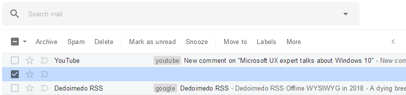
You can also use text instead of icons to display mail functions (under Settings). This gives much better visibility of what you're doing. This is closer in spirit to what the classic interface did, and it's much easier to use and navigate. This + fonts change = big progress. Find the right theme for best contrast results.
![]()
Plus of course, you can disable the new replies, nudges, etc. Now, the one thing that you cannot currently change is the Smart Reply functionality. Apparently, Google will add the ability to disable this on the desktop, but it's not there just yet. Therefore, you need a different tweak. Specifically, if you use an Adblocker like Adblock Plus, you can add a custom filter and block the cheesy nonsense replies. Under Adblock Plus, click Options, then go to the Advanced tab. Toward the bottom, under Create and edit your filter list, click Start writing my filter list.
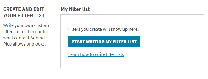
In the box, you will need a custom filter. Just add the following:
mail.google.com##.brb
Save, reload Gmail, and the Smart Replies will be gone.

Final looks
And here we go, as good as new, I mean old (with Arial):
And with sans-serif only in the CSS rule:
More reading
A few other interesting articles on this and related topics:
Roboto
Is Was a Four-headed Frankenfont
Unity forum discussion on Roboto fonts
Conclusion
Every day, more and more products turn mobile all the way, leaving the desktop in the lurches. And by that, they also leave efficiency and productivity behind. Aesthetics trump functionality, and this makes me a very sad user of modern technology. Because my time is wasted fighting design decisions that feel arbitrary, cool and pointless.
Google can do whatever they want with Gmail. After all, it's their product. And overall, I like Gmail. But then, there comes this new interface, it's slower, less stable, the fonts are worse, it's harder to use quick mail actions, and you get suggestions that are irrelevant. That's not progress in my book. That does not make anything better. Ah well. Hopefully, this little guide will give you some of the efficiency and productivity back. I do hope Gmail re-takes into consideration ergonomics and health and not just the levels of visual hipness, because in the end, it's about users. Somewhere in the last few years, that has been forgotten, across the entire IT industry. Take care, fellow members of the Borg.
Cheers.