Updated: April 15, 2020
My overall experience with Microsoft product has been largely bi-polar over the years. Either it's brilliant or chute d'oiseaux par excellence, with a rare meh in between. For example, the EMET framework or Windows Phone, the best thing since sliced bread and space-based lasers. But then, you have things like Windows 8 Start Menu or the Settings in Windows 10, which challenge my chromosomes.
Edge, the browser, is another example. I loved it on my Lumia 950. It was fast and elegant. On the desktop, it's a paperweight. Useless. But then, having recently done some testing with Firefox Preview, I decided to put aside my anguish and sense of disillusionment after the demise of the Windows Phone, and give Edge another chance. Only on Android this time.
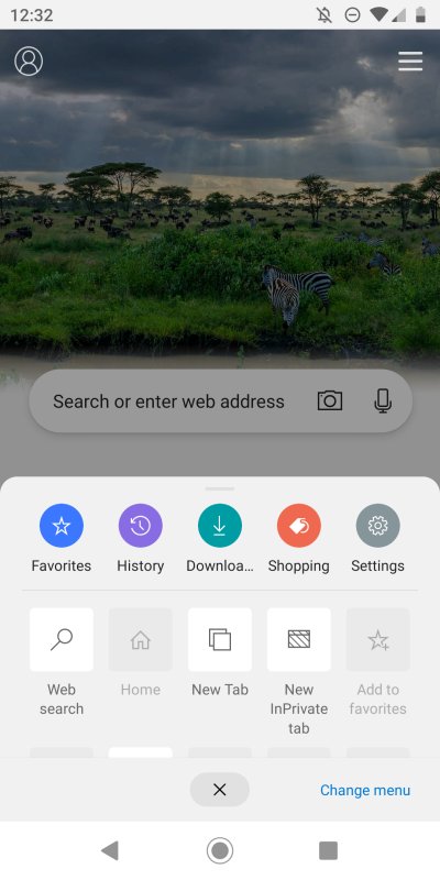
A plethora of checkboxes
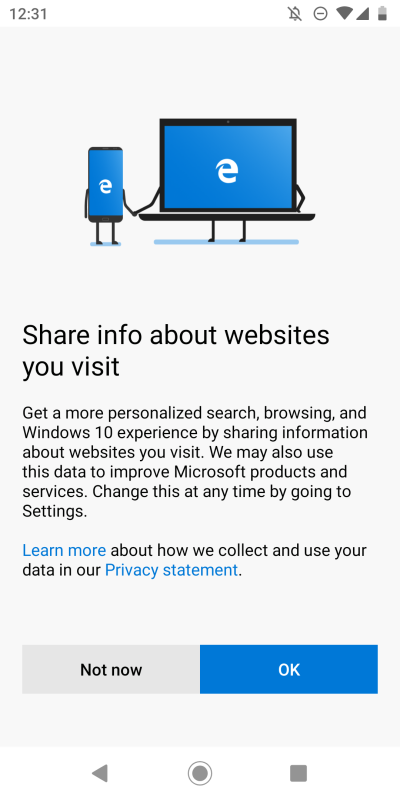
I installed the browser. Check. I looked what permissions are set for the app. Nothing. Good. Check. I launched the browser and went through the initial configuration. Annoyingly, you are asked to sign in with a Microsoft account, but then, you can skip this if you don't like the idea.


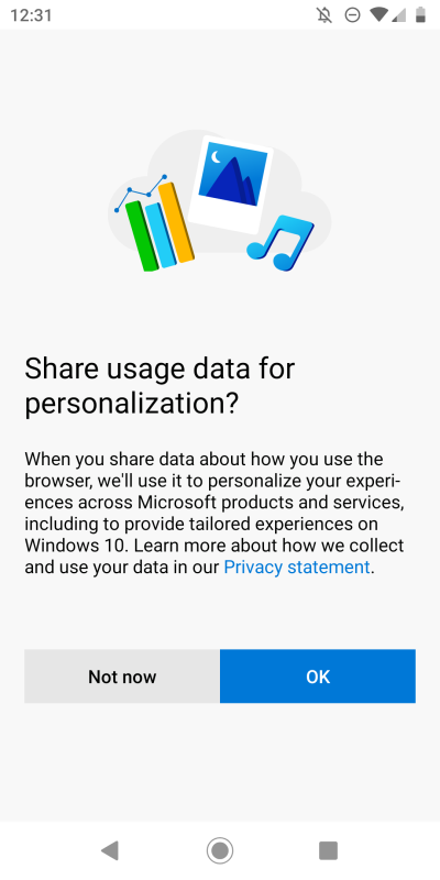
Then, in a matter rather similar to Windows 10, as I've recently shown you on me new desktop setup, you're asked a few more silly questions about search and browsing info sharing and such. This wouldn't be a problem really if personalized data was actually properly tailored - which it never is, ever, on any platform, and if data wasn't so easily leaked and lost.
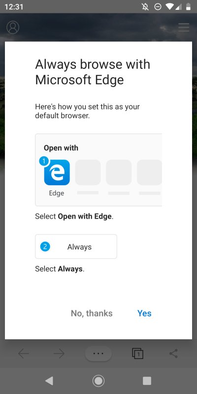
Then, more peskiness - making Edge the default browser. I mean, shouldn't you give me a few minutes to actually try the product before I make it my primary choice? I've not see a single webpage yet, just a bunch of questions. Ah well, almost there.
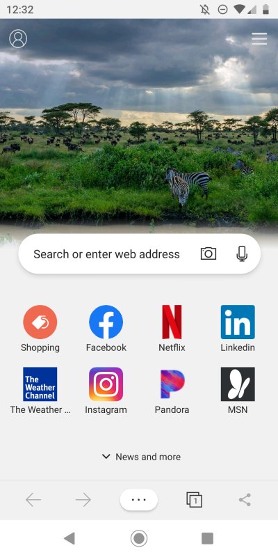
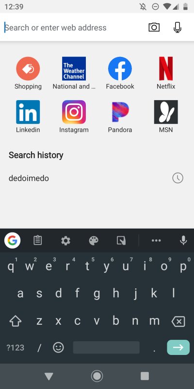
Once this step is complete, you will see the default browser home page slash new tab page. And right there, there's a huge problem. While Bing images are often cool, I don't really need to see them when I launch the browser. Nor am I interested in those shortcuts. With the region set to US English, this is what you get. Now, I know this is meant to cater to the average simian, but that also means people with six-digit IQ will be angry when they land on a page like that.
Pull-up menu & customization
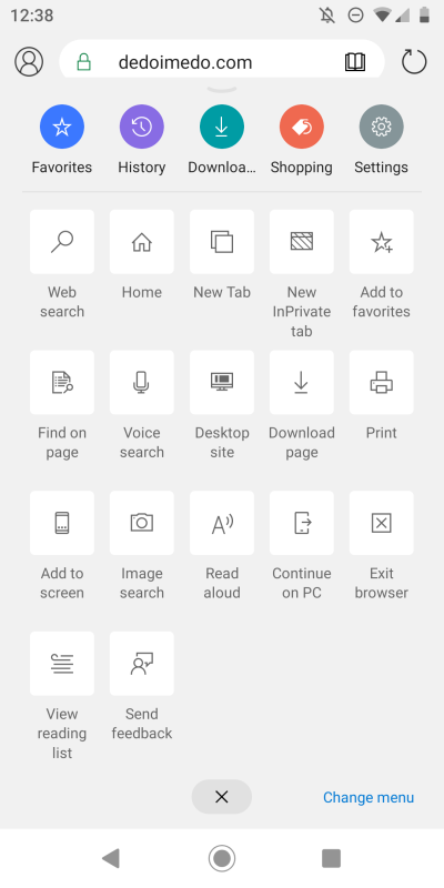
The browser interface is a bit odd - and comes with its own set of inconsistencies, much like Firefox Preview. The search box (Bing by default) is your address bar. Mimics the Android home screen, but this is not how a browser should look like. Then, there's the three-dot menu at the bottom - and that's where you actually get things like Settings, InPrivate mode and whatnot. A weird placement by all means.
The hamburger menu in the top right is what you'd think would be the above, but no. That's just to change the layout of the home page. Ah, there's nothing like the word Inspirational to ruin your day. Some faux happy nonsense for the almond-milk first-worlders who don't have enough emotional integrity to find the meaning of life within themselves.

Under Custom, you get get rid of some of the nonsense. Looks much better - but wait, this is only a temporary reprieve, as problems will emerge once again as you start browsing - and creating new tabs. Still, the fact you can't get rid of some of the elements is annoying. Do I really need the gigantic logo? Can I have the search box placed at the top or bottom rather than almost arbitrary bottom-third of the screen?


I went into the Settings next, option by option. There's a lot of stuff, so you need time and patience. But this is rather commendable, because it lets you really tweak Edge. Quite often, mobile applications are minimalistic, and you don't have much freedom in what they do, and how they behave.
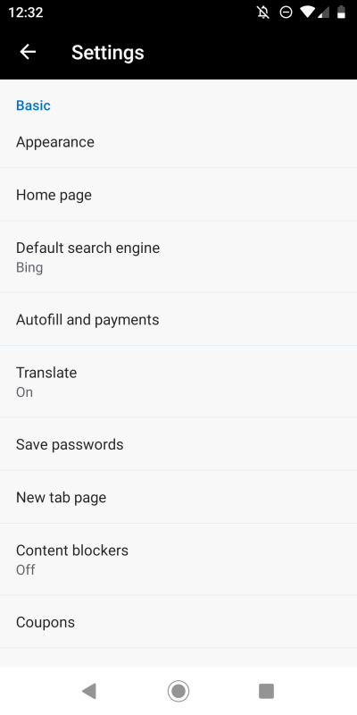
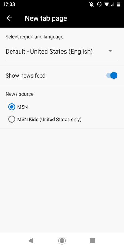
News feed, really? MSN as the only option, really?
Privacy and security, content blocking
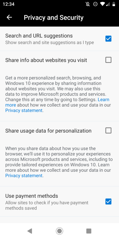
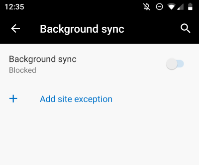
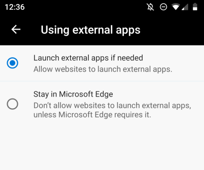
Most of the stuff is similar to Chrome. But then you get a bit more, methinks. Those two options we skipped on first launch - not checked, good. You can further trim down what's being sent to the mothership, including even crash reports. You can disable autoplay, which is another "modern" annoyance. Don't forget background sync and external apps. This is good, and fairly practical overall.

Then, I discovered something called honey. What. Coupons? What.
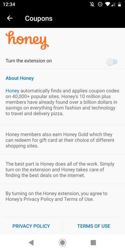
Interestingly, this is an integral part of the browser. Then, you will find Adblock Plus (or at least I did), and it will even tell you to turn off Acceptable ads, if you're so inclined. I wonder why there's only one content blocker available, and if there's any correlation to existing content blockers I am using in other browsers on the device. Perhaps. Either way, this is a good thing, meaning you can browse without low-IQ, high-JS stuff slowing down your browsing experience and wasting your battery life.

Browsing
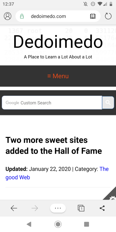
Now, the important part. Overall, Edge is fast, snappy. It saves some on animation, which makes transitions more abrupt, but then, they also feel instant. For most people, this is important, as it gives them the sense of speed they expect - and can appreciate. No one really cares about Javascript benchmarks, and frankly, no one should ever.
Here, we hit the inconsistency corner again. Once you actually get content loaded, predictably, the address bar is shown at the top of the browser interface. But it does split the experience between top and bottom views, as the navigation controls are not close to the URL. Limited space, I know, but still. There's a difference between using an adjacent overflow menu and moving your hand down 5-6 inches, however big your screen is.
The full menu is overloaded with stuff, and in a way, all these options are quite cool, and in a way, it explains why this kind of menu is needed. I like the approach, but then, there's a bit too much stuff. My feeling is Microsoft tried to distinguish their browser from everyone else by offering a more detailed, user-focused interface, but you can't really get the desktop-level of information quality and density and not overcomplicate things on the phone.
The worst thing is - new tab and actual search. When you type, you get those website icons right under the address bar. Too much color, distracting. I don't want to see anything when I'm searching, just the stuff that actually interests me. Notice the difference between US English and International English versions. Seems arbitrary.
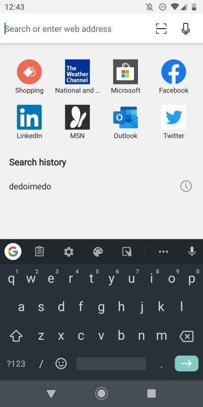
For all the options and settings available in Edge, I couldn't find anything that disables those pinned icons. The whole dial pad thing is so wrong - and it also exists in Chrome. There, you can't remove them either. The same problem currently affects Firefox Preview. But not Firefox. There's a browser where about:blank means just that, and that's how it should be. Not everything is an opportunity to shove ads down people's throats. I couldn't care less about social media, shopping or so-called news. But there you have it.
Conclusion
Overall, Microsoft Edge for Android is a surprisingly decent browser. I was expecting something far more chaotic, but it's actually a pretty streamlined product. Fast, reasonably stylish, with lots of options and tweaks, including content blocking. Very nice.
But then, the interface is somewhat inconsistent, and for all the lovely customization, the one thing you can't get rid of are silly icons that pollute the tab space, and make you feel like you're participating as an extra in the most prophetic movie of all time, Idiocracy. And that's exactly the bi-polar experience that I've always had with Microsoft products. Brilliance, and then, boom, you get hit with a low-IQ brick in your face. You just know that this is forced wedlock between solid engineering and soulless sales. And unfortunately, this is the norm in the modern reality, especially across the lawless steppe of the mobile world.
The other problem is, Edge and Chrome are quite similar. The actual value of one over the other is subtle, but then, competition is awesome. In the long run, it means we could actually get better products. More variety, maybe more freedom or control. Anyway, I'd say for those looking for a somewhat revamped Chrome experience, Edge offers a fresh take. For me, though, at the end of the day, it's Firefox that does the most reasonable job. Cleanest interface, solid control throughout, by far the best and widest range of extensions, and decent speed nonetheless. Even Firefox Preview doesn't cut it.
So there we are. For me, Edge the way it was on my beloved Lumia remains the high point. This is a welcome, encouraging development, pretty solid even, but, but, but ... it will take more than that to win my heart and mind. Swipe away.
Cheers.