Updated: February 19, 2021
I first tried VLC around 2003 or so. It wasn't a good experience. The player's interface showed me a garbled view of the video file I was trying to play. Then, in 2006 or so, I tried it again. Since, it's become my staple media player on every single platform and operating system, including the mobile. The reasons are many: the king of codecs, tons of features, a simple no-frills interface.
Recently, the VLC team has started working on a visual revamp of the UI, which should come live in version 4.0. This marks a significant departure from the established look & feel of the player, which really hasn't seen any big visual updates throughout its history. So I thought, let's have a look at the early work and see what the future has in store for us. Early impressions, don't get too excited, things may rapidly evolve and change and whatnot. Follow me.
The touch menace strikes again
As soon as I launched the new player I was dismayed. Right away, I saw tons of problems, none of which are present in the old - VLC 3.X interface. The application launches with the Video "tab" open by default. Previously, or currently, VLC launches into a neutral screen that does not show or list any existing files or clips.
So I thought, OK, let's browse for a video file and play it. Except, you can't browse the local filesystem. VLC 4.0 shows you a bunch of location handlers, but it does not show you your disk! You need the file menu for that, which is hidden behind a three-dot icon in the right corner of the interface.
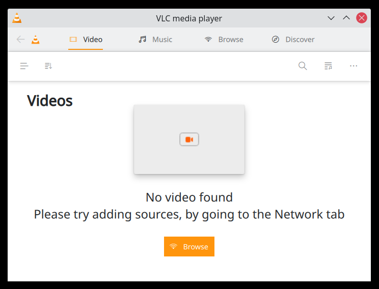
There's no Network tab. And why network. I want LOCAL disk!
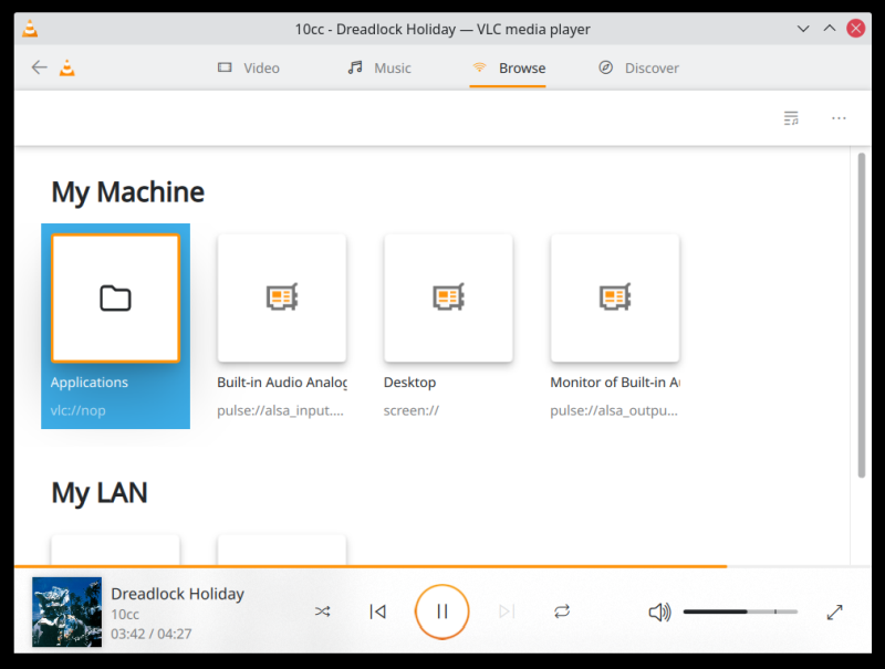
Under Browse, you get all sorts of protocols, even Samba shares. But local disk, nope.
Touch nonsense right there. The old player has the menu shown permanently, so you need fewer clicks to get to the desired action. As always, ALWAYS, when you introduce touch stuff to the desktop, you lose efficiency.
The new UI also uses pale gray-on-gray colors - bad ergonomics. You can zoom in and out inside the main interface with Ctrl + mouse scroll - like you're in some browser. This rearranges the UI elements constantly, including changing the actual tab bar. So you don't have a simple and predictable layout you can rely on.

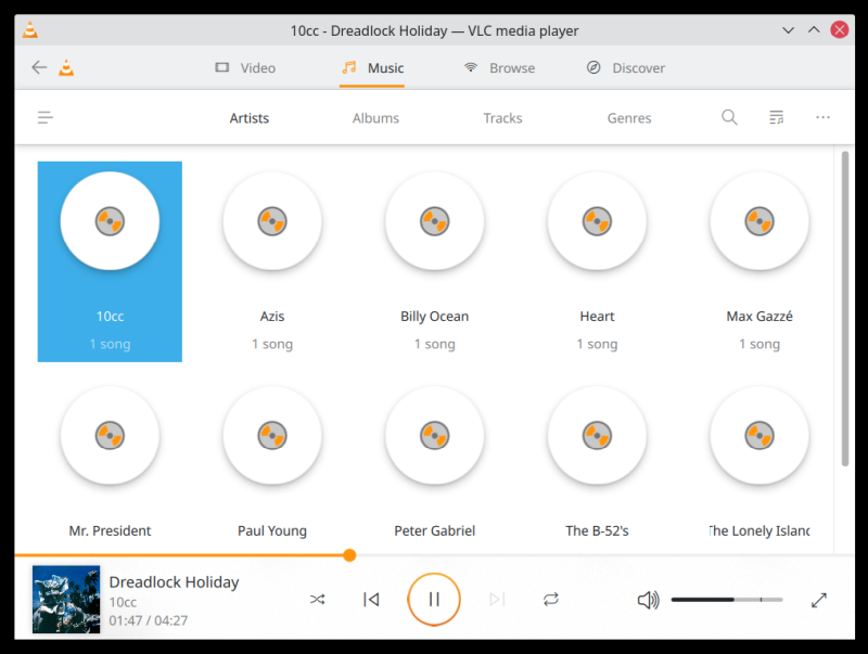
Notice how Tracks and Genres does not align with Browse and Discover above. The menu needs extra mouse clicks for what you can do quickly and easily in version 3.X. The colors are pale. There are visual artifacts all over the place - the line under Help, the red line on the Play button, etc - but these are the least of our worries.
The new interface is not only less navigable and legible, it's also slower. The whole thing responded more sluggishly to my actions than 3.X. This is probably not important at this stage in the version's development cycle, but it is indicative nonetheless that whatever new implementation is used, it's less efficient than the old one.
My music clips have no art preview. The old VLC, as I've already shown you, can do this quite elegantly. The whole thing reminds me of what VLC looks like on the phone. Except ... that's a phone! This is a desktop! Not only that, on the phone, the interface is actually more coherent, better integrated, and the font clarity and contrast are sharper. Why do I need this touch nonsense on my PC?
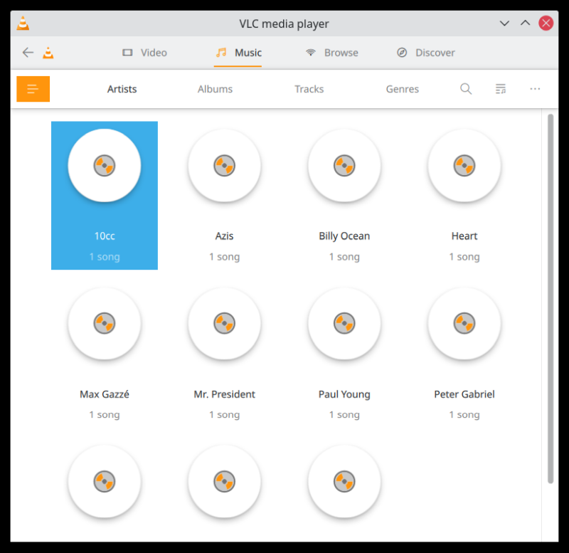
Great, my 27-inch screen now shows album previews that are about the same size as a real CD.
Playing video
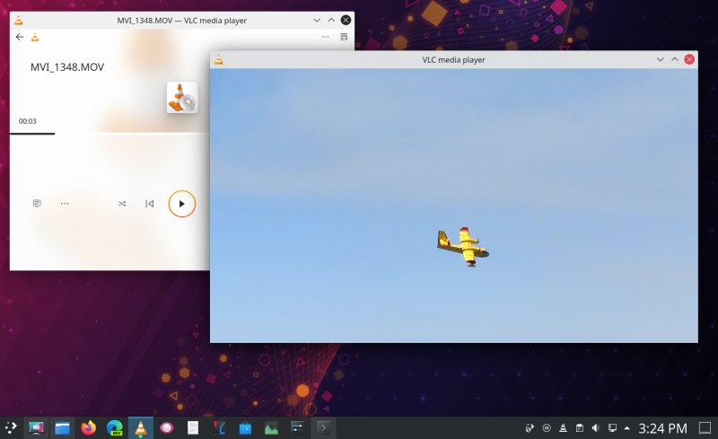
So music, no thumbnails, ok. But video, now that's a hot potato. The video clips actually open in SEPARATE window! You get a borderless frame that plays the actual content, with no controls whatsoever. Mouse clicks don't pause the video, you need the space bar, or to switch context to the main interface. Why? How is this a good thing? Even if we put aside the massive loss of efficiency due to the increased amount of clicks and actions, if someone is watching a video, why would they need to Alt-Tab into a different window to control the first one? That's like saying you use Firefox, but then need to switch to Thunderbird to open a new tab.

This is an example of a video file playback - the interface is not where the video is.
And just like that, my heart sank ...
Bad contrast, misaligned elements, extra mouse clicks, inefficient workflow. A far, far, far cry from what VLC is - a Swiss Army knife of media that does things extremely well. VLC is probably the most installed software in my arsenal. While I do install this or that application on this or that computer, VLC is the one program that gets installed everywhere, every time.
Not just that, I really enjoyed my journey with VLC, discovering its many powers and uses. Over the years, I've written dozens of articles on VLC, showing you how to accomplish tons of useful, practical and fairly advanced tasks - like embedding subtitles into videos, for instance. If this is VLC's future, I'm not sure if there are going to be any more VLC articles from me. In a nutshell, it comes down to this. Always remember:
On the desktop, any "touch" application or UI is 100% inferior to the classic desktop formula.
Any software developed using "modern" methodologies is inferior to the slow and steady approach.
Conclusion
Does VLC have a perfect UI? No. Does it need a redesign? Perhaps. Is the new UI concept showcased in early builds of version 4.0 the answer to this need? No, absolutely not. Even without going into specifics, the fact it is touch-inspired tells you everything you need to know. There are ZERO cases where a desktop program was made better by using anything from the mobile world. ZERO.
I hope this UI does not become a thing. Because if it does, I really see no use for this magnificent program on my machines anymore. I'll stay with 3.X builds for as long as possible, maybe even compile it myself, and if things stop working after that, so be it. I have no use for touch nonsense on my desktop. Life is too precious for that. At this point, I might as well go live on a farm somewhere, growing Brussels sprouts. Thus endeth another depressing article.
Cheers.