Updated: May 23, 2025
I've sort of stopped doing distro reviews in the past few years, but here and then, I do download an ISO or two, and commit to a couple of hours of rigorous testing. Now, I mostly do that with distributions that interest me on some level, even if I may not choose to personally use them day to day. Fedora is a good example. 'Tis a system I wouldn't run on me boxen, but then, I like and respect its stubbornness, its state-of-art approach, and the fact it innovates, for better or worse, except, of course, Wayland, PulseAudio and systemd, that is.
With Fedora 42 as the new version out there, it's time for a fresh article. And no, I'm not going to be doing any cliche Douglas Adams quotes. That would be too crude. What I am going to do is test the Gnome edition, yup. After all, if you wanna Gnome, you might as well do it with Fedora. My test system is the dual-boot IdeaPad 3, a somewhat older system (brand new in my mind), which currently houses the useless Windows 11 test instance and Zorin OS, from a recent endeavor. NVMe storage, though. Let's begin.

New installer, what!
Finally. Remember that anti-ergonomic installer first introduced in Fedora 18? It's gone! No more. And good news, Fedora's team has actually brought in a rather sensible replacement. Now, it ain't perfect, and it's reminiscent of how Ubuntu has been doing it for the past decade plus. Nevertheless, it's parsecs ahead of the previous tool, plus, on its own, objectively, it's a reasonably useful, intuitive utility.
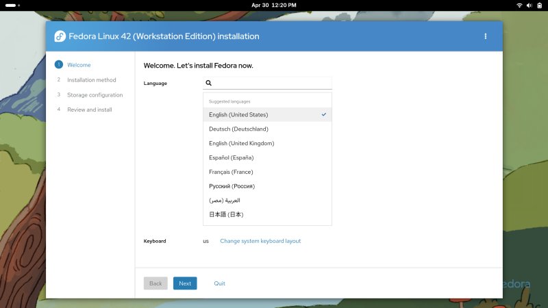

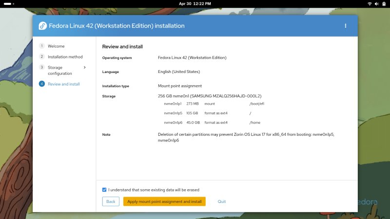
The new wizard actually uses sensible, non-nerdy terms where possible, and this is a good thing, although I'm not sure it's actually possible to create a partitioning tool that isn't at least somewhat buzzwordy. The new installer offered similar options to what you'd see in Ubuntu: a side-by-side setup, whole disk use, and manual configuration (called Mount point assignment). The last isn't 100% accurate, as you can also format partitions.

Notice the change in wording. Now, it's called Manual disk configuration: Mount point mapping. There are a lot of small problems here. First, the use of all-too-pale font, a modern problem prevalent in lots and lots of operating systems who go for boring, depressing flatness as the style de jour. Everyone, please stop with depressing-chic layered on top of despondent-decor. Gray on gray isn't modern or cool or useful. It's soulless and pointless. The 1960s brutalism had more passion than this.
Second, you don't know how existing partitions are used. Non-techies could accidentally overwrite important data. It would be highly beneficial to show more information, especially since the installer already knows about it (as it correctly detected Windows and Zorin). Third, when you add extra mount points, there's no list to choose from, like the common stuff /home, /var, and such. Fourth, partitions with selected mount points are always shown in the list, and that can add further confusion. Fifth, I'm not sure why /boot is shown separately, but not other parts of the filesystem. Sixth, I couldn't find any option to encrypt partitions. There don't seem to be any option for RAID or LVM, either. Filesystem choice? Hm.

I couldn't proceed to the next step until I deleted /boot from the list of mount points. Overall, like I said, not perfect, but it's quite all right. However, notice the custom partition /home being indented about 10 px to the right compared to the required partitions above. Oh, my OCD pixies be shivering.

The partitioning summary tells you that Zorin will be displaced - this info could have been provided earlier, to give helpful clues to the user. Most importantly, it would help the user identify their Windows setup, so they don't delete or destroy it by accident.
After this, the installation started. The progress status is way prettier than before. It took about ten minutes for the installation to complete. And when I say complete, I mean fail. Yup. The wizard failed setting up the bootloader for some reason.


The wizard also tried to restart itself, but it failed to do so. At this point, the installer became completely unresponsive, and I couldn't click the Quit button. I had to go to the command line, and kill a whole bunch of processes, roughly a dozen of them, including a number of python3 scripts related to Anaconda, the name of the installer, that is.
I didn't reboot. I restarted the installation process. This time, it worked fine. Go figure. The process took about 12 minutes or so, but it does not include the user setup portion. That happens after the first boot.

There were a few other niggles during this setup. One, the system was ultra-slow. For example, you take a screenshot, and you click on the notification to view the image. The process could take 10-15 seconds. The command line wasn't responsive. The system would often hang or freeze for a few moments. Looking at the Activities overview, the installer was shown as Firefox, and the actual browser couldn't start. So, better, and much buggier, at the same time.

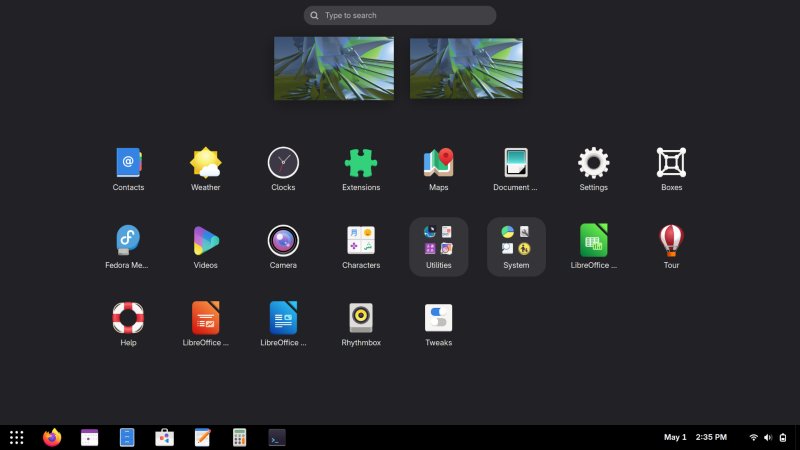
The Gnome desktop
I know this isn't strictly related to Fedora. And yet, Fedora is the face of Gnome, and vice versa. You cannot really decouple Gnome from Red Hat. In a way, Fedora is the one distro where you can get the pure, vanilla Gnome experience, and before any other distro. So I have to include this part in the review. Now, I could have used a different desktop environment, but I wanted to see what gives.
Interestingly, in some ways, the Gnome desktop surprised me for the better. It others, the experience was worse than I had expected (with very low expectations to begin with). Let me elaborate then.
In the live session, the desktop performance and responsiveness were quite bad. Among the worst I've seen on this machine, and among the slowest live sessions I've tested in quite a while. In the installed system, the speed is much better, but still behind non-Gnome desktops. It works fine, but there's perceptible lag.
The semi-good news: you can log out of your Gnome session and log in with Gnome Classic. This is still Wayland, and there's no X11 option (more on this soon), but at least you get a more ergonomic if not quite perfect desktop setup. There's a top panel with visible menu categories, and a bottom panel where you can see your open windows. No panel shortcuts for your favorite applications, though.
Most cardinally, the performance in Gnome Classic is BETTER than standard Gnome. More responsive, more fluid. It would be great if one could turn off all animations and desktop effects, and even disable the compositor, alas, you can't do that with Wayland, from what I know. Not designed for "old" systems, so to speak. A travesty, but just wait.

Gnome Classic is snappier, faster than default Gnome. A lot.
Another good thing, the Classic session gives you minimize/maximize buttons by default! Golly! However, not all programs used them. The Text Editor didn't, but then, after I closed and reopened the program, it did. So there's a bug somewhere.

Classic gives you normal, sane min/max buttons.
I decided to log back into the standard session and customize the look and feel. To that end, I installed Gnome Tweaks. The program informed me that extensions management is no longer done through its interface, and that I needed another tool, Gnome Extensions. This is a bit messy, but at least both utilities are available in Fedora's standard repositories, and you don't need to use Flatpak for that.

Why recommend Flathub if the tool is available in the repos?
However, extensions management is still wonky. I had to navigate to the correct page in Firefox, ignore the notification message about the system component (chrome, unrelated to Chrome), and I installed the fabulous Dash2Panel extension. Superb. A classic panel with pinned application launchers. This restores sanity and efficiency right away. Fewer mouse clicks, better visibility, better situational awareness.
This will forever remain one of the weak points of Gnome. I cannot understand or reconcile with the decision to not allow the basics like windows buttons, show desktop button, an instant view of running programs, and a set of application shortcuts. Each one of these requires extra mouse clicks in Gnome. And of course, the nerds will tell you, use keyboard shortcuts. The answer is, no. Make the system efficient regardless of which peripherals are used. For that matter, why not make the system voice only and dispense with the keyboard? This is Windows 8 Metro level of bad.
The font clarity is meh. The font contrast is meh. You can't do much here unless you compile your own themes, another reason why Gnome is an anti-ergonomic desktop. So much in fact that Linux Mint just recently announced it will fork the underlying theming engine (LibAdwaita). The new thing will allow the creation and use of new themes (like you could do in the past via Gnome Tweaks). It's called LibAdapta, and I'm very happy with this change. I don't like the endless forking in the Linux space, but sometimes, it is necessary, to combat silly decisions. And in many ways, Microsoft-like decisions. Forcing end users to use THE ONE interface is not the open-source way. When big corpos do it, it's evil reincarnate. When Linux projects do it, it's something else? Where's that hallowed open-source choice, so to speak? Sure, if that means compiling programs, then yes, plenty of choice! Ergonomics ftw!
Furthermore, the interface is way too pale, way too flat, way too lifeless. At least changing icons is still doable. I downloaded the lovely Papirus set, copied the files to ~/.icons, and then, I could make the necessary changes through Gnome Tweaks. Yup, the default icon set is rather bland and boring. Later on, I realized that Papirus is actually available in Fedora's repos. No need for any extra downloads. Noice.
On the plus side, the Gnome desktop is more consistent than ever before, and prettier, compared to itself, than ever before. It looks more posh, more slick, more organized, and while I find the workflow choices atrocious, at least there is a semblance of repetition and pattern across the desktop. Technically speaking, this ain't an ugly desktop at all. I might even say it's rather nice. I can't get past the paleness and flatness, though. Or the anti-ergonomic, anti-desktop, anti-user-choice design.
Wayland (is not good)
This is another crucial part of the experience, and again, Fedora = Wayland, Wayland = Fedora. In many ways, you can't disconnect Gnome from Wayland from Fedora, any which permutation you choose. What makes this even more controversial is the deliberate choice, by the Fedora team, to drop X11 components. You can no longer use the X11 session, for instance. Soon, they will drop Xorg altogether.
This wouldn't be a problem, except ... Wayland is still not good. Fifteen years on, still beta.
Moreover, X11 and Xorg are actively maintained. Don't believe the hype. There's nothing missing in the old stack except the fact it's old. And it's getting security fixes and functionality improvements, while actually offering proper desktop usage for all the different hardware models, graphics cards, and whatnot.
Again, Wayland feels like a pure a-la Microsoft move. Exactly like replacing Control Panel with Settings, except the new tool is 100x more inferior, incomplete, less efficient, less useful, less everything. Here, too, X11 is being supposedly "deprecated" (sidelined on purpose really) while the new thing can't do what the old one does. Still, still! After fifteen years of development. But again, because we're talking Linux, this is somehow supposedly okay. Nope.
But it's not. It's a big middle finger to legacy software, to old games, to remote desktop, to VNC, to manual keyboard assignments, to many other wondrous things. I love Linux, but when it comes to backward compatibility, Microsoft is ahead. I can still run ancient Windows programs from 15-20 years without any modifications, whereas similar efforts in Linux, even with native tools, are more complex, more difficult, and often impossible.
For basic day-to-day stuff, sure, Wayland worked fine for me, and I encountered no issues. But then, I tried to play some old games. Like the amazing RTS title Pharaoh, which I recently shown you running in Linux, on UHD displays. I accomplished this using X11 tools - Xephyr, X11vnc, TigerVNC. Y'know, all X11 tools that have no real equivalent in Wayland. Yup.
So I tried to get Pharaoh running. Xephyr started all right. But X11vnc couldn't run.
01/05/2025 15:43:43 x11vnc version: 0.9.16 lastmod: 2019-01-05 pid: 7702
01/05/2025 15:43:43 Wayland display server detected.
01/05/2025 15:43:43 Wayland sessions are as of now only supported via -rawfb and the bundled
deskshot utility. Exiting.
So I tried with the raw framebuffer option:
-rawfb map:/dev/fb0@1536x1152x24
01/05/2025 15:45:57 closing X DISPLAY: :2 in rawfb mode.
01/05/2025 15:45:57 failed to open file: /dev/fb0, map:/dev/fb0
01/05/2025 15:45:57 open: No such file or directory
01/05/2025 15:45:57
01/05/2025 15:45:57 On Linux you may need to load a kernel module to enable
01/05/2025 15:45:57 the framebuffer device /dev/fb*; e.g.:
01/05/2025 15:45:57 vga=0x303 (and others) kernel boot parameter
01/05/2025 15:45:57 modprobe uvesafb
01/05/2025 15:45:57 modprobe radeonfb (card specific)
01/05/2025 15:45:57 modprobe nvidiafb (card specific, others)
01/05/2025 15:45:57 modprobe vesafb (?)
01/05/2025 15:45:57 modprobe vga16fb
Nope. These modules aren't around. They have been removed from Fedora. If you look at this page, all of the self-praise is about the benefits to Fedora, and none of it for the end user. From the link above:
Benefit to Fedora
Verified modern supported paths for cases currently handled by vesa/fbdev
Simpler support/testing matrix for QE
One less reason to need Xorg installed at all
And also:
User Experience
This change should be largely invisible ...
One less reason? How about 100 reasons why Xorg is needed? SSH with X forwarding, remapping keyboard keys, VNC sessions, remote desktop, old games, legacy software, ability to run without compositor, and many others. And no, the change is not invisible. Far from it.
Again, this is entirely dev-focused thing. Make it easier for devs to dev. Why not make it easier for users to use? Sure, the one usecase all the nerds bring up for how Wayland is great is how they can use three monitors, each with a different refresh rate and resolution. And beyond that?
Also, the one usecase all the nerds bring up for how X11 is bad is that you could have a "rogue" application install a keylogger and listen on your X session. This is absolute bollocks. One, if you install malware, then there's no end of possibilities to what it can do. Two, I can, with my basic knowledge of C and Linux kernel, write a keylogger in about 10 minutes. You simply need to hook the right device under /dev. That's it. There's no reason to go through X11. Lastly, in the past 20 years, there hasn't been one single case of where this particular doomsday scenario came to be. Instead, we had tons of cases of frivolously packaged software from random repositories and sources containing malicious packages, because modern software is cool, and the more dependencies you have, the better. Not related to Wayland, but definitely related to the baseless hype.
Fifteen years, Kathleen! Fifteen years!
But let's go back to the whole Linux-love-old-hardware, Linux-good-old-stuff mantra. It might be true, but then, most distros HATE old stuff, because old stuff is boring. They wanna play with new and nerdy stuff, and not care about something that happened in ancient times, i.e., more than three years ago.
In the same vein, this is why stuff like systemd sucks big time, why modern distros take 20-30 seconds to boot even on NVMe - more on this soon - because devs all use RAID-99 NVMe setups on their helium-cooled i11 processors, and then they feel frustrated when people with mechanical disks complain their distros are slow. I mentioned this in my Lenovo Y50 and then again Lenovo G50 revival articles. Three minutes to boot. A travesty. A joke. And never forget, Xubuntu used to boot in about 8-10 seconds on a device with MECHANICAL storage back in 2010 or so. Never forget.
The same applies to all these other "modern" solutions. You could say we need to move away from X11. But first, why? Second, why Wayland? If it hasn't shown its value after fifteen years, why not make something new and better and simpler? Third, what about legacy stuff? Old games? Are they not sacred and important enough to preserve?
Even if only 1% of people need this, so what. The whole of Linux is 1%, and we all get very angry when big companies, governments and banks "forget" about us or not offer official, supported tools for Linux. Because we're "too small". So how's this any different?
It's actually worse, because Linux folks should know better!
And this is the thing. Just think of Microsoft and their arbitrary decisions, especially replacing something that works with half-arsed, unfinished products. The same sort of judgment needs to be extended to Linux solutions. The whole open-source thingie does not cut it. It's irrelevant. What matters is that the end users are harmed in some way, and they have fewer options than before. That's the only thing that matters. But backward compatibility has never been a thing in Linux, except enterprises.
Is this a mega rant? Yes, it is. But I want to be able to use Linux freely, and to run my stuff freely, and Wayland doesn't allow that. If tomorrow Wayland offers me seamless functionality for everything, I repeat, everything, then perfect. I will happily use Wayland. I have nothing ideological against it - I'm simply 100% opposed to low-quality, inferior-quality replacements to working solutions, regardless of the domain. That's all.
But deep down, I know Wayland cannot do it. And so, brute force seems to be the way forward. Like removal of X11, for now. It won't stop there, of course. Progress will be had, and morale will improve, whether you like it or not. Somehow, it feels a lot worse when it's done in the open-source community than with the big corporation. I expect the big guys to try to screw me over. To see it done with the exact same gusto in the Linux domain feels awful.
Fedora day-to-day use
Okay, so we looked at the installer, we looked at the desktop, we looked at Wayland. Now, let's see how Fedora behaved in various common scenarios. Among the most cardinal elements - software management!
TL;DR: It was sort of okay, but rife with problems, but much less so than most other distros, especially smaller distros that try to mix various software sources like deb/rpm and Flatpak and alike. On first login, Fedora will ask you all sorts of questions, among them, whether you want to use third-party sources. This is good, but the problem is, you don't know what these sources are until you open Software and check the fine details.

As it turns out, Fedora activates a lot of sources, including its own Flatpaks, FlatHub, Chrome repo, plus several RPM repos. The inclusion of both Fedora Flatpaks and FlatHub is confusing, and I already wrote about this. Then, the availability of Copr seems weird. RPM Fusion seems to be enabled only for Steam and Nvidia drivers, but I'm not sure how that's implemented in the background. The list is nice, but I'm not happy about lots of these extras, again, as I noted in my Zorin OS review and the openSUSE Tumbleweed review.
What sets Fedora 42 apart, in a VERY good way, is that it actually lets you enable/disable these other sources, and you can also only show results from VERIFIED publishers (presumably on FlatHub), so this means you won't see potentially dubious results for popular software packaged by random people, trusted or not.


All of these elements make Fedora's implementation of Software decent. But then, if you want to do system updates, it tells you to "reboot & update". What a load of nonsense. This is the worst possible would-be nod to the Windows-like usage ever. It's also completely wrong, counterproductive and unnecessary. In the end, I resorted to using dnf on the command line.
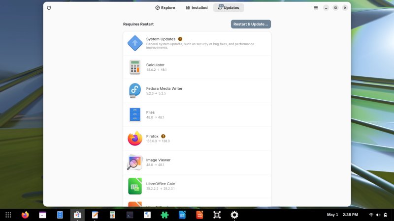
Restart & Update. What. Why? The whole idea of Linux is that you wouldn't need to do this really.
On its part, dnf is super-fast and slick. No complaints. But that also makes it impractical for 99% ordinary users who don't want to run stuff on the command line. Linux package management peak was Ubuntu Software Center in 2010 or so, and we haven't had anything even remotely as good since.
There are some problems with software usage, though. Run an update or an installation of any kind, and dnf will ask you to accept repository keys. I mean, what. For example:
Running transaction
Importing OpenPGP key 0x105EF944:
UserID : "Fedora (42) <fedora-42-primary@fedoraproject.org>"
Fingerprint: B0F4950458F69E1150C6C5EDC8AC4916105EF944
From : file:///etc/pki/rpm-gpg/RPM-GPG-KEY-fedora-42-x86_64
Is this ok [y/N]: y
Is this ok? How would one know? I mean, yes! I grabbed the ISO, I installed the system. What else am I supposed to do? If this is designed to prevent repo or system tampering in some way, then again, the vast majority of people won't know what to do, and they will be stuck. And this isn't even for third-party repos like RPM Fusion. This is for Fedora proper.
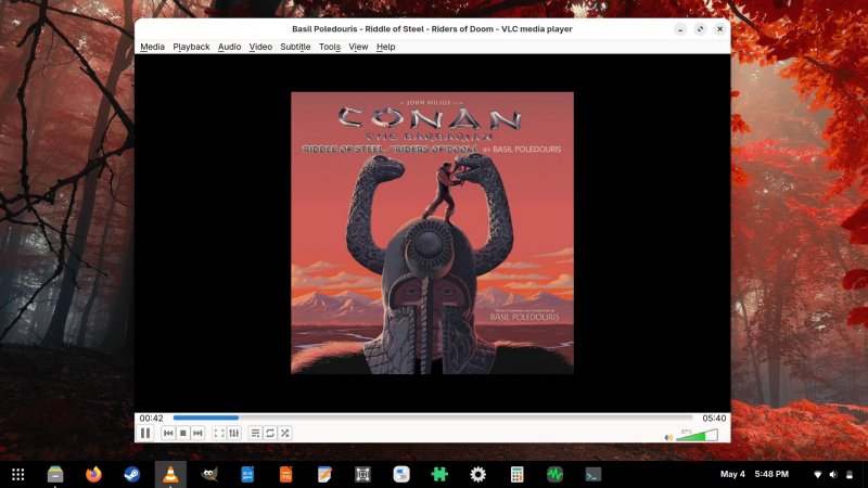
The first round of updates was huge - over 1GB worth of downloads. I disabled Flatpaks, and I went for RPM stuff only. I was able to install and run Steam without any issues. Similarly, I grabbed VLC and GIMP. Easy peasy.
The system was stable. No bugs. No crashes. Stuff worked fine. Not bad.
I tried to play some MP3 tunes - Fedora wanted to open this in Videos. Meh. I then used VLC, and I noticed the mouse cursor gets tiny when you drag it over VLC, and goes back to normal size elsewhere. This probably belongs in the next section, but still. P.S. The screenshot tool makes the mouse cursor bigger than normal when you select the "show pointer" button (no tooltips here, either). But even the default size is still bigger than the one shown inside VLC's interface. The default one is about 48x48 px, whereas the one for VLC renders around 16x16 px or so. Weird.

Look and feel
Now, the system is not bad-looking. Fedora 42 does a few things well. Notably, the dark theme is better than before, but not as good as Zorin's, but still bad in its own right. Various programs use all sorts of three-dot menus here and there, but there are no tooltips, so you don't really know what buttons do. You need to guess from the icon symbols. Mobile like behavior nonsense. Basically, we're marching toward Idiocracy, in that people now use pictograms rather than text to understand functional context. Nope. Text, text! What's wrong with text? People can't read anymore, is it?

No tooltips. Wireless name truncated. Two "airplane" icons, like in Zorin.
The default wallpaper is quite childish, much like Plasma 6 did in its first few versions. The other available wallpapers are okay, but not too exciting. You can add your own images, and unlike previous versions of Gnome, here you can actually load images from any which directory.

Most options windows and menus are not resizable. Not very ergonomic. But at least you get more options than before, and you don't need to gsettings your way to usability. I didn't like the default text color and contrast in the text editor, but at least this was relatively easy to change. The same goes for the terminal.

The lack of scrollbars is quite annoying, I must say. It feels like the window is badly truncated. Yet another ergonomic travesty. Somehow, scrollbars are bad. Absolute nonsense.
The battery indicator only shows percentage - you need to click on the icon, which takes you into Settings, where you can see available time left. This is another stupid trick from the Windows 11 book. More nonsense. More absolute nonsense.
The date indicator is a bit wonky - the day of month and the year are too close to one another. This depends on the first number, so I guess this is a font problem, plus a matter of some healthy spacing. Funnily enough, Gnome is all about "spacious" smartphone-like design, but here, the date is all cramped up.

All file operations have been completed - thank you for the accurate and clear information.
Rounded edges? Meh. They create a rather jarring effect. For example, the text editor:

Notice the text cursor - it touches the border.
You still cannot right-click and create text files in Files by default. Meh. Nonsense.
In the end, I managed, and the desktop was kind of okay. Still not 100% happy, but the looks were nicer than I thought.

Performance
I mentioned this some, but there's more:
- The boot times are quite bad - 27 seconds from boot menu to login, and this is without any disk encryption, plus another 7 seconds from login to desktop. Systemd, right. Meh. Among the worst results I've had on this laptop. And remember, this is Ryzen 5, NVMe storage. Not some paltry mechanical disk.
- The desktop isn't slow, but it isn't blazing fast either, as it ought to be. In comparison, Plasma is much faster. In Zorin, disabling animations significantly helped. In Fedora 42, Gnome Classic offers much better performance and responsiveness. Overall, there's a big, noticeable lag doing things. Even window resize is quite slow. You can see the drag increments. A rather jarring effect. I guess the whole GTK framework is simply not performance-optimized.
- The battery showed about 1.5 hours of time left at 50% mark and 50% brightness. Taking into account the battery deterioration (not shown in Gnome, BTW), then this translates to 3.5 hours for a full charge with moderate use. With light use, this would be about 4 hours or so. Okay, but not stellar. However, most newer distros, even frugal ones like MX Linux, no longer offer amazing times on this device. Part of that is battery deterioration, but an even bigger part is software bloat.

- Samba speed was good. Responsive, solid throughput.
Other observations
If you haven't noticed, I didn't make this review linear - live session, install, post-install usage. On purpose. I wanted to spice it up a little. So here's a handful of other stuff and concepts and problems I noticed or encountered during my '42 usage.
- On first boot, I saw a blue BIOS-like screen about some key restoration. Must be some stupid UEFI thing.
- Fedora's boot is clean of text errors and such, but it dims half way through. On this laptop, in the past, connecting the power cable would cause most distros to dim the screen fully. Here, we see a similar effect, but under different circumstances. I've not see this in a while. A regression, I guess.
- My Wireless connection was preserved after the installation.
- The screenshot tool is awful (I mentioned it in Zorin's review), and it usually takes a few attempts for it to "remember" the last mode. Even so, with no timer, ability to change screenshot names, or set the screenshot directory, it's a pointless utility. You can see performance issues with this tool, too. For example, it caught the VLC slider in between the second increments. I've never seen this happen on any other desktop. You could say this is because the utility is fast. No, the reality is, it's simply because the desktop is too slow rendering stuff. Of course, being able to actually set a timer would help.

Conclusion
Okay. So, Fedora Workstation 42 is both better and worse than what I expected. On the plus side, the desktop is quite pretty, slick, way more consistent than before, the dark theme is better, the ergonomics are better, the new installer is quite good, you can fine-tune software management quite well. All of these are nice improvements. Fedora 42 was also reasonably stable for me, apart from the first installation attempt. But better does not mean good. It simple means ... better than what you had before. On its own, not an endorsement of quality or success.
Now, on the negative side, the ergonomics aren't stellar on their own, and you need extra tools to improve the everyday usability and efficiency. Even then, you're rather limited. The performance and speed were rather average, even disappointing. There were also a lot of small visual bugs everywhere. The worst thing is the Wayland-only session, which to me feels like: here comes big corpo to make all your decisions for ya. This is an anti-user, anti-freedom choice really. It's not that I have anything personal against Wayland. I simply dislike inferior software solutions, especially when they're hailed as the "new and modern" replacement. Nope.
All in all, Fedora 42 comes with a strange duality. It surprised me, both ways. But at the end of the day, with a super-short support cycle, I don't see myself using it. Obviously, if I did, I'd choose a non-Gnome edition, Plasma to be more precise. Gnome simply isn't flexible enough. And it severely lacks in numerous areas of common desktop usage. In some ways, it feels like Gnome and Wayland go hand in hand, in that they offer a solution that's limiting by design, and can only do 60% of its rivals, counterparts or predecessors. An offering of mediocrity.
Still, if you DO like Gnome, then I would say Fedora 42 will please you. It improves on its baseline in almost all areas. But there are some snags and bugs, and don't expect any stellar speed unless you have a really new and powerful system. All other things being equal, at the very least, the new installer is well worth checking, and while Software is a meh tool, at least it gives you a great level control over third-party repositories and Flatpak sources, much better than any other such implementation I've seen, including KDE Discover. Not much, but something. Well, I guess, that would be for today. From your favorite curmudgeon, au revoir.
Cheers.