Updated: September 20, 2024
Every few months, I power on my test machine, emphasis test machine, and start the Windows 11 instance installed there, and check what has changed in the operating system, often for the worse. I do this for several reasons: 1) masochism 2) get new material for my blog 3) see what Microsoft is planning for the average user, and update my doomsday prepper toolbox. I did that a few days ago, and boy was I angry.
You may think I'm exaggerating of course, for populistic reasons. Nope. I tried to update the system, the update failed. I encountered a whole bunch of fresh ergonomic travesties. I encountered new inconsistencies in the Windows UI, and then some. Follow me.
Windows Update failure
I powered on the box. My tweaks from the previous round of testing seemed to hold. But then, I decided to run the Windows Show & Hide Updates tool, to see that there's nothing annoying in the available set of updates. Here, I hit my first snag. The tool above isn't as "readily" available as it used to be. I mean yes, if you search for it, you will find it, but that's not the point.

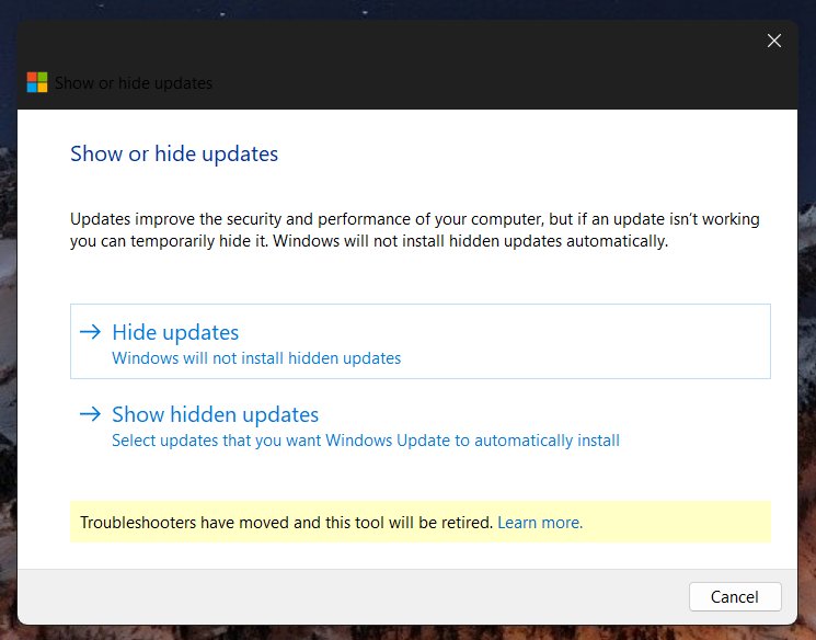
Here's the thing. I have the tool (diagcab) saved on my systems, so I could always grab an old copy. But I wanted to test whatever Microsoft offers officially. Indeed, the "new" version of the tool (the hashes differ ever so slightly) comes with a notice/message that troubleshooters have moved, and that the tool will be retired.
This goes hand in hand with the general stupidification of the desktop, as I've outlined in my article on Settings vs Control Panel just recently. Instead of normal, efficient tools, you need to work with pseudo-touch garbage designed for the crayon brigades. Because "modern". At the very least, the tool will continue working normally for people on older releases of Windows 11 and older versions of Windows, so you retain some level of decent functionality.
There were no updates I wanted to hide, so I let the system run. I noticed the updates were progressing super slowly. Seems like Microsoft "optimizing" things for me. The updates were downloading at a mere 4-5 Mbps, while the network can do 250-300 Mbps. Even Microsoft's own internal test shows 10x more than was being utilized.

The big spike is me doing a manual speed test.
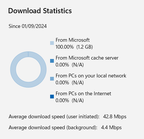
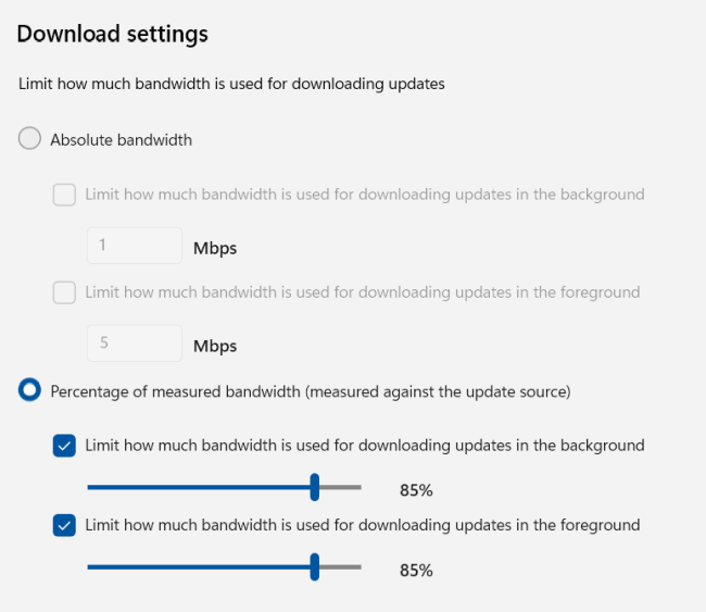
I then launched Settings and changed the dl/ul throttle limits - this made no difference. Only after a reboot, which I had to trigger due to a failed update, as we will discuss shortly, did the new limits apply, and Windows managed to use 65-70 Mbps, but still way less than it should have or could have.
In comparison, on this same network, my Windows 10 machines take significantly less time to update, and Linux machines even less. Mere minutes. I used to praise Microsoft for improving the update process, and making the updates more streamlined (after ruining them, of course, that's how you do "progress" in tech), but now, it seems we're back to slow and pointless.
Eventually, the update majestically failed:

I tried a couple more times, no luck. On reboot, the system screen would read: Updates underway, but not show any percentage. Another time, there was the percentage bar, but this didn't make any difference with this specific cumulative update. All of this was taking time, a lot of time.
At this point, I decided to try to manually fix the issue - and I might write a separate article on this. I opened Microsoft's update catalog in Firefox. This particular KB shows twice for each architecture, probably because it was released twice, as the first iteration borked the bootloader on dual-boot systems. Yet another reason why you shouldn't use Secure Boot in your home environment (as it was never meant for that), as it doesn't really add any true value except revocation of compromised keys due to bad implementation and lax practices by various OEM vendors and alike, hassle, complication in usage, possible limitations, locking you out of your legitimate Linux distributions, and tons of other issues. The whole modern boot story is just obfuscation and nonsense, with the ultimate goal of creating a boot sequence totally out of user control.

The two entries also have different hashes, so they are essentially different. Which one to choose? Perhaps this is the reason why the update failed? Windows tried to download the old one? Who knows?

The KB identifiers for the x64-based systems are:
37ac4615-6919-4fad-9270-c3da9c83ce67
303d0d14-506a-4edb-8462-71ef4eb747ca
Now, a few more things worth noticing. The update catalog looks like something from the Windows XP era. That's not bad at all, but it's another element of the huge discrepancy and inconsistency in the visual styling of different Windows versions. The copyright symbol (C) is also positioned flush with the left border of the page. But the worst thing is, if you expand the entries, and try to click on the relevant support pages, you will get a Secure Connection Failed error in Firefox. No option to continue. Microsoft says this is a bug in Firefox. What this feels to me like is 2006, when you could only open and use Microsoft/Windows updates via Internet Explorer, and no other browser would correctly load the update page. I might be wrong, but hey.
I downloaded the KB with the "higher" number. I tried to install it myself.
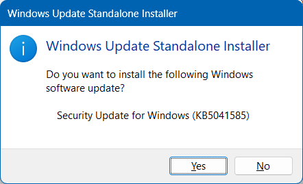
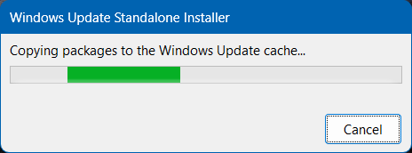
The copying package process stalled. I left it be for more than 30 minutes, and I checked the task manager after that. The CPU and disk activity for the installer was showing 0%. Obviously, the task had somehow stalled somewhere. I killed it, tried to run the update again, and got an error:
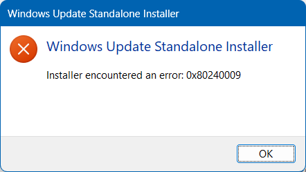
At this point, I rebooted the machine. This time, the black maintenance screen showed percentages, the system rebooted, there were some more percentages shown, and I was able to log in. I launched Windows Update, checked if there was any difference in the results, and lo and behold, it would seem the manual update, despite the stall and the error, had completed successfully.

Overall, it took me roughly 3-4 hours to complete a simple system update. So many errors. So much nonsense. QA, QA, where art thou? But don't worry, you have a nice flat UI, gray on gray, pale fonts, and a commitment from Microsoft to reduce carbon emissions. That's the message you need to see in Windows Update! But maybe, if Microsoft didn't under-utilize my bandwidth, or didn't have shoddy packages, the whole things could have been completed in 1/10th of the time, and we would have saved many carbons? Also, I don't care.
System menu nonsense
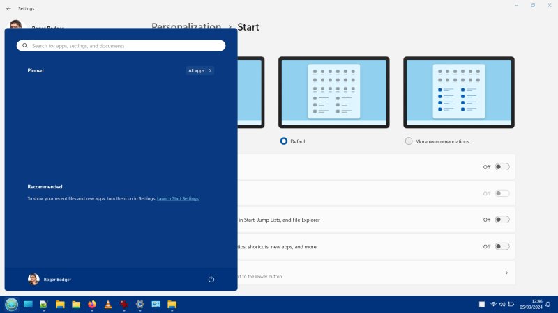
I use Open-Shell rather than the default menu, because it's superior in every possible way. But I wanted to see whether anything has changed recently. Look at it. I toggled the recommendations off, but the section is still there, taking unnecessary space. Sure, you can minimize it a bit more, but it's still there. And you can't see all your apps right away. More mouse clicks. The whole idea behind Windows 11 is to add mouse clicks. As if they hired an "efficiency consultant" and asked them, how can we make the operating system less efficient?

Explorer behavior, performance
Windows Explorer, the new one that is, remains slow. It takes about a second to launch and another second to render. You can actually see the rendering on the screen like it's 1994. It does not respect my color theming, and remains ugly, pointless and stupid. As you may recall, I was able to make it fast, via registry by disabling the "new" look, but since, Microsoft has killed the tweak. A big, pointless regression on all levels.
I tried to play with the Windows Explorer properties, and managed to do two things:
- Under View, I disabled the option that says: Launch folder windows in a separate process. This helped with the performance a little bit, but the program still remains slow, clunky and ugly.
- I noticed that under General > Privacy, there's a box that says Show files from Office.com, preselected. What? I didn't mark this, ever. Why would I? Another modern travesty, another little facet of brazen disregard for the user's privacy, sanity and dignity.

Also, notice how any advanced functionality or menu opens in the OLD CLASSIC window style, because that's where the real functionality is, unlike the Settings app, designed and intended for five-year-olds? But sure, Microsoft wants to deprecate these and give you the touch-inspired nonsense!
Settings, BitLocker, inconsistencies left and right
During my troubleshooting of the updates process, I consulted a variety of Microsoft support pages and threads, to see whether there's anything that might shed light on my broken system. One of the suggestions was to check the EFI partition, to make sure it's not clogged.
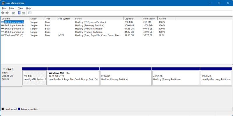
First, I launched Settings, and looked at its disk- and storage-related information. Useless. Absolutely useless. Look at that touch-inspired estate! All that hidden information, all those extra "taps" you need to exercise just to see what can be shown in a single pane. I launched the old Disk Manager applet, and it showed all of the information in one go. Not pretty, but useful and informative.
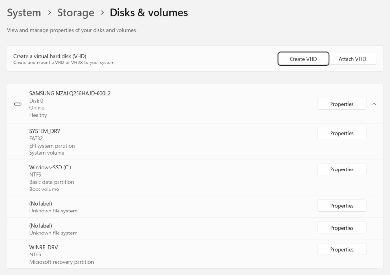
Just look at that "new" "modern" travesty. Look at it! A failure of design and thought. Here's why:
- A tool that doesn't show information is pointless.
- The fact you need to click Properties to see individual partitions is stupid. The whole idea is that you can actually see all of your disk information at once.
- No sizes are shown, which is probably the stupidest element.
- There's that Create VHD thing up there - what, why? I'm running a Home edition of Windows 11, so I can't use Hyper-V even if I want to. But the cynic in me thinks, this is gentle conditioning for people to think, hey virtualization, Azure, cloud, boom!
- The interface is anti-ergonomic - pale gray fonts on a pale background. Who is this designed for? Why is that pale, feeble font a good choice, regardless of anything else? How's that good or modern? How does this benefit anyone? What sort of artistic, stylistic message does this convey? Amateurism? Apathy?
- Let me repeat that again, a DISK-related view of Settings which does not show SIZES by default. A storage app that does not show KB, MB or GB, not even percentages. Nothing. That's a failure of astronomical orders.
Now, another suggestion was BitLocker. Not likely on a Home edition of Windows, but still. Here, I encountered yet more problems. If you click on Manage BitLocker through the system menu, it will open a Control Panel page in the Explorer and tell you:


To manage your encryption settings, go to Settings, choose Update & security, and then choose Device Encryption.
The problem with this message:
- There's no such option as they outlined it above.
- Look at the ergonomics of that things. Barely visible address bar and search bar against pale gray background, thin, reedy fonts. So much flat, empty, useless, pointless nothing that serves no purpose.
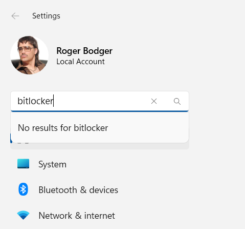
Notice the search drop down, how it covers the Home icon in the sidebar? Another ergonomic nonsense. This way, it looks like there's a big gray shadow under the search box drop down, but it's just the Home entry highlighted, from whatever else I was doing previously. Now, a five-year-old could spot these visual errors, if they bothered. But I guess QA is not "modern", so no one tests this.
Other things
I also noticed that my box hadn't had a timezone sync in about a year. Why? Beats me. Furthermore, in the latest round of updates, there was also a bunch of drivers included (AMD and such). And then, after a reboot, I got a notification/popup from AMD Software about some latest software and signing up and whatever. I don't use modern "apps", and I've uninstalled pretty much everything on this box. And yet, after receiving updates, there's this pointless little notification. Why? I don't want to see anything. I don't care. I don't want to sign up for anything ever anywhere, leave me alone.

This is such a typical example of modern software tragedy. You add so much hyperactive nonsense into the operating system, you go full Silicon Valley 2000 turbo ADHD mode, notifications, popups, signups, action, colors, and then it becomes impossible to use the operating system without being distracted. So then Microsoft adds the "focus" mode so you can work without being disturbed. You know what helps being focused? Not being disturbed in the first place!
Conclusion
Another fantastic journey of pointless ends. Such a travesty, such a waste of time. And all of it, completely unnecessary, too. Windows 11 is mostly UI changes for the sake of it, not well executed either, plus arbitrary limitations on usage. The worst offender is the super-slow Explorer, which takes forever to launch. You can work around it, as I've outlined in my article from two years ago (!), but the fact the whole thing is so badly sluggish is an insult to the software development domain.
Let's not forget broken updates, visual inconsistencies, and such. Amateurish drama, with no benefit. On the plus side, since I don't use Secure Boot, my Linux part of the setup remains untouched, Open-Shell works fine and has not been affected, most of my tweaks work, so if I need to do something, I can still have a modicum of efficiency and sanity. But the Explorer performance, the system tray, the so-called "modern" additions are so utterly slow and stupid, it's impossible to ignore them. That's, right there, the future for you. Anyway, I'm tired of this article. Take what you will from it. See you soon.
Cheers.