Updated: July 30, 2025
Howdie. Many a Linux nerd is under a wrongful impression that I have some rancorous emotional investment toward different components of the operating system called Linux, Gnome in particular. Nope. My dislike of certain technologies is purely technological, ergo if a supposed solution doesn't do what it should, does it badly, or compromises heavily on important ergonomic aspects of DESKTOP usage, then, yes. In my case, it comes purely down to functionality, not ideological affiliations.
Ever since Gnome 3 became a thing, I was opposed to its visual minimalism, excess of mouse clicks to get things done, hiding of information, and lack of easy customization. That said, it's not a blanket verdict. Indeed, as I tested the latest version of Fedora Workstation, I discovered a few interesting pieces. Some good, some bad. I didn't elaborate too much in the review, so let's have a little piece focused on the aspects of desktop usability. Good things, bad things, lessons in Tux. Follow me.
Accessibility
This is probably one of the most neglected elements of the Linux desktop. Most distros "assume" most of their users are young AND nerdy, so they are okay with figuring things out themselves, and/or they don't need any big help, physical or technical, using their systems. This assumption shouldn't be the default, nor is it an excuse to ignore accessibility for those who do need it.
So, how does Fedora 42 (Gnome) stack when it comes to accessibility? Well, not bad actually. Sure, there are ergonomic problems in the basic usability (hidden window buttons, no visible panel with shortcuts, extra clicks to get things done, and such), but on the accessibility side, there's been some rather neat progress.
You have a screen reader built in. Presumably Orca. Now, this is good, except ... it doesn't work that well. The narration tone is robotic and waaaay too fast, and it doesn't always correctly read what's under the mouse cursor. The idea is noble, but needs more polish. Still, we have a solid starting point.
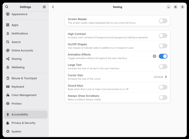
Then, you can toggle off animations, which also has the side effect of making everything faster and snappier, if needed. You can also show scrollbars, which is a great thing, plus toggle on a high contrast theme for the system (and apps). Now, this is super important for several reasons:
- Most modern distros come with depressing flat interfaces, with little to no contrast between background and foreground windows. You can see it in the screenshot above; almost no color other than gray, the titlebar color is not, well, it's not, and the fonts are way too pale.
- Newer versions of Gnome do not allow you to easily change the theme colors. From Gnome 40 onwards, you actually need to compile themes from source CSS files, which feels so ultra nerdy I wanna go back to using MS-DOS. Therefore, having some toggle, whatever, that lets you improve contrast of the shown text is critical for anyone not keen on compiling anything.
And here, Fedora 42 does well. In all my past reviews of Fedora/Gnome, I often complained how the high-contrast theme (which was always there) looked extremely badly implemented, neglected, with ugly icons, missing icons and then some. Well, the latest edition offers a much better result.
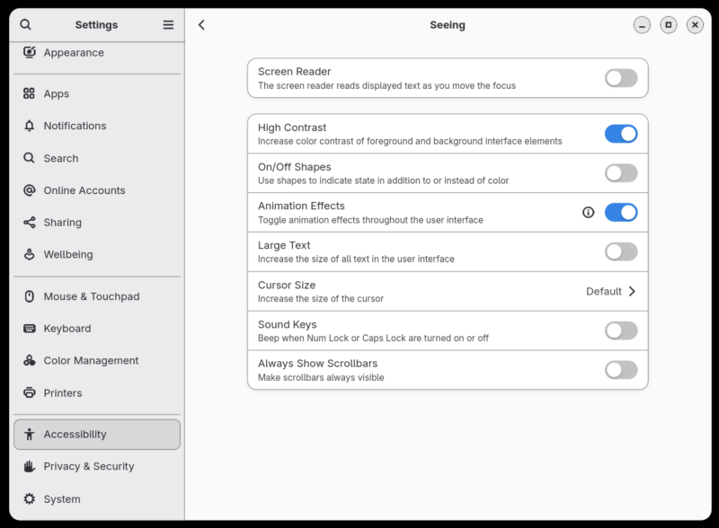
Look at the screenshot above. There's still a lot of room for improvement, but just look at it. So much easier to see things, navigate, separate elements, read. In many ways, this should be the default, and if people want to use so-called "modern" flatness without soul or style, they can. And this goes beyond Fedora or Gnome, it's the scourge of the entire Internet, with silly, bland interfaces that look like someone forgot all the color and passion in the previous century. Since when did the color become the enemy?
Online accounts
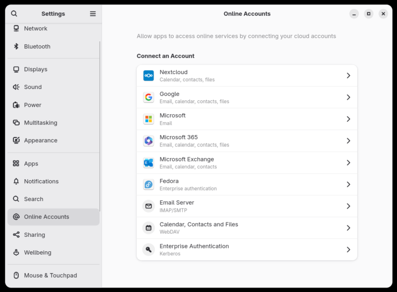
Fedora also does online accounts all right. You get quite a range, and for the most part, the integration is decent. In this regard, I have no complaints.
Search
Fedora implements a reasonable, fairly granular search functionality. Not as turbo as Plasma's Krunner, but still decent, and you have a good "dashboard", which lets you tweak the behavior. You can define which search locations you want to use, and which programs (and their data) to include in the results.
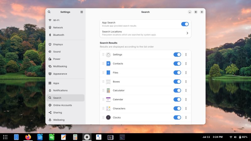
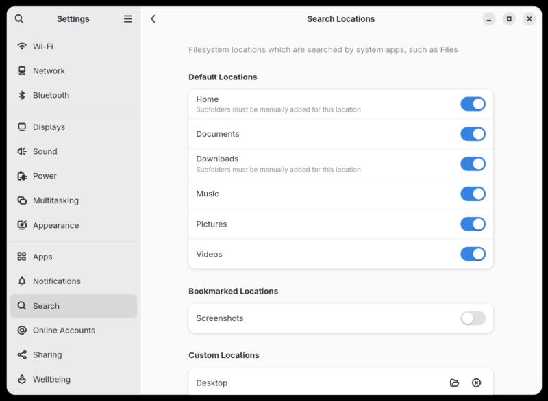
You can add your custom folders, if you like.
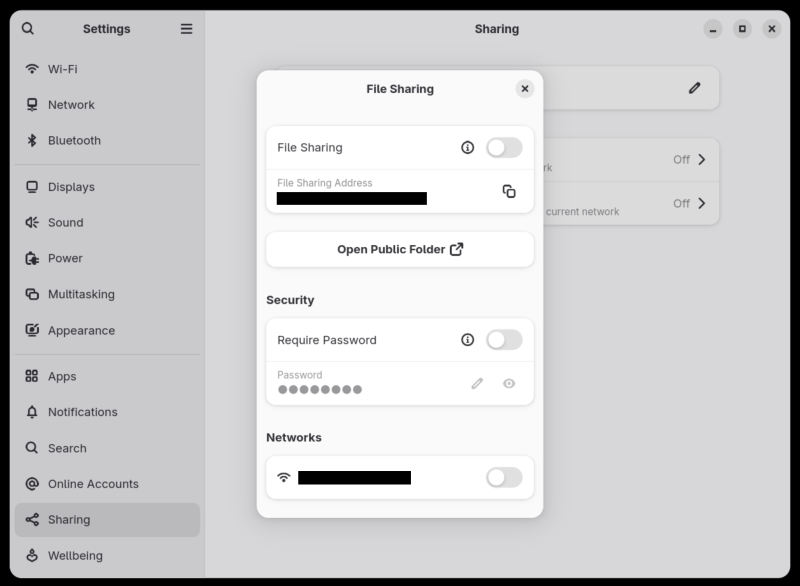
File sharing
Implemented reasonably well. It's DAV, but without you having to tinker too much.
Apps
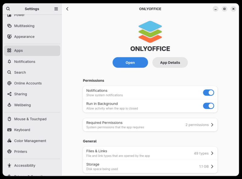
One thing that I thoroughly dislike in Fedora's (Gnome) Settings is the Apps section. This immediately creates a flashback to Windows 10/11, and how they implemented it. Lo and behold, Fedora does almost the same thing, showing you permissions for your "apps" and whatnot.
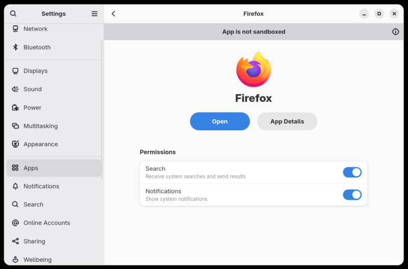
I presume the intention here is that, fast forward a few years, Linux runs a-la Chromebook, and your system is sort of isolated, and all of your apps are sandboxed or containerized programs, or apps in modern parlance, where you can control their behavior and permissions. Sounds okay, except, there are tons of problems, even with Flatpaks (should you choose to use them):
- As I recently highlighted multiple times, the question of trust, verified versus unverified (see the end of the Fedora Wayland benchmark article linked above, if you please), unless there's a 100% secure chain of trust, the whole thing becomes a guessing game of what you may or may not get. The store model ain't bad, but even on iOS and Android, you have to carefully cherrypick what you need, because it's a minefield. I don't know if anyone uses Microsoft Store, but if so, they have the same problem. And if you cannot trust a store, and you have alternatives (like direct downloads or the distro repos), why not use those then?
- The controls aren't granular enough. You may allow access to Files or such, for instance, but what if I want a program to only be able to access one particular folder or a set of files. No such option today. Going back to Search, I'd want to see something like this to even begin to consider this useful enough.
- You cannot disable "necessary" controls. For example, I checked regarding OnlyOffice, as I had tested the program recently (review coming soon), and through Fedora's Settings, you cannot disable network connectivity or full system access for that matter, as these are, supposedly, essential for the program's functionality. But that's not correct. On the command line, you can launch any which Flatpak with network unshared [sic]. Also, OnlyOffice works fine without the Internet, it's just that certain online/cloud components won't work. But then, if a normie has no ability to disable certain "mandatory" aspects of an app's behavior (without any specific implications on OnlyOffice, used as an example here), then we're slowly but surely going toward the Android/iOS model, where the vendor knows better than you. Not interested in that. Or rather, I don't need Linux also telling me that.
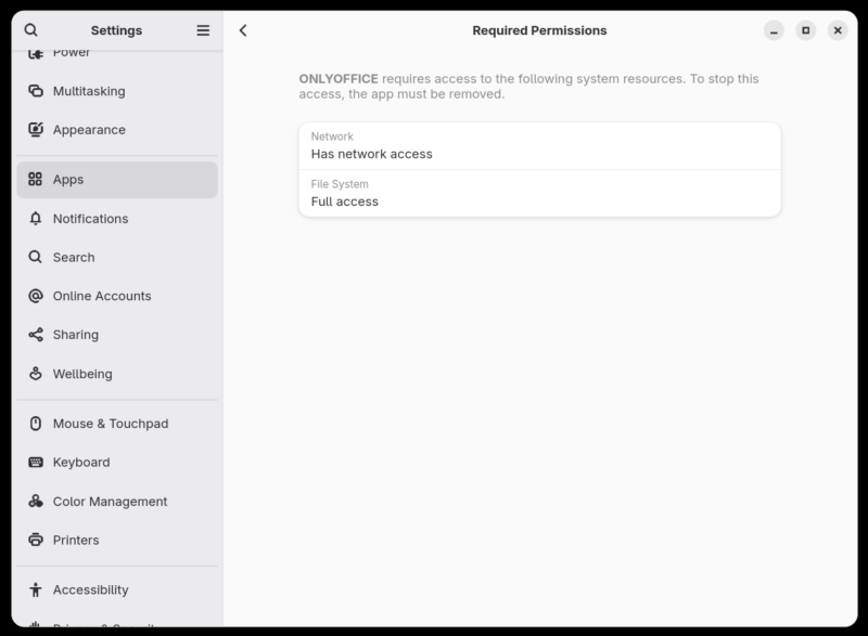
Settings tell you in order to stop network access, you need to remove the app. This is 100% incorrect. Absolutely and totally incorrect. To run any Flatpak without network, you can do: flatpak run --unshare=network "whatever". OnlyOffice runs fine, without problems, minus the cloud elements. But it works fine.
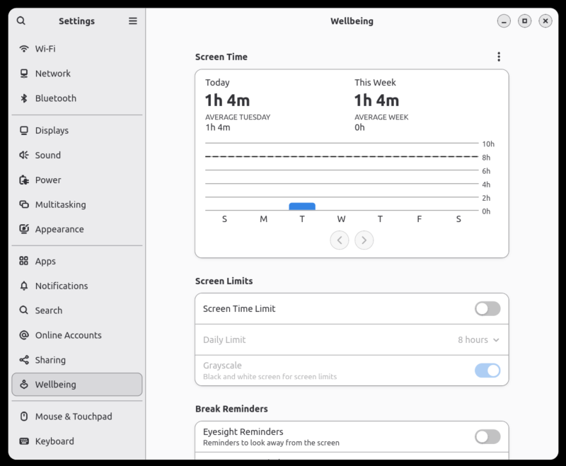
Notifications, wellbeing, screen time
This feels like another page take from Windows 8+ and/or mobile. Notifications, do not disturb, focus and all that. First, why would apps even need to send notifications? If I'm using it, I'm using, and if not, then I'm not interested in its content. It shouldn't "lurk" in the background, waited for "push" messages from whatever. Second, the whole concept of "hyperactive" modern usage is flawed. There is no reason to be constantly bombarded by info, or to be "connected" all the time, responding to messages or whatever. Copying this functionality is wrong, as it enables the worst traits of the proprietary world.
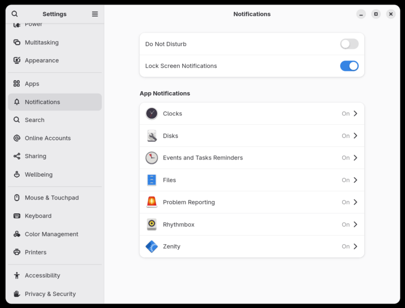
Now, if notifications exist, then sure, having a control center where you can enable/disable them is a good thing. But the entire notion, to begin with, is quite flawed. At best, the user needs to see critical system messages, if and when relevant. But not more than that. And if you want to chat, then launch the chat program, and be done with it.
Wellbeing is not a bad thing in principle. What I object to is the notion of "no personal accountability". If a grown, adult human needs reminders from a machine to take breaks, step out, do some exercise or similar, the problem is much bigger than the sum of code that went into this implementation. I know this is a modern thing, and it might even be considered ergonomic, but it sits too close to Windows and friends for me to consider it beneficial in any way.
Ergonomics, customization
In my view, the biggest problem with Gnome is that it's not very friendly out of the box. There's visual minimalism. There's a lack of obvious desktop things (active panel/taskbar with shortcuts, desktop icons, window control), which means to get where you want to, you require more work, more mouse clicks in Gnome.
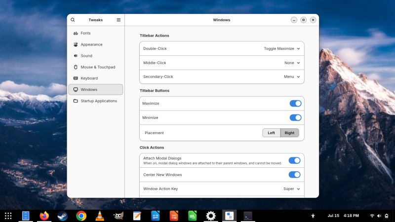
This can be solved, to an extent - a topic of numerous articles I wrote on this subject. In Fedora 42, I needed two components for a classic desktop experience. I installed Gnome Tweaks, and in there, enabled window controls (min/max buttons). I installed Dash 2 Panel extension from the Gnome website, and this activated a standard bottom taskbar with pinned icons and an end-corner Show desktop widget, so I didn't need to do the same thing myself. Jolly good.
A third component is optional, but you may want to consider it. Again, as I've written a billion times before, Fedora's fonts, most likely due to possible proprietary format licensing issues, don't look as they good as they could. Thin, blurry, meh. Even if you change anti-aliasing and hinting options, even if you enable all sorts of font tweaks in your environment, you still won't get the results you expect. But you can solve all that by using Ubuntu fonts. Free and good-looking.
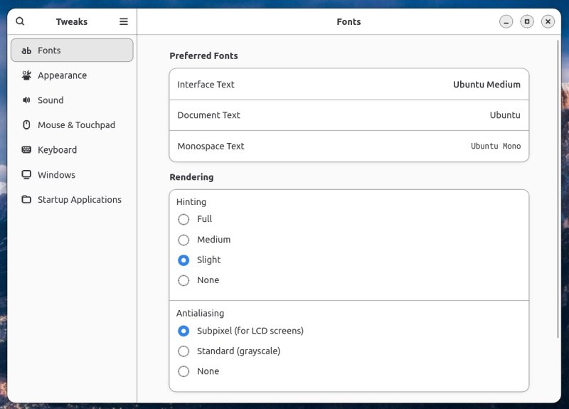
You can also manually activate scrollbars, so you don't have the thin disappearing overlay ones:
gsettings set org.gnome.desktop.interface overlay-scrolling false
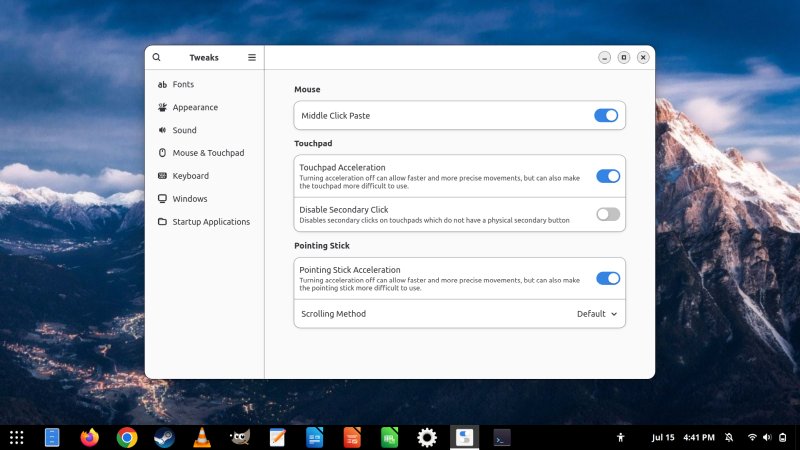
Lastly, on the ergonomics side of things, Fedora/Gnome implements a good mouse cursor, with good speed and acceleration. Usually, I need to tinker, ever so slightly, in most distributions. Not so here.
Device Security
This also sounds and feels like a "modern" thing. If you go under Privacy & Security, you can check your Device Security, and you will, as I did, probably see a lot of red warning symbols, telling you how your device failed its checks. Now, this seems alarming, but if you dig into it, you realize it's just ... unnecessary.
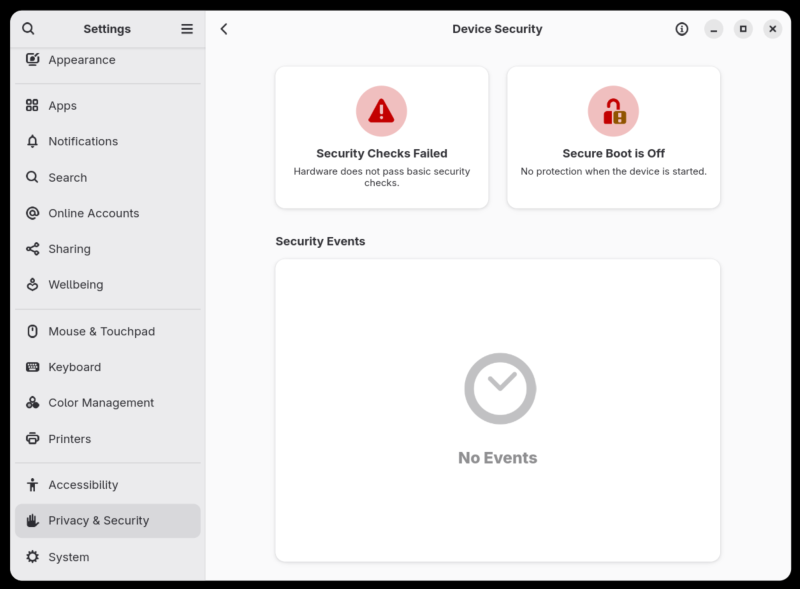
I looked what checks my system failed, and the "basics" that it failed are related to UEFI key management, TPM, stuff like that. Basically, nothing I want or care about in the home environment. 100% irrelevant. Remember my rant about the Windows 11 message on this topic? Same thing.
And it also applies to Secure Boot. I don't consider this protection of any kind, nor do I want or need it. But then, there are alarm bells going off in my head now, and they all scream: run away. The reasoning is, if Microsoft wants to arbitrarily lock me down into their ecosystem and make me buy a new machine because it "fails" checks, then seeing the same thing in Linux, regardless of the actual implications, creates a similar impression.
If you ask me, basic checks would be: user password, home encryption, firewall, perhaps permissions on certain system folders. The rest is just modern pseudo-corporate noise that I immediately associate with big companies and their greedy ways. Lastly, if my system fails so many checks, but there are no events, what then?
Slow Software, fast dnf
Fedora's command-line package manager has a funny name, dnf = did not finish, in sports parlance. On the contrary, this is an ultra-fast and tight utility, a sprinter. My experience, it's faster than its siblings zypper or apt. It resolves package names more quickly, it install packages more efficiently, and it does delta downloads, which ought to save bandwidth.
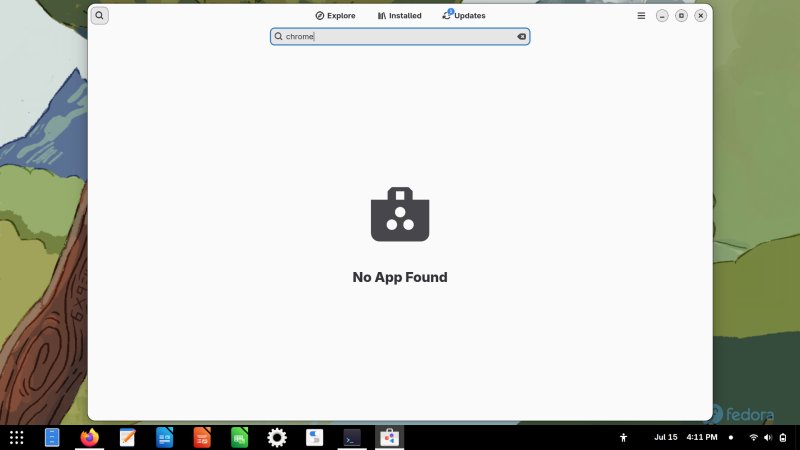
The polar opposite is the GUI version thereof, called (Gnome) Software. It's cumbersome, not that pretty, and not very accurate. For example, going back to the Google Chrome example I brought up in my Wayland vs X11 article. Now, even if you don't care about the bigger topic of display protocols, you might as well just read the last section of that piece, which covers the ins and outs of software installation and third-party sources, with Google Chrome as the best example.
With Flathub disabled (where you can/could find an unverified, unofficial version of Chrome), and with Google's own repository enabled, if you search for Chrome, you won't find anything. This is in stark contrast to dnf, which handled the job without any fuss.
32-bit library support
Recently, Fedora's council voted to keep 32-bit software around. This is a good thing, but this vote should never have been had to begin with. Removing support for old libraries effectively means killing lots of meaningful "legacy" software and most games, including Steam. Indeed, if you install Steam on Fedora, or any which distro for that matter, you will see a torrent of 32-bit packages streaming your way, because they are much needed.
Conclusion
And here we are. The end of this article. In some ways, you could consider it an extension of my review of Fedora 42, with a bit more focus on specific aspects of the desktop behavior and usage, ergonomics, package management and such. Some good things, some brilliants things, some bad or even awful ones. I'm not trying to be diplomatic on purpose, I simply see a blend of solutions and options that don't gel well together, a story of Linux repeated a million times.
I've always liked Fedora's underlying tech, the kernel, the yum/dnf tooling. I was never keen on the licensing model, as it sort of mandates breaking out of the distro's world to get to the stuff that people want or need, as, alas, there's a lot of useful proprietary stuff out there. So far, attempts to reconcile this haven't worked out that well. If anything, I think the latest few attempts only create more confusion. For now.
Ergonomics. Ah, ergonomics. Where do you separate taste from functionality? Well, as I always said, you count mouse clicks. Only techies use keyboard shortcuts, so if your first thought is Ctrl + something, nope. A simple GUI is good in that it's not cluttered, but form over function, c'mon. The normies ain't any more enlightened, and you only make work harder for people who seek efficiency. But on the plus side, I think Fedora's made inroads in the accessibility space. And then, side by side with it, it also seems to embrace a whole bunch of smartphone-like Windows-11-like ideas that have no place on the desktop.
And with those words, I bid thee farewell.
Cheers.